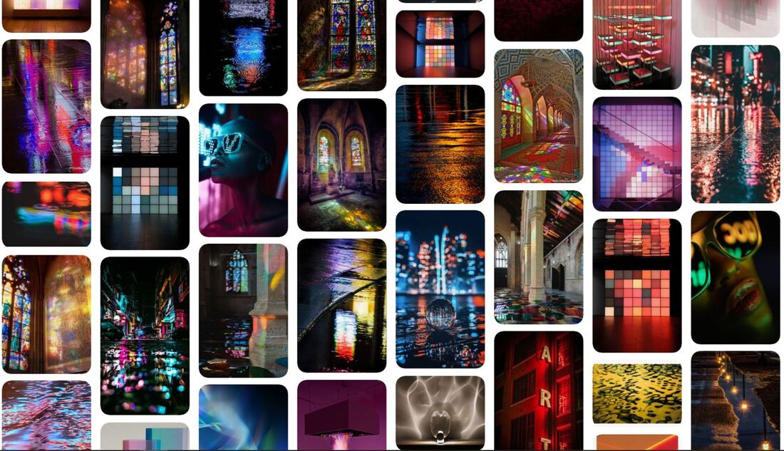
EXCELLENT MOODBOARD!
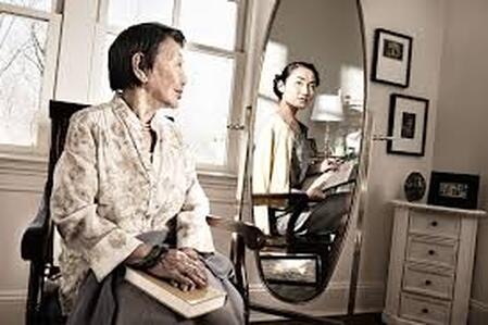
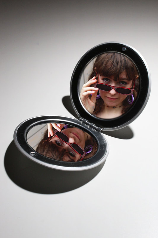
Distorted Reflection
Distorted reflection may refer to any augmentation of the normal appearance of something being reflected. The face of the subject may be contorted into strange unnatural expressions either by the subject themselves or the medium through which it is being reflected. Another way a photo may be distorted is by giving a false impression of something.
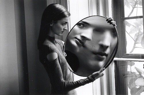
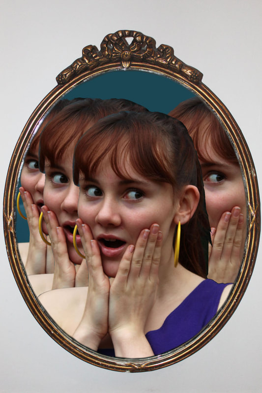
Here the reflection of woman's face in the mirror is warped because of the distance of the camera from the mirror, giving a creepy repeated look.
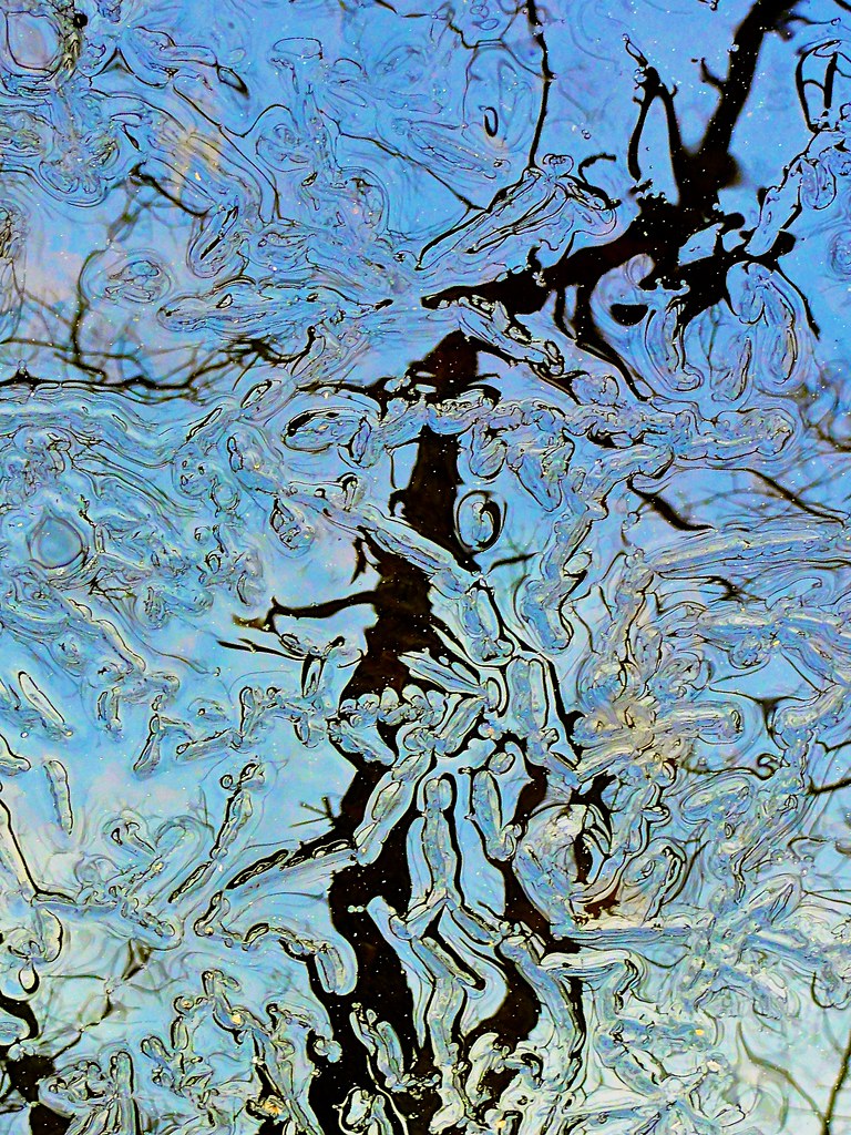
The bubbles in the water of this photo mask the dark shape behind and add movement to the photo, concealing what is beneath the surface.
|
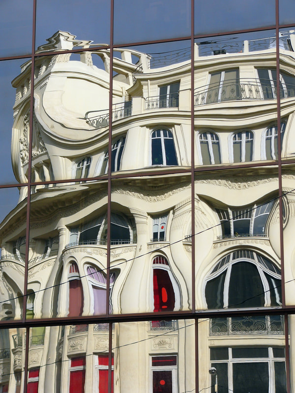
In this photo, the shape of the building has been warped in photoshop to give a swirling effect which is not a true representation of reality.
|
My First Response
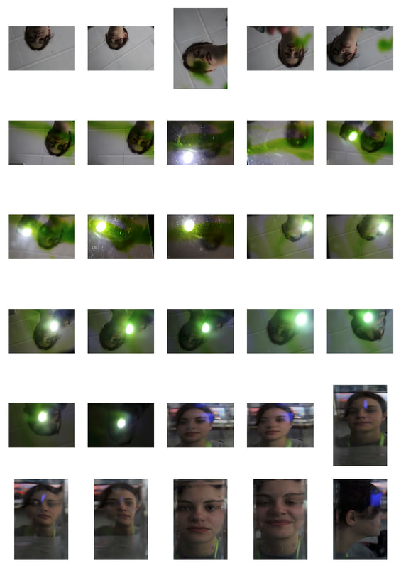
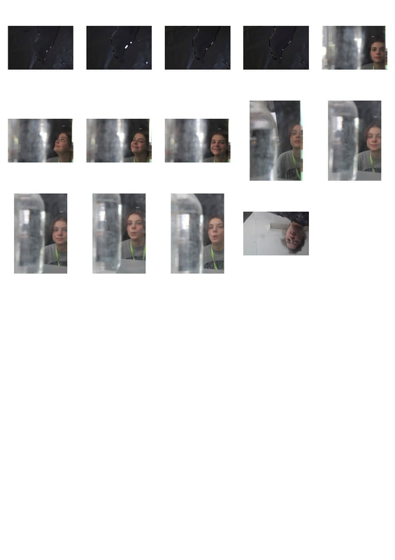
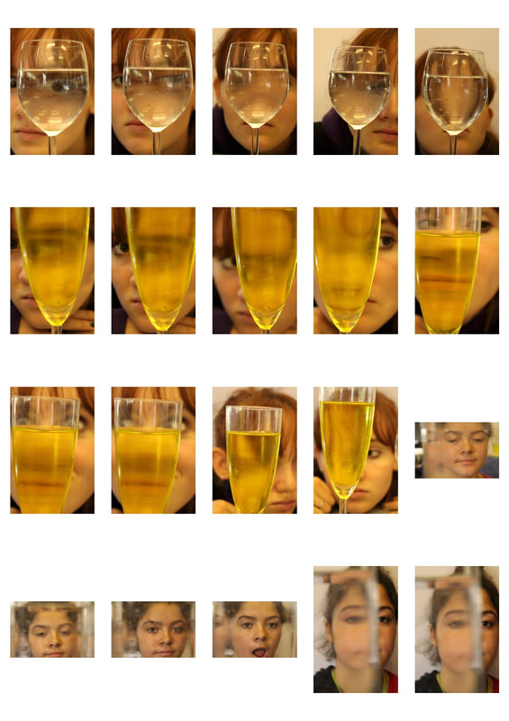
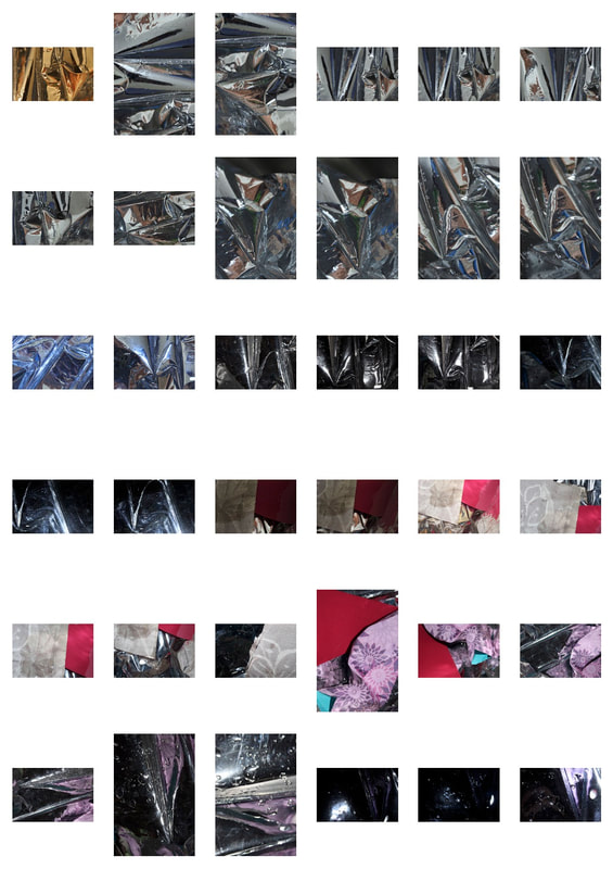
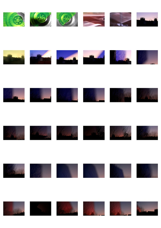
In this task I was working to create abstract and unconventional photos using the idea of reflection. I used water jugs, mirrors and coloured ink to create these effects as well as a torch to direct the lighting. I wanted to convey the idea of an augmented reality, and how the appearance of something is not always as it seems.
|
|
|
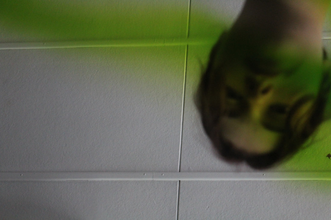
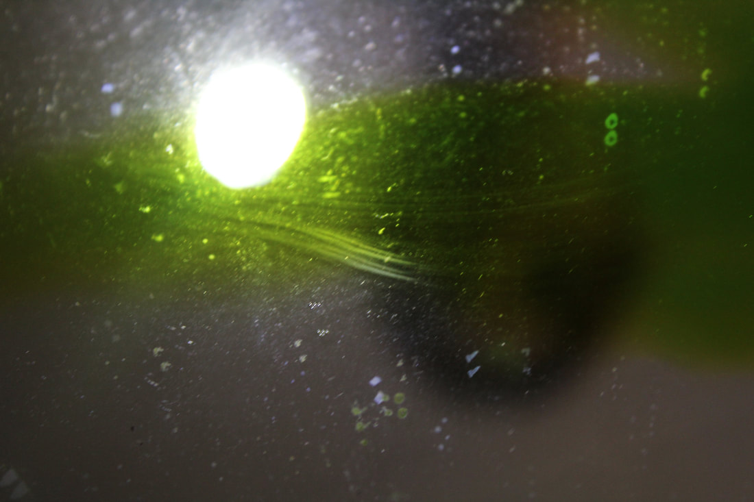
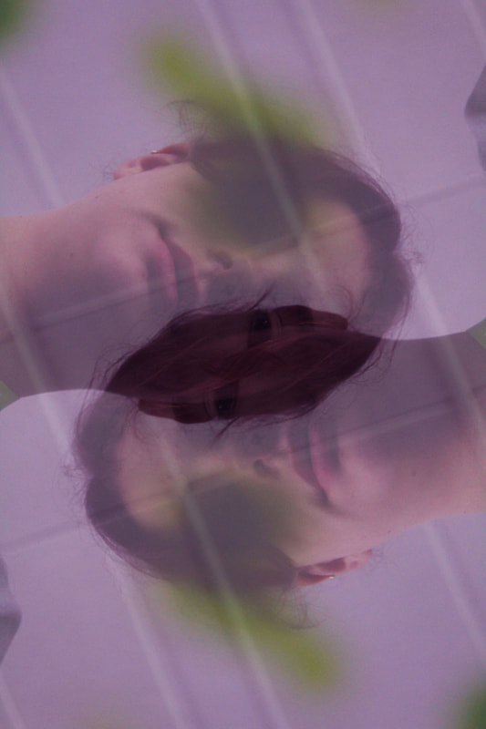
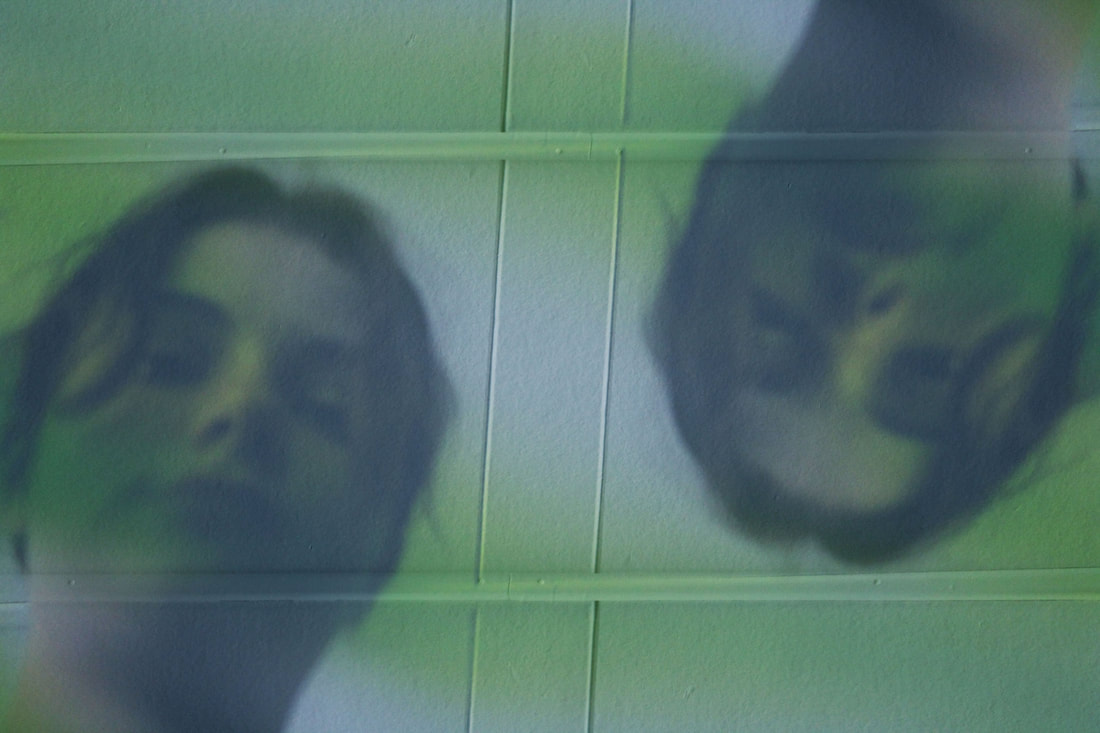
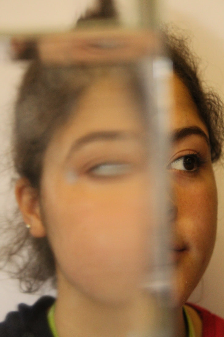
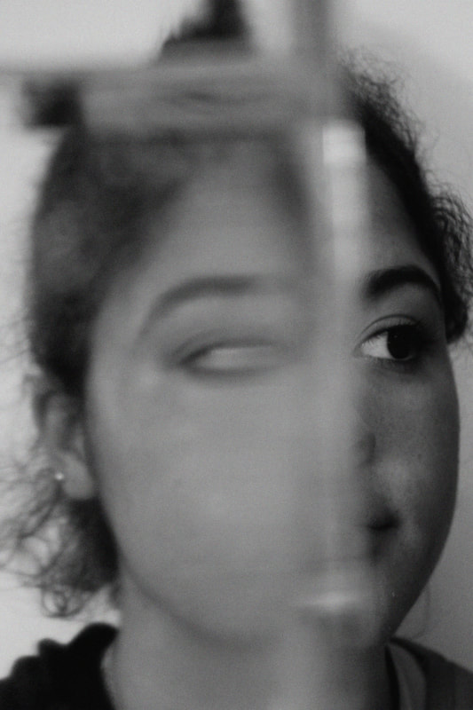
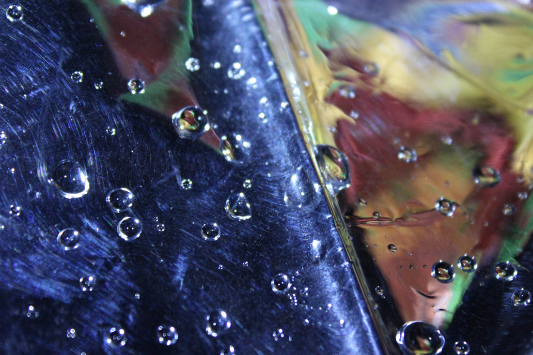
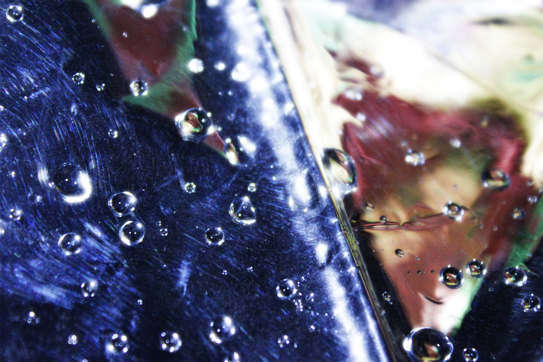
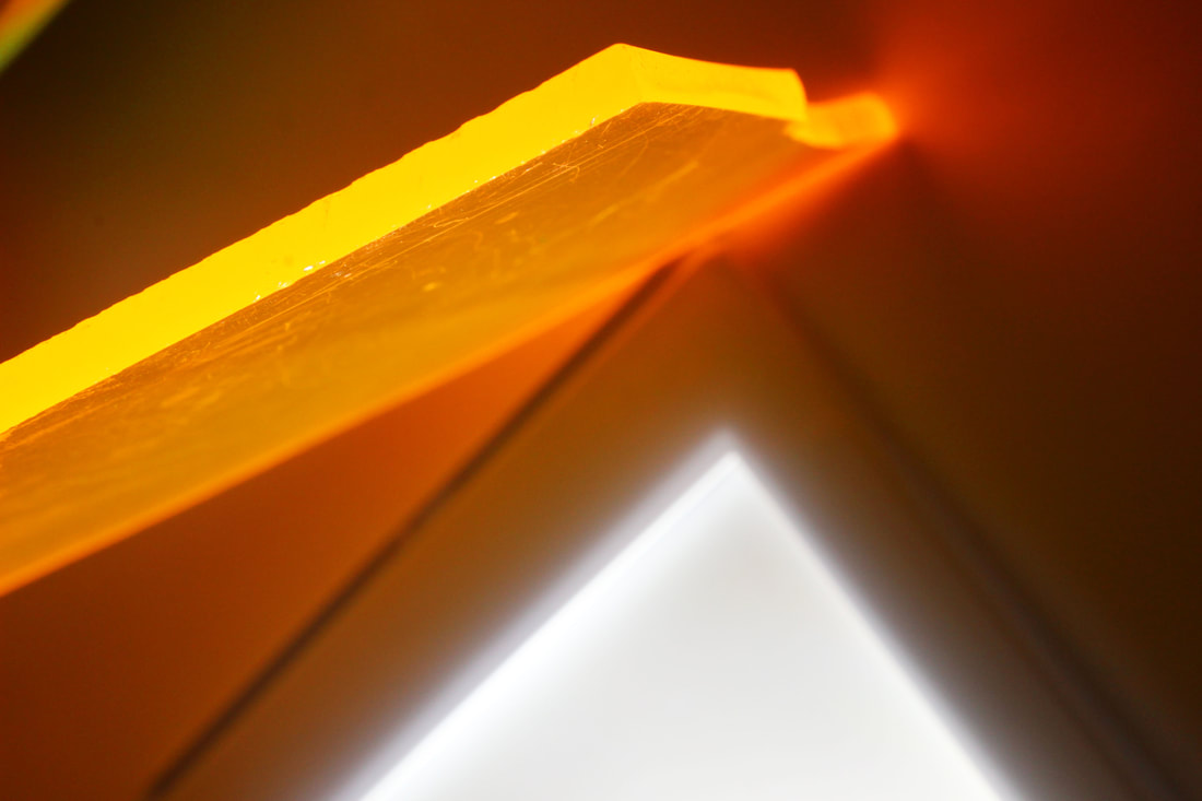
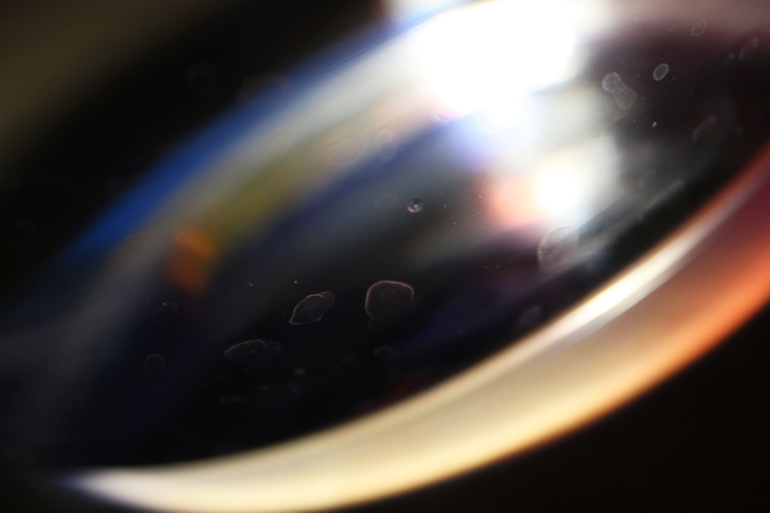
These are my three favourite images from my first shoot, as there is colour and the photos are clearly focused on a specific point. I like the pattern the lines on the ceiling created which give the photo direction and divide the background into segments, as well as the rough texture of the ceiling coming through in the background. I also like the way Sophie's face is partially concealed by the green ink on the mirror, but half of it is still visible. This contrasts the last photo, where her outline is barely visible and the bright light and texture of the marks on the mirror are the main focus. However, there is quite a lot of grain due to my use of a high ISO, which I could try and minimise in my development.
This photo is effective because of the use of the formal element of lines, as there is one which divides the photo down the middle, and two parallel lines across the top and bottom of the photo. The focus of this photo appears to be on these lines and the texture of the ceiling, which initially draws away from the subject to the right of the photo. The green ink bleeding into the left half of the photo gives the photo a sense of continuity, which juxtaposes the divide created by the lines.
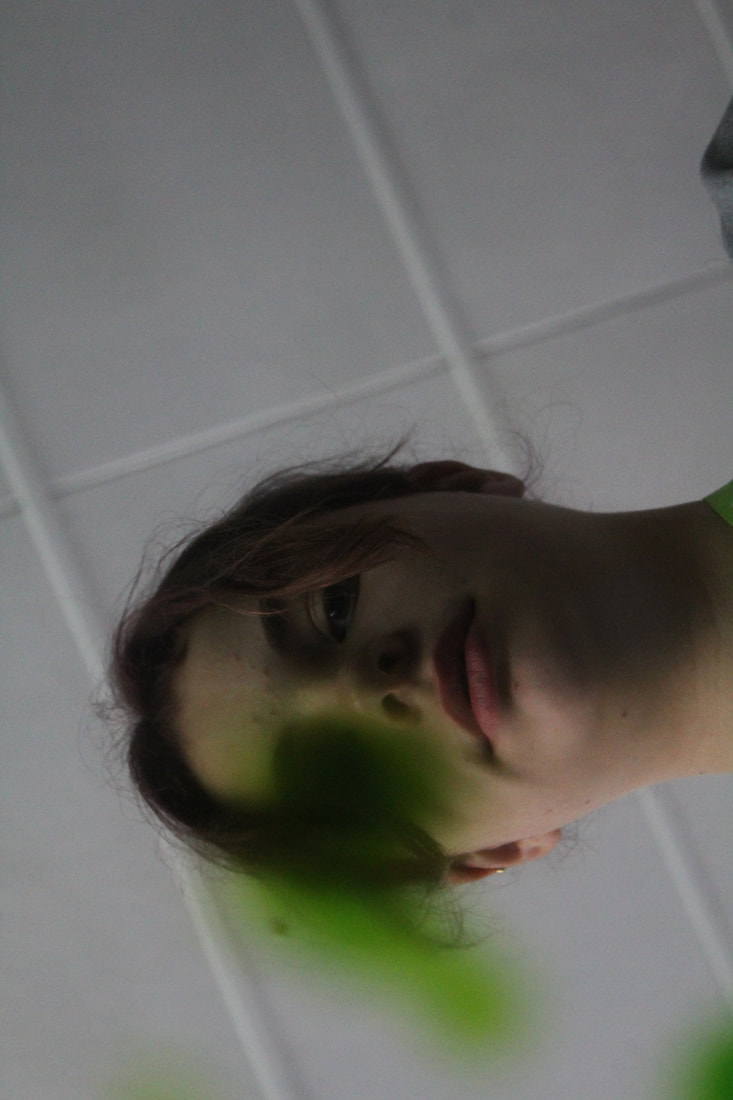
I like this photo because it is difficult to tell that it was taken using a mirror, and most people would assume it was taken from below. This gives the viewer something to consider about how the smudge over Sophie's eye was achieved, and the way that it seems perfectly fitted to her eye socket.
I like this photo as the marks on the mirror give it texture, which is enhance by the green splash of colour in the centre of the photo. The reflected marks also give a distorted and repetitive feel, which shows the almost ghostly silhouette of Sophie in the background seem slightly creepy and ominous, and this heavily contrasts the bright torch light reflected to the left of it.
My edited photos
I think my edited photos are very effective due to the use of the formal elements, specifically line, colour and geometric shapes. The parallel lines in the first photo give it direction and order, and in my second photo the way her head and neck are joined together in the middle in a sort of wave shape is interesting and unusual.
|
|
|
|
|
|
My editing method
Antonio Gutierrez
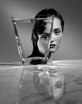
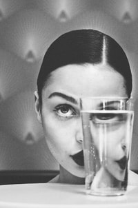
After my first response, I then looked at Antonio Gutierrez, a photographer who takes portraits which have been distorted due to reflections and refractions, specifically through the mediums of glass and water. The water in the glass creates the effect of an augmented version of the face which you'd expect to see in a generic portrait, by changing the proportions of the facial features. This enhances Gutierrez's intentions of an unexpectected and warped appearance of the human face. I believe this is effective as it allows the viewer to see an altered reality of what would be seen if the glass and water had not been incorporated into the image.
BE MORE SPECIFIC AS TO THE ACTUAL EFFECT OF THE GLASS AND WATER ON THE FACE. DO YOU LIKE THIS WORK AND IF SO, WHY OR WHY NOT. STRETCH - ANALYSE ONE OF THE PHOTOS BELOW AND WHAT YOU LIKE ABOUT IT.
|
|
This is my favourite piece of Gutierrez's reflection work as one side of the woman's face is almost completely obscured by the glass of water, and the side of her which is visible has been reflected inside the water. My favourite part of the image is where the two halves of the eyes appear to match up at the water's edge. I think this is effective as it gives a distorted, inhuman feel. The added use of contrast between the white table and pale background with the model's dark facial features give the photo a nice juxtaposition of tone.
|
EXCELLENT DEVELOPMENT OF YOUR FIRST SHOOT, INCLUDING YOUR EXPLANATION OF HOW YOU EDITED AND YOUR ANALYSIS OF YOUR IMAGES. KEEP GOING, CAL!
My Response
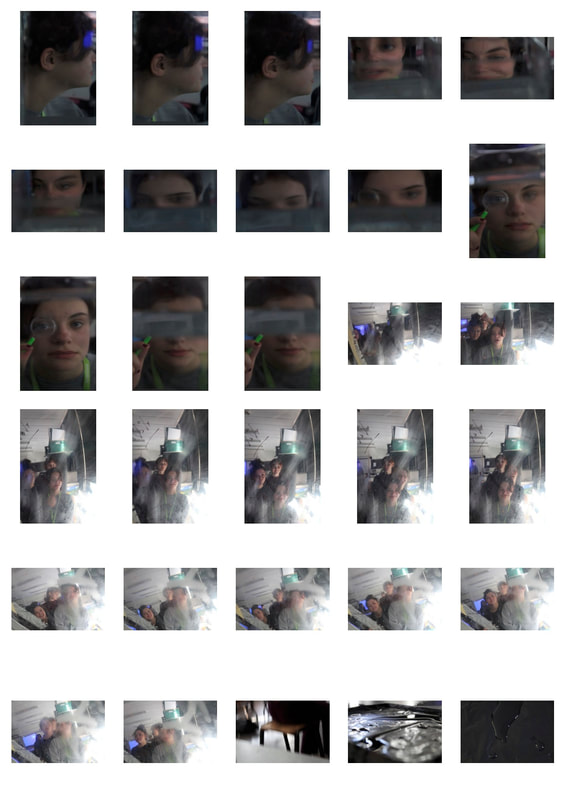
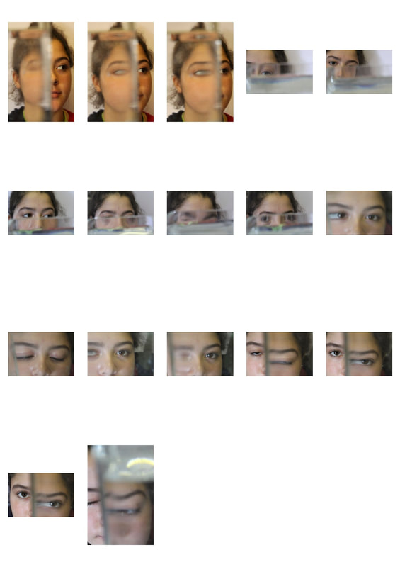
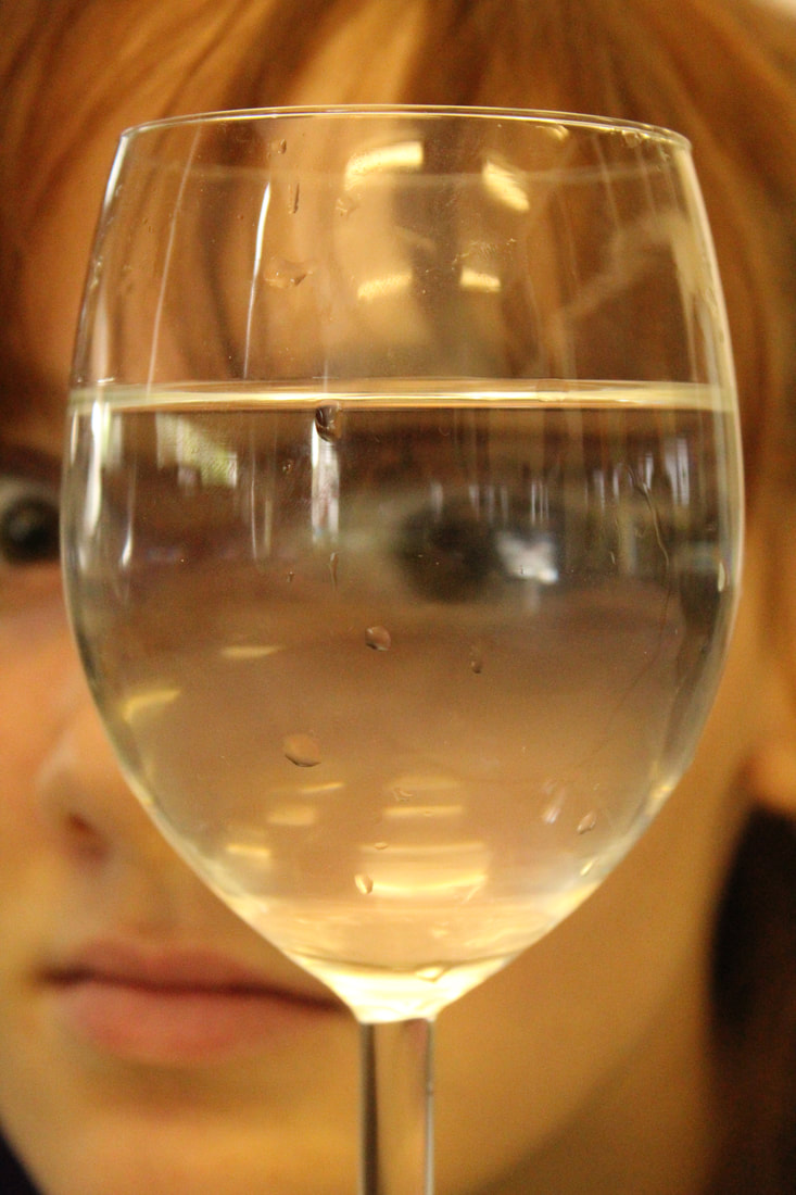
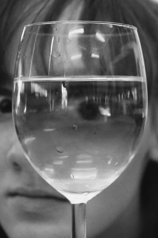
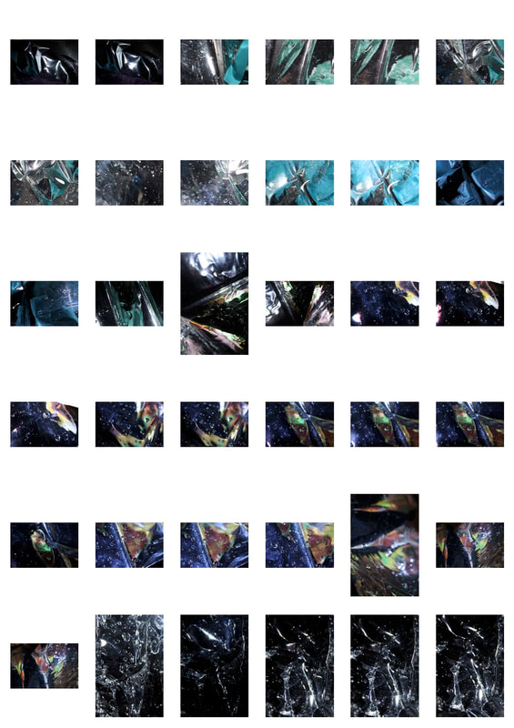
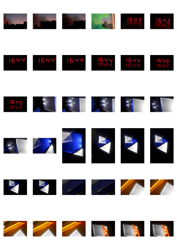
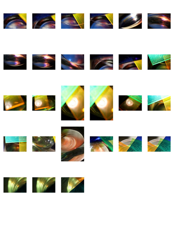
In my response to Gutierrez's work I aimed to improve on my first shoot and make the photos more refined, including less grain and better balance of the lighting. Inspired specifically by Gutierrez, I looked more at reflections through glasses of water and the interesting shapes created.
In some of these photos, I used a different light setting on the camera which gave the photos a warmer, more golden tone which reflected the colour of the ink which I put in the water.
In some of these photos, I used a different light setting on the camera which gave the photos a warmer, more golden tone which reflected the colour of the ink which I put in the water.
|
|
|
|
|
|
This is my favourite photo of this shoot, as I like how outside of the glass her face is defined by sharp lines and her facial features like her eye and eyebrows are dark and heavily contrast the watery effect created inside the glass. The way Ella's eye is distorted is also eerie-looking and adds to the overall strange effect of the photo. One part of the image that I particularly like is the reflection of Ella's eye and hair in the water at the top of the vase because it craetes an unexpected flipped version of reality in the water. It is less obvious in my black and white image, so to improve this I could have altered the contrast of just that section of the picture in Photoshop so that it stood out more. Using a lower ISO value could also have achieved a slightly sharper, less noisy photo with might have been more smooth looking and could have represented the true reflection created in the vase and water more accurately.
My editing method
ALWAYS CHECK YOUR FOCUS - FOCUS RING/STEADY HANDLING/LARGE ENOUGH APERTURE/HIGH ENOUGH SHUTTER SPEED.
INCLUDE WWW, EBI HERE
INCLUDE WWW, EBI HERE
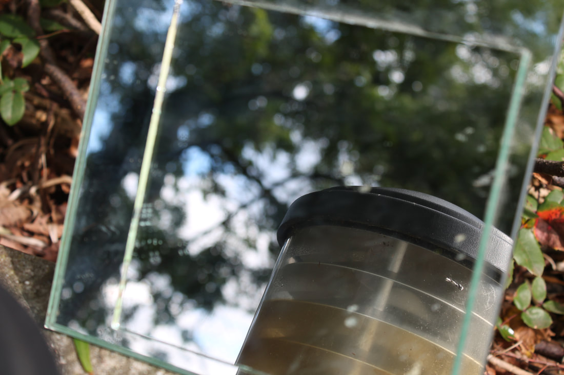
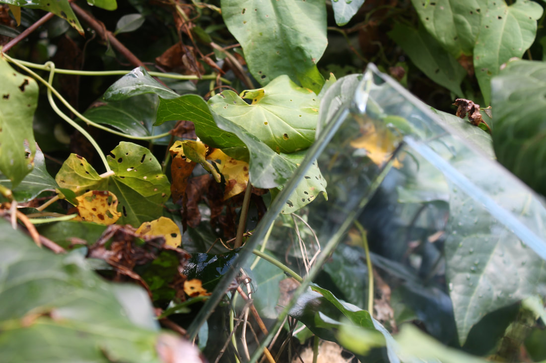
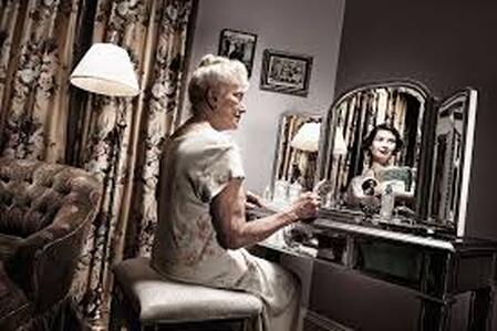
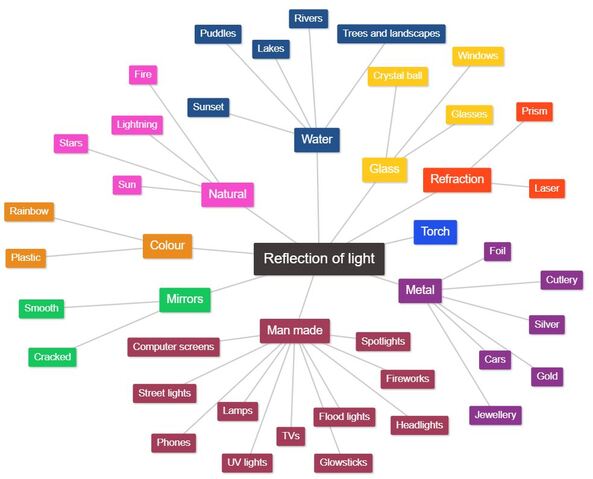
Reflection in Mirrors
Reflection in mirrors is one of the most typical ways to represent reflection in photography with everyday objects. It is diverse, and can be use with an infinite number of subjects. Various interesting shapes can also be created through the use of a shattered, scratched or warped mirror.
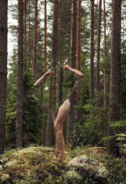
A mirror has been placed over a woman's body here so that her body and face are concealed, leaving only her limbs exposed. In the mirror, the forest is reflected, which gives the immediate impression that the body is not there, however when you look closer you realise the woman is holding the mirror and that she hasn't been edited.
|
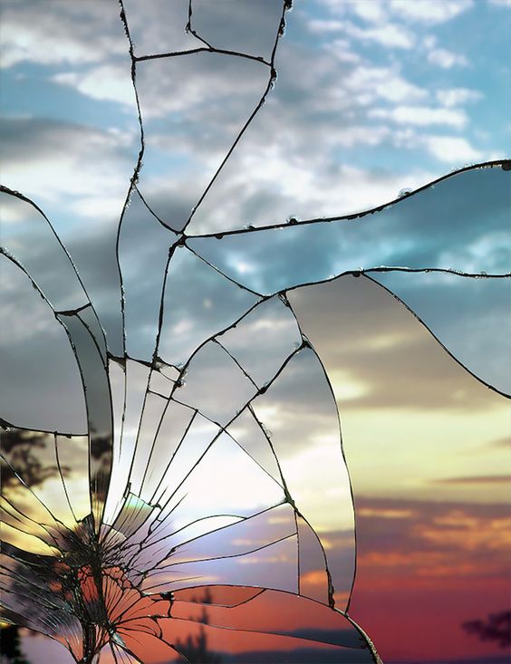
This shattered mirror reflects the scene of a sunset in an unnerving way, as it is a mask of the beauty which Is underneath. The colours are sectioned off by the large overall sections of the broken mirror, and give a faded feel to the photo.
|
|
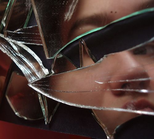
The cracked effect on the surface of this mirror distorts the subject's face and only shows a part of it. The photographer has considered the positioning of the subject and where they need to stand to get a result which shows only the features intended, and creates shapes and lines over the parts they want to conceal. |
Sebastian Magnani
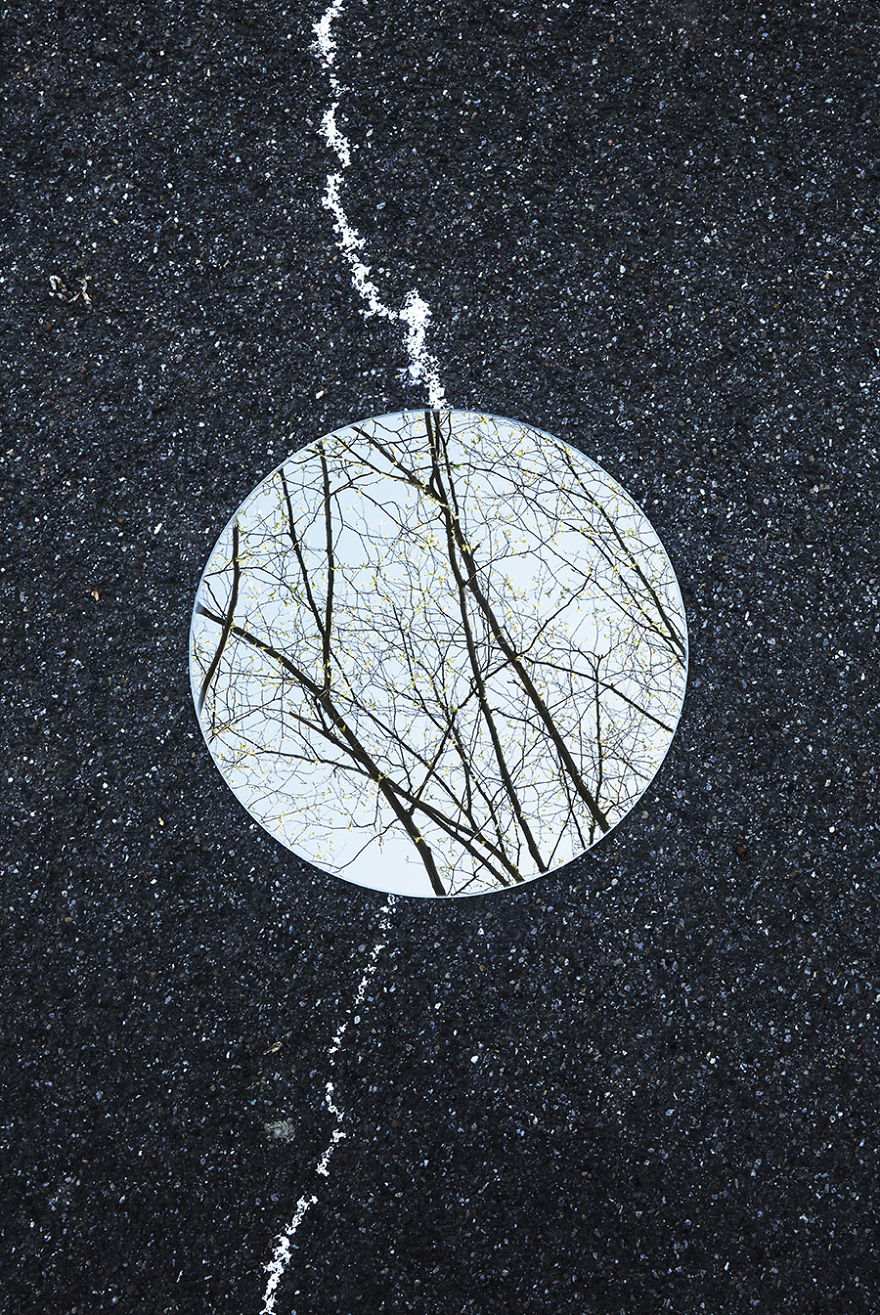
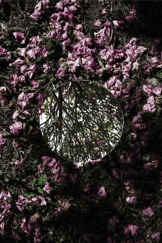
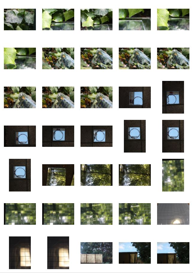
Sebastian Magnani is a photographer and media designer born and based in Switzerland. His work centered around reflections in nature is simplistic in appearance but skilful in the way the camera needs to be manipulated to achieve the desired outcome. He focuses on reflections of objects such as leaves, flowers, trees and the reflections of the sky in a round mirror which is central in the portrait-oriented photograph, but also maintains the focus of the background to give contrast and variation.
I like his use of the juxtaposition of the mirror on the ground which reflects what would be seen if you looked up, whilst only giving a small snapshot of it compared to the rest of the photo, which is sometimes of the same thing, eg. leaves from the same tree, and sometimes something completely different, like the sky or bare branches. His photos are also very regular, with the same orientation, size and shape of mirror, and position of the mirror in the photograph.
I like his use of the juxtaposition of the mirror on the ground which reflects what would be seen if you looked up, whilst only giving a small snapshot of it compared to the rest of the photo, which is sometimes of the same thing, eg. leaves from the same tree, and sometimes something completely different, like the sky or bare branches. His photos are also very regular, with the same orientation, size and shape of mirror, and position of the mirror in the photograph.
|
|
|
|
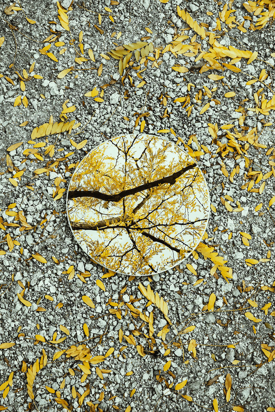
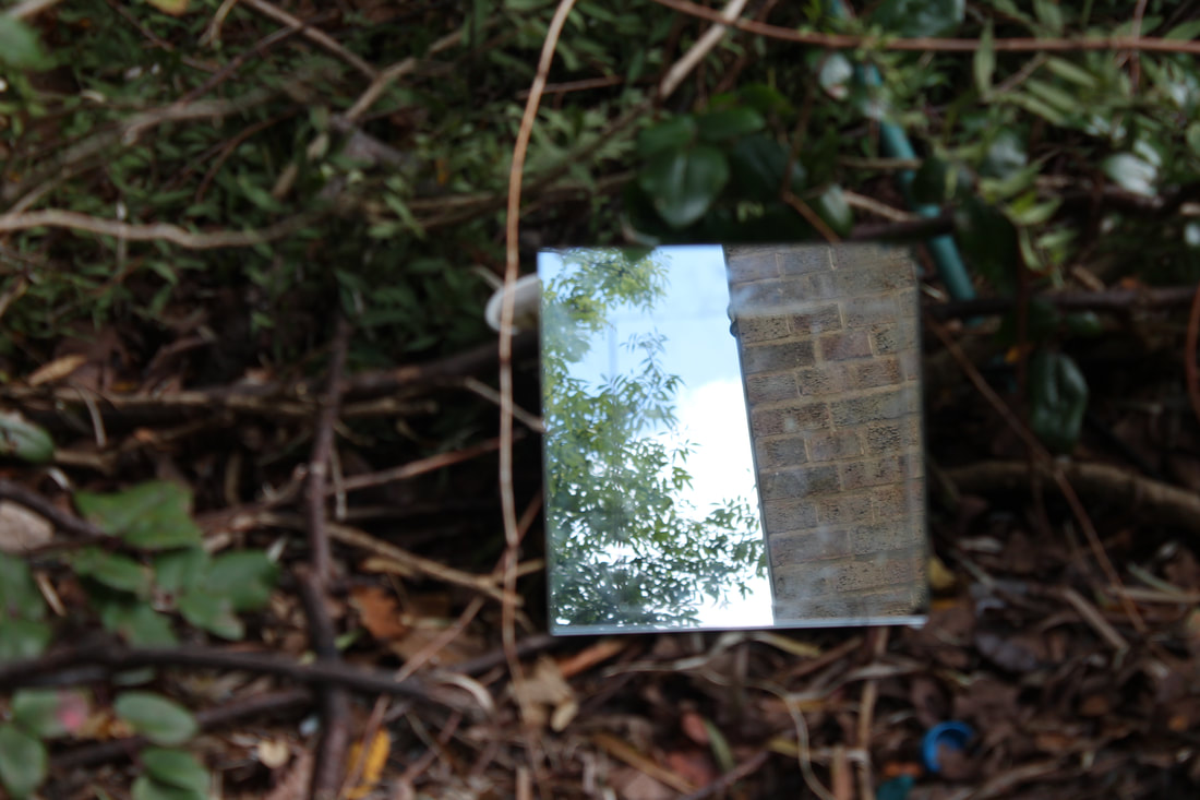
I particularly like this photo of his, as it captures the stark contrast between the human landscape and natural environment. Magnani has used the formal elements to make this photo effective, specifically shape, colour, and texture.
The round, smooth mirror depicts and glowing, bright natural world, however when placed on the dull ground it creates a surreal, almost magical effect as though you are more looking through the ground to a more exciting place. Magnani wants the viewer to consider the oxymoron of man made land which is often presented as making the world a better place, concealing the beauty and purity of nature when undisturbed. The shocking pink of the spiky leaves peaking out of the top of the mirror give brightness and texture, as well as the gravelly background which gives a grayscale tone as well as a realistic 3D effect to the image, which almost looks like it would be rough to the touch. I think the photo is effective at getting the viewer the consider the contrast between the natural and human world, and shows that nature holds a power which humans can't always compare to and can often ruin. |
|
EXCELLENT ANALYSIS OF MAGNANI'S WORK AND YOUR INSERTION OF CONTEXT. GOOD JOB!
My First Response
In my response, I took inspiration from Magnani's work and placed a mirror on the ground in an aim to capture what was on the other side of the camera which couldn't be seen. However, I altered the style and experimented more with different angles, shapes and perspectives. I changed the zoom and height the photo was taken from, which is less obvious in Magnani's work.
In this shoot I intended to show the wide range of difference between the often drab, boring ground and what is often overlooked when you look up. My use of the various mirrors shows this in different ways.
In this shoot I intended to show the wide range of difference between the often drab, boring ground and what is often overlooked when you look up. My use of the various mirrors shows this in different ways.
|
|
|
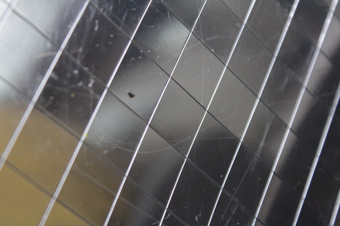
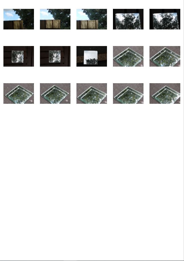
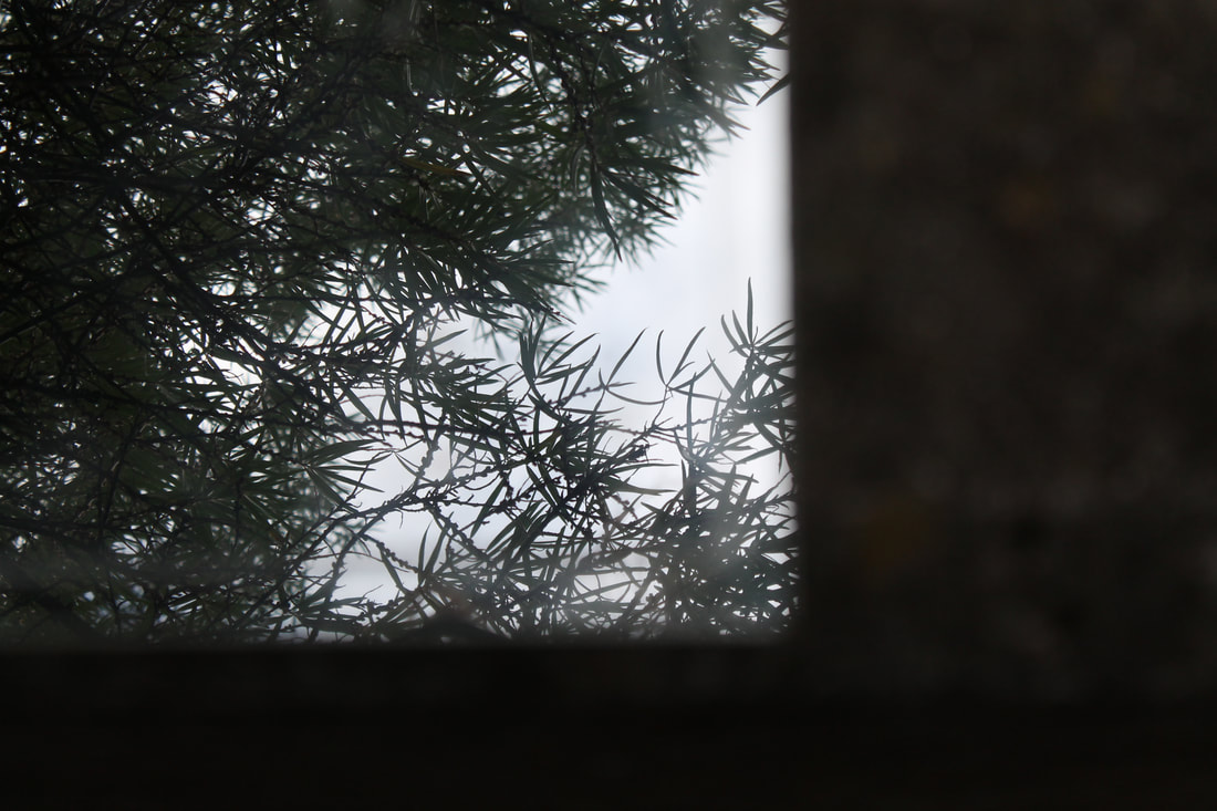
My favourite photos from this shoot were all quite varied, some focusing on the trees and sky which created a good contrast because of the clear skies, others focusing on the content inside the mirror, for example my first one where the background is eliminated and instead chooses to focus on the pattern of the squares on the mirror and the texture created by the scratches. I like my use of this pixelated mirror, as it gave a distorted effect and gave the photos line and shape.
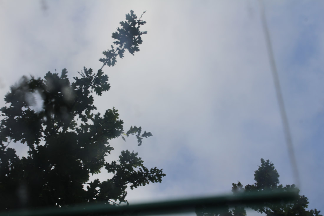
I like the difference between the pale blue skies and white watery clouds, with the deep green and sharp outlines of the leaves in this photo, however you can see that the mirror was not completely clean in the corner, which ruins the clear, smooth effect created by the rest of the photo. I should pay more attention to detail to improve my work a make sure my camera is well focused on the subject.
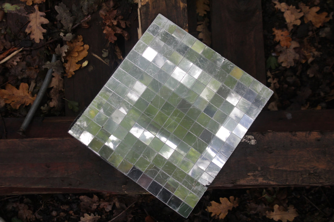
This is my favourite photo of mine from this shoot, as I like how the mirror is positioned centrally at an angle which juxtaposes the beams of wood which it rests on. The background is full of deep orange and brown tones, whereas the mirror in the foreground portrays bright green and white. There is also lots of texture in the photo, added by the scratches on the mirror and the leaves scattered at the back.
Overall in my first response to Magnani's work I think I have interesting shots from various angles and perspectives, but I should use a cleaner mirror and ensure my photos are always in focus to achieve the best possible photos.
My Second Response
In my second response I wanted to refine my photos, including making the focus better by increasing the aperture so more of the photo was in focus. I also experimented with different angles, including placing the mirror so that it wasn't necessarily flat on a surface. Overall, I was much more happy with this shoot, as the photos had greater contrast and had much sharper focus.
|
|
|
These are my favourite photos I captured during this shoot, as I believe they display my intentions of opposition and contrast between low and high in the best and clearest way. I also believe they are an improvement to my first response as they show more contextual background and heightened use of the formal elements.
I think this is my best photo from this shoot as the mirror in the corner gives an optical illusion effect, as at first it almost appears like a sheet of see through glass or a prism, however after studying the photo for a little longer you can see that it is a mirror. I like the sharp background and more watery look of the reflective mirror, giving a contrast, which is enhanced by the deep dark greens and browns of the leaves.
I improved the focus from my first development and also which makes these developments better, however I should try and vary my subjects more.
CONTINUE TO USE A VARIETY OF APERTURES AND SHUTTER SPEEDS, IN ORDER TO GET THE RIGHT DEPTH OF FIELD AND LIGHT BALANCE. TAKE 5 SHOTS FROM EXACTLY THE SAME LOCATION BUT CHANGE THE APERTURE AND SEE WHAT EFFECTS YOU GET.
Reflection of Colour
Colour can be reflected in various mediums, such as mirrors, glass or water, as well as in the environment. Creations can also be made physically and then photographed creating various forms of colour which are reflections of each other.
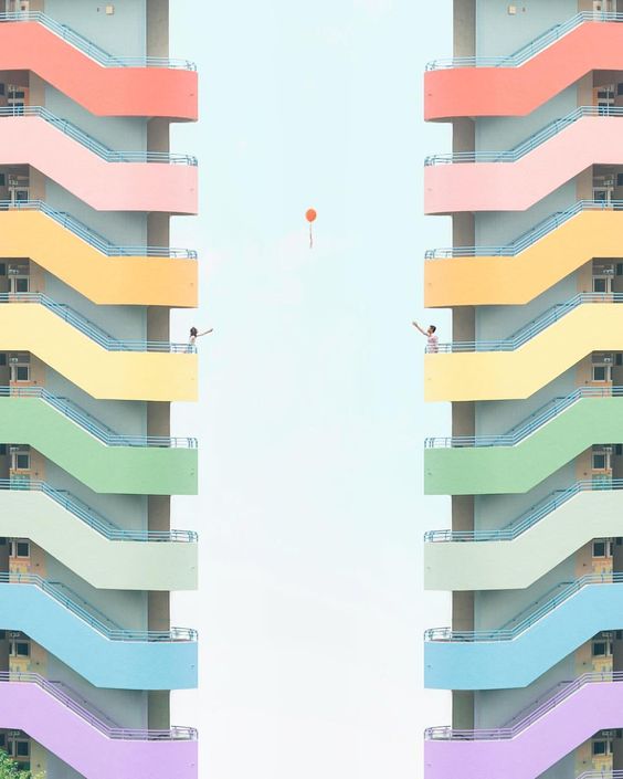
Minimalist architecture has been used here to create a touching photo of two people with their arms outstretched to a balloon which floats in the centre. The white negative space contrasts the focus on the two buildings, which are identical and stand opposite each other. In this way the colour is reflected in the physical environment.
|
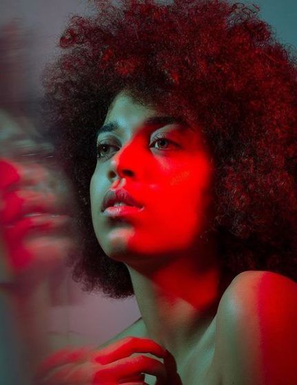
The red light landing on the woman's side profile sections the two halves of her face, and the added colour reflection in the glass creates a duality effect of red and blue.
|
In this photo the idea of geometric shapes is used to reflect multiple different colours. in the water, tiles and polished wood. It gives an abstract effect on something which is clearly real, and this is very effective.
|
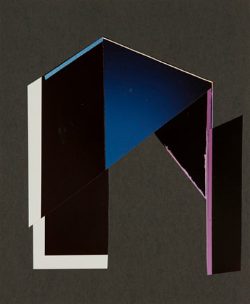
Tamara Lorenz
Tamara Lorenz is an artist and photographer born and working in Germany. She creates constructions out of objects such as paper and card, which she photographs to achieve a three-dimensional appearance of a flat plane of bold colours and angular shapes. She considers the formal elements of colour, tone and shape carefully when she is making her models, which provides contrast to the images she takes. She achieves a notion of abstraction, which intrigues the viewer and makes them think about what idea she wanted to convey through the generally simple forms shown in the photograph. She wants us to consider our depth perception, as often her images are on something completely 2D but she can achieve the illusion of them having depth by the shades and angles she creates.
|
|
|
|
I find this image of her's particularly intriguing due to her use of the dull grey background which is enhanced by the pop of bright colours in the centre. The lines used direct the viewers eyes to the focus of the image, which acts as a zoomed in effect of the yellow and blue merging to create the dark green. The varying tones of the yellow and blue are effective as they give shade and tone to the image, making the viewer perceive the direction of the lighting differently. The black lines aim to create triangular shapes within the image, as well as the optical illusion of a cuboid form, with the green and blue rectangles acting as the front and back dissections.
I will use Lorenz's experimentation with colour to influence my photos and achieve brightness, tone and contrast. |
|
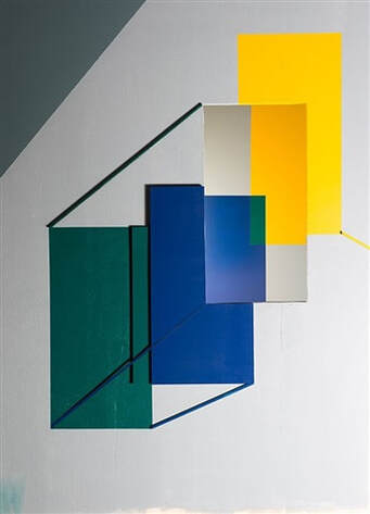
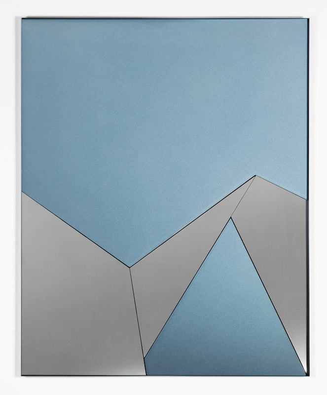
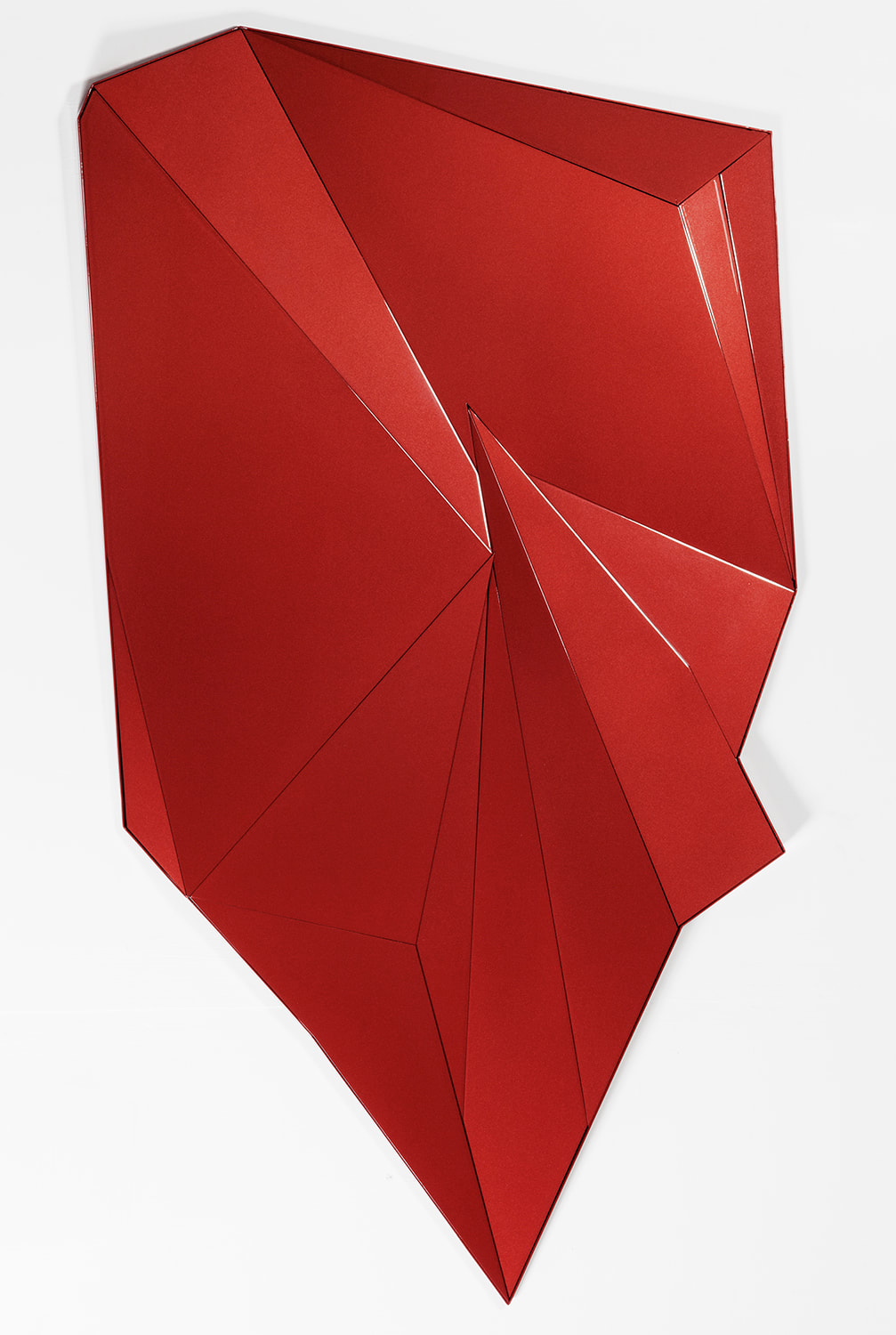
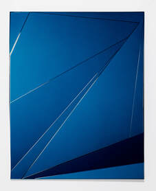
Theo Simpson
Simpson uses sheets of stainless steel and aluminium to create his physical prints. He uses a laser cutter to get clean lines to create angular shapes and contrasting colours. He experiments with parallel lines and regular shapes such as rectangles, squares and triangles, as well as irregular polygons.
|
|
|
|
In this print, Simpson decided not to limit his external shape to a rectangle as many of his other works. He achieves an abstract, three-dimensional appearing creation through the tones of vivid red enamel paint which he incorporates as well as the multiple triangles and quadrilaterals which he combines, interlocking and giving a broken mirror effect. The outcome is a print that could almost be interpreted as some scrunched up paper, or smashed glass. The viewers eyes perceive the image as three dimensional even though it's flat against a wall.
I will use Simpson's technique in my images to make sure I achieve clean, sharp lines and angular shapes, as well as apparent depth. |
|
Comparatively, Lorenz and Simpson's works are quite different in the techniques used, as Lorenz often creates her sculptures out of paper, whereas Simpson prints colour onto sheets of metal. I prefer Lorenz's work as her designs give the eye many more elements to decifer, and the textures, tones and contrasts she captures are more defined and intriguing. Simpson's work appears more basic to eye, and has fewer elements to the final image.
|
Tamara Lorenz
|
Theo Simpson
|
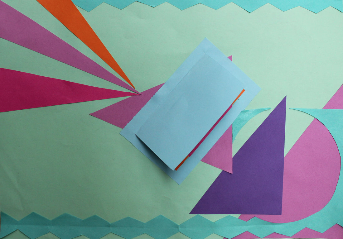
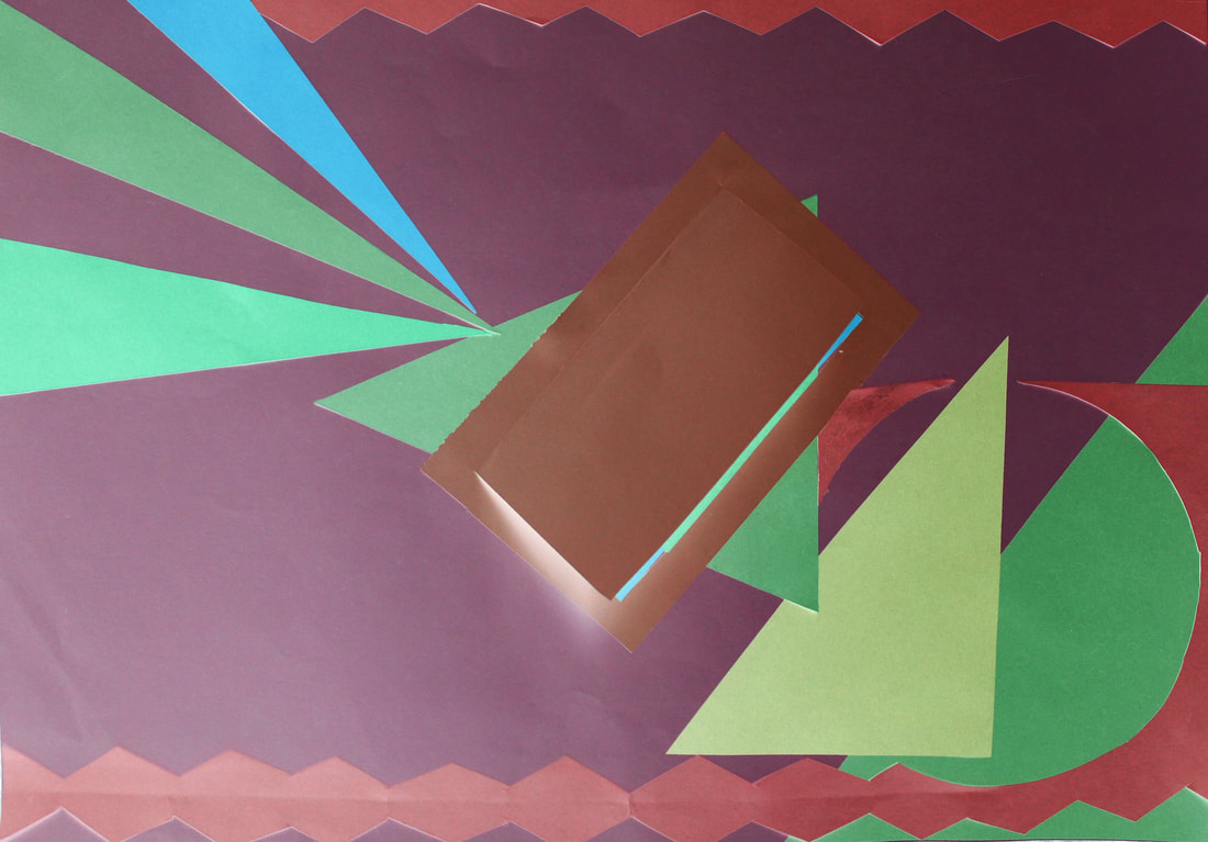
My Response
In my response, I cut out paper into shapes and created a collage to represent the reflection of the colour. By inverting the colours in my edited version, it gave the impression that the colours from my original creation had been completely changed, when really it was all an illusion.
I used colours that when reflected are opposites of each other, which gives a more exciting view of the image created when they are placed side by side. to make these photos better I should take care of shadows varying across the image, and make sure that the photo is straightened.
I used colours that when reflected are opposites of each other, which gives a more exciting view of the image created when they are placed side by side. to make these photos better I should take care of shadows varying across the image, and make sure that the photo is straightened.
|
|
My editing method
FANTASTIC ARTIST RESEARCH SECTION WITH COMPARISON OF ARTISTS! BUT...WHERE IS YOUR EXAMPLE OF YOUR PAPER CUT-OUTS? PLEASE UPLOAD AND EDIT THIS ASAP.
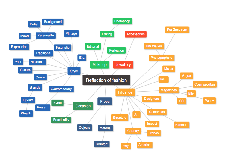
Three Strands of Reflection
Reflection of Self
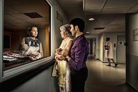
Tom Hussey
Tom Hussey is an American photographer who focuses on lifestyle photography. In his reflection project, he captures the reflection of someone's younger self, to give the effect of reflection on the past. I like his photography as he establishes the mood of the scene in which the photo is taking place through the expressions and emotions on the subjects' faces. He also uses costume and setting effectively to transport the viewer back in time and show the personality of the model.
|
|
This is one of my favourite photos by Tom Hussey, as it is something that many people will be able to relate to, making it almost universal. The clever composition of the mother staring back at her past self holding her child just moments after it was born, including the now grown up son standing by her side now that they are both older, evokes an emotional feeling of ageing but also youth and the beauty of development and motherhood. Hussey aims to show the unending connection between and mother and her child, and the unconditional love which can be reminisced on and the memories which are created between the two of them.
My Response
In this task, I wanted to capture a reflection inspired by Halloween of someone doing something arbitrary like looking in the mirror, however in the reflection have something creepy or unsettling. I took two photos of the subject in the exact same place, however in one of the photos Daphne wore a mask and looked directly at the camera. When editing my photos together, I simply had to place the photo without the mask in the mirror underneath the other, and erase the mirror so that the reflection showed through.
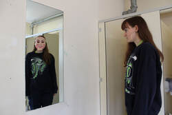
I think I achieved my intentions well with this photo, as my photo is effective and sharply edited. It creates an uncomfortable, haunting mood, with an otherwise fairly dull setting and situation. To improve this, I could have used a more interesting subject and background, make it less obvious she is wearing a mask. In Hussey's photos, he usually has the subjects looking back at themselves giving an idea of reflection of the past. I could have taken a photo where Daphne looked at herself in the mirror when wearing the mask, which could have given a different tone to the photo.
My editing method
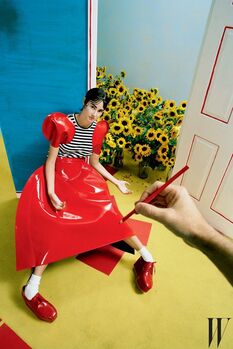
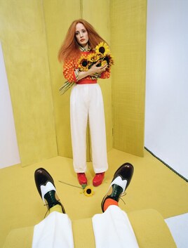
Reflection of Fashion
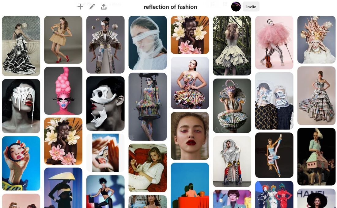
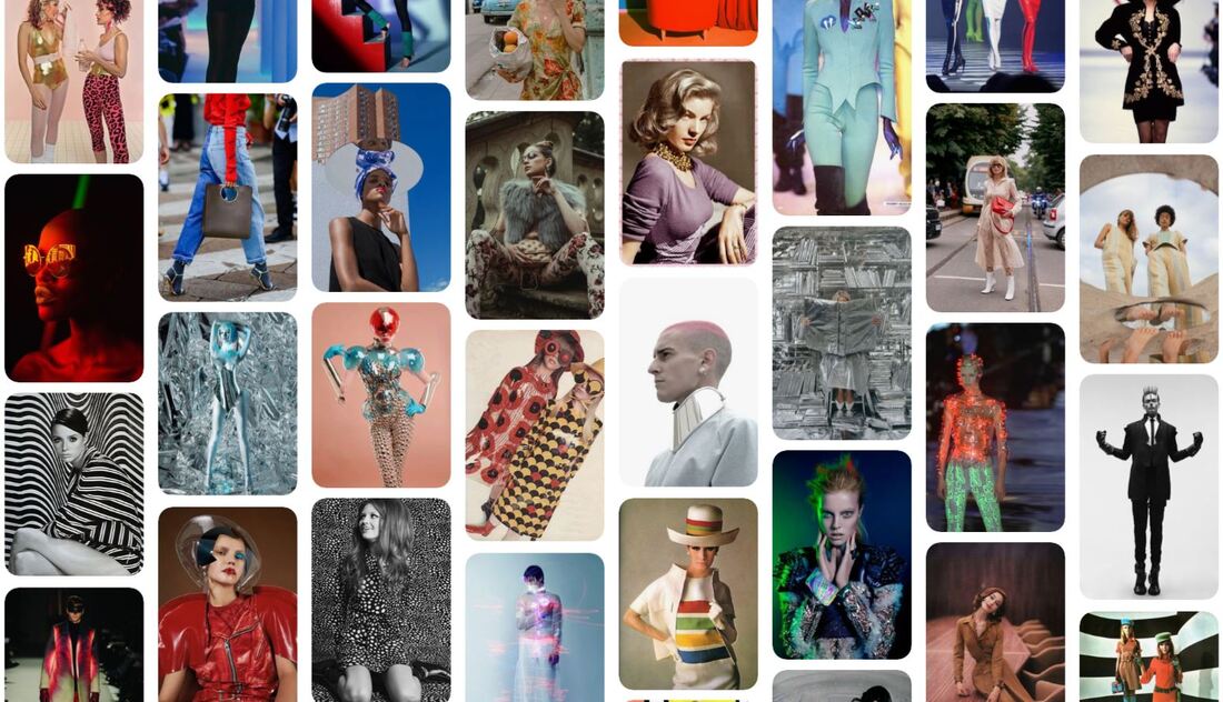
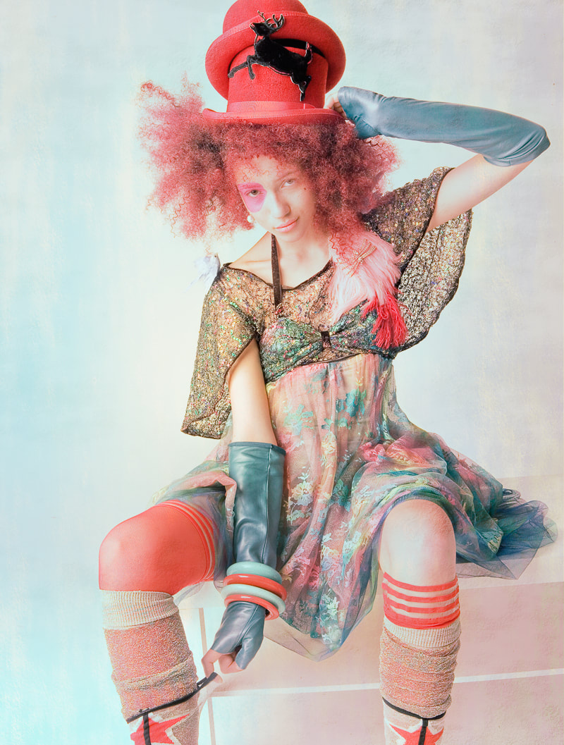
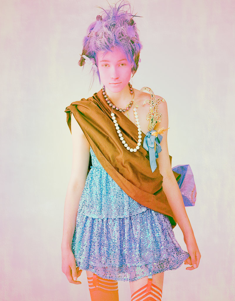
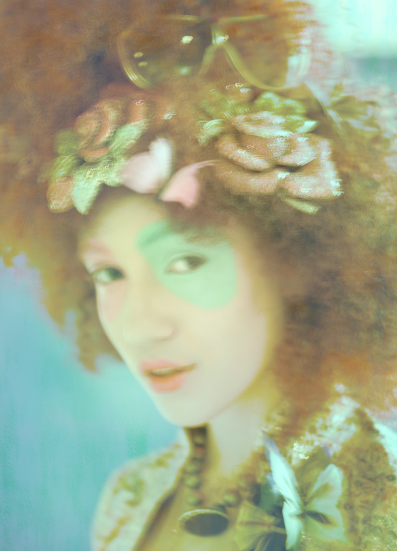
Per Zenstromm
Per Zenstromm is a fashion photographer and filmmaker based both in Berlin and Stockholm. He often focuses on editorial fashion photography, which is a creative, experimental way to stylise clothing and photographs, often used in magazines. In his 'Moon' project, he creates his own magazine project, using numerous different models who each express their own style through their clothing choices. Zenstromm writes: "I believe that a photographer today needs to do a lot more than just taking pictures and then call it a day. Today we can self publish our work and laser target our audience."
I like the photos from this shoot because of the self expression which can be captured through simply the looks of a face and the fashion accessories.
I like the photos from this shoot because of the self expression which can be captured through simply the looks of a face and the fashion accessories.
|
|
|
This photo is my favourite as it is quite different to a conventional fashion editorial photo. It is not perfectly focused and there is a little contrast and shadow, however there is still and feel of depth created by the blue background and the model's pale face. The use of editing is also effectively used in this photo to give a smoothed, dazzling effect. A haze is created through the use of a filter and the glitter on the accessories has been enhanced to give texture. Make up is also used with the blue and pink circles around the model's eyes, which accentuate the other blue and pink sections of the photo and give the photo the formal element of shapes. |
|
MORE DESCRIPTION AND ANALYSIS PLEASE.
ALSO INCLUDE THE VISIT TO TIM WALKER HERE, AS WELL. DID YOU GET INSPIRATION FROM THAT EXHIBITION?
ALSO INCLUDE THE VISIT TO TIM WALKER HERE, AS WELL. DID YOU GET INSPIRATION FROM THAT EXHIBITION?
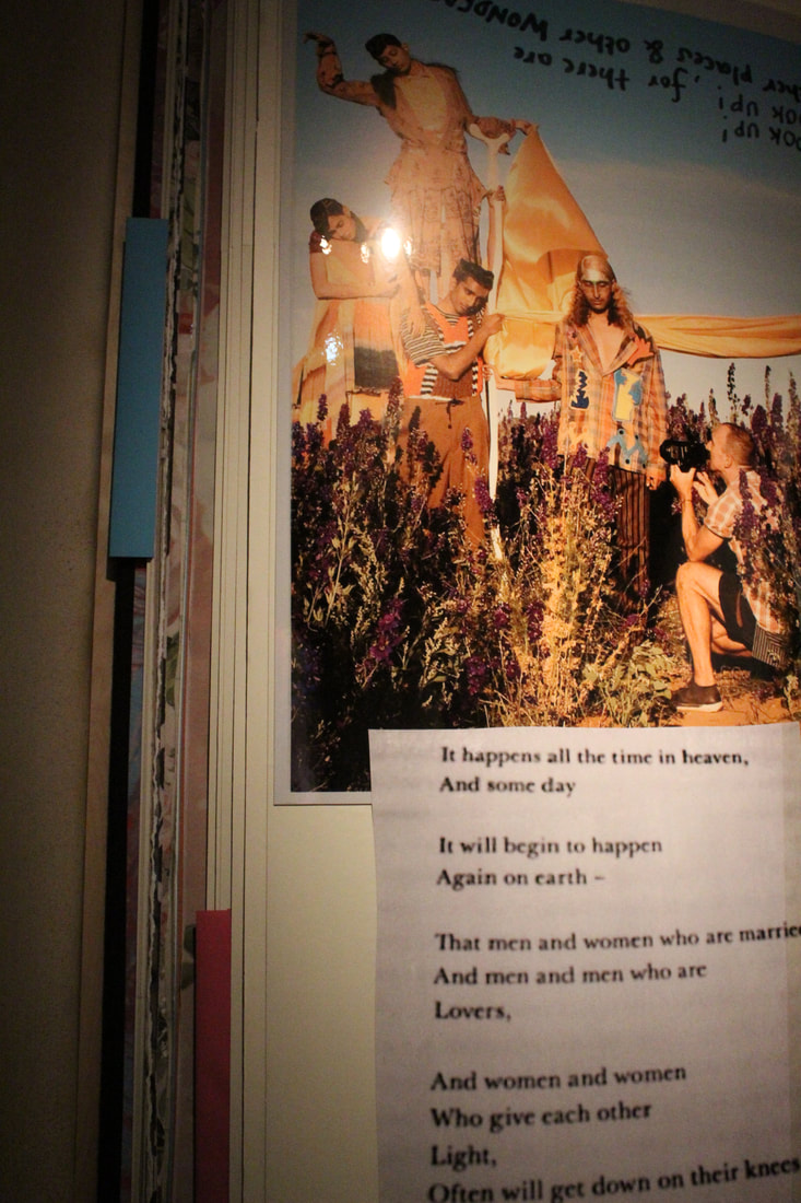
Tim Walker
Tim Walker is a well respected British fashion photographer, who often works for magazines like Vogue, W, and Love. He experiments with flamboyant costumes, large sets and strong characterisation. The celebrities he shoots often adopt a persona which is not totally representative of themself, allowing them to create a character which is completely their own.
|
|
|
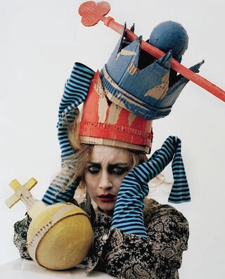
I took a lot of inspiration from this photo by Tim walker as it conveys a distinct character through the facial expressions, props and costume. I like the physical contrast between the idea of royalty and riches the are often created when you see a crown and sceptre, and yet the props are made of cardboard and are clumsily painted which shows a distinct contrast between expectation and reality.
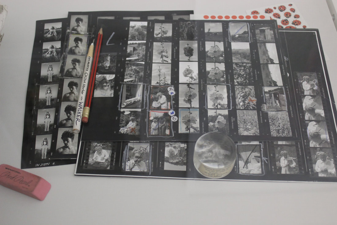
'Wonderful Things' at the V&A
For my research into my reflection of fashion strand, I went to the V&A Museum to the exhibition 'Wonderful Things' by Tim Walker. I really enjoyed it because it was as if you were walking through his entire thought process, curation and execution of his ideas and photography. In the exhibition, Walker took inspiration from specific areas and items which were on display in the V&A Museum and created photography project based around these items. The photos told clear stories and had lots of historical and contextual background, however Walker managed to show his own original ideas side by side, which I found to be really inspiring.
|
In the first room, 100 photographs from various different projects show viewers the surreal inventiveness which Walker is known for. It also showed the viewer his thought process and planning of his shoots, including the contact sheets created of his thematic photoshoots. |
|
|
There were many collections of original film photos and items which Walker took inspiration from on show beside the main photos displayed on the walls. I thought these were very interesting as it shows who Walker is influenced by, giving me an extra strand of inspiration. |
|
One of my favourite parts of the exhibition was the giant scrapbook pages which covered the walls near the end of the exhibition, which shows inspiration to Walker's shoots, behind the scenes photos, drawings and sketches of ideas. |
|
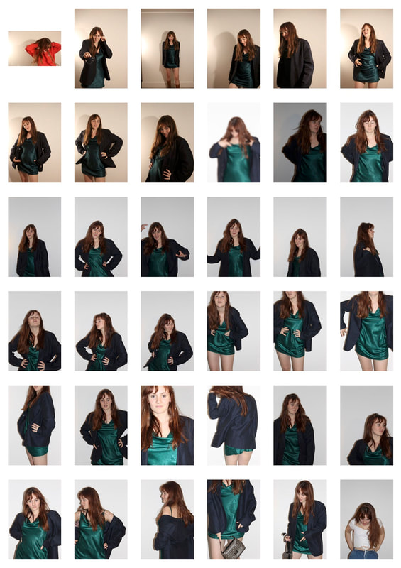
My Response
For my photos of reflection of fashion, I took a more literal approach and focused on the shadows created by the model's body on the plain white wall as a reflection of her. Daphne displayed her different moods and emotions through each of the outfits.
|
|
|
|
|
|
|
|
|
This is my favourite photo from this shoot as the shadow have been filled in with the bright yellow which contrasts the deep blue and green of the dress and jacket. I also think the outlining in this photo is the best out of all three of my images. The strong formal element of lines are presented by this style of outlining which gives the photo good direction and motion.
|
|
My editing method
My favourite elements of this development are the effective outline of the shape of the shadow. In my further responses I could use more quirky outfits and different camera angles to improve.
My Second Response
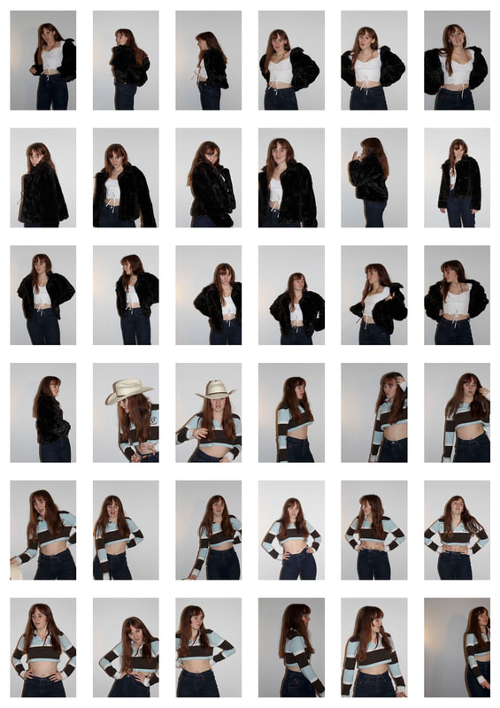
In my further developments, I took more influence from Zenstromm and Walker's work. I attempted to make the outfits look like they each belonged to a specific theme and developed characters of sorts for each persona adopted by Daphne and Eva.
My original plan was to make a type of standing doll out of my figures and use this as my final piece, however I then had the idea of combing together my fashion and light reflection photos, which gave a much better outcome.
My original plan was to make a type of standing doll out of my figures and use this as my final piece, however I then had the idea of combing together my fashion and light reflection photos, which gave a much better outcome.
Oriental
I took inspiration from Asian influences in this costume, including the traditional kimono and rice hat.
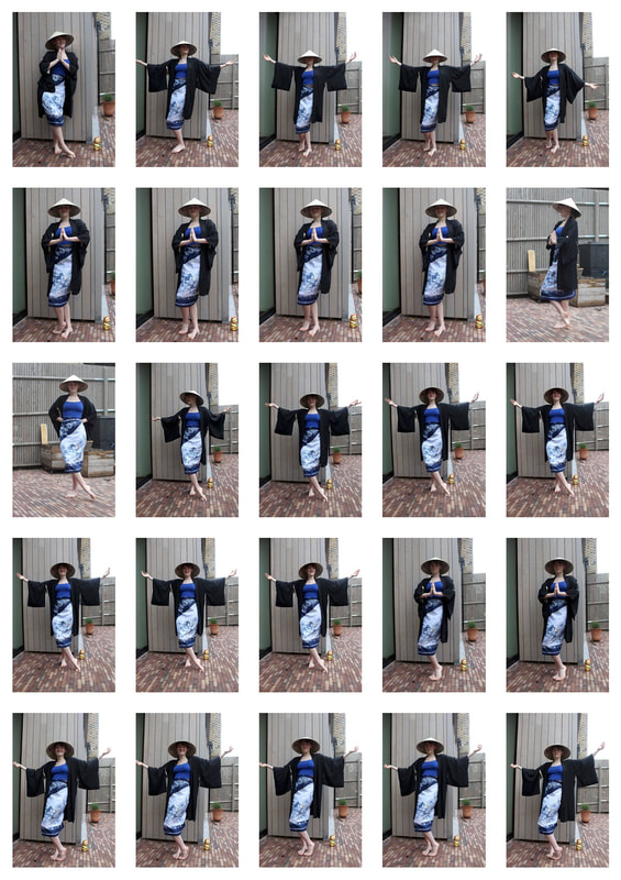
|
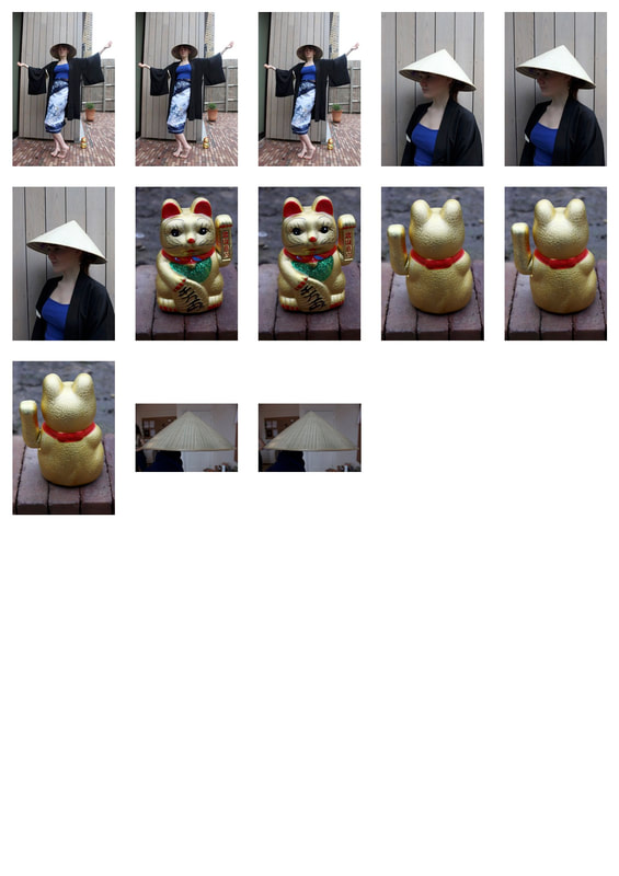
|
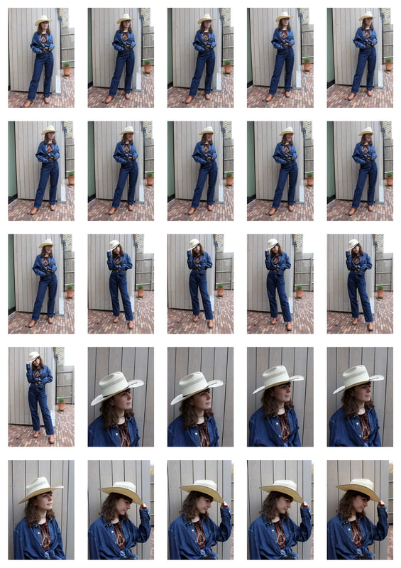
Cowboy
The style was based around the 'cowboy' look of the southern United States and from Western movies.
|
|
Animal Print
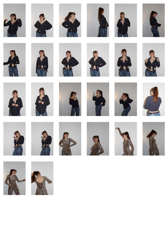
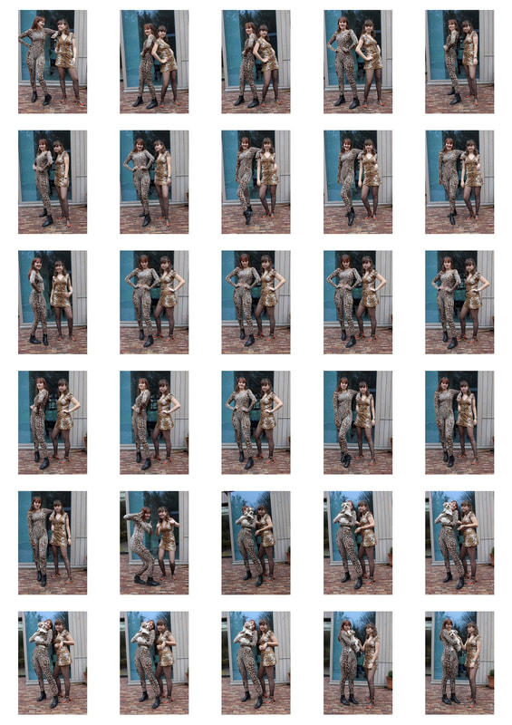
Eva and Daphne posed in animal print outfits, and these turned out as some of my favourite photos. By adding Daphne's dog to the photos it gave a wide range and variation to the photos which isn't seen in my first two styles.
|
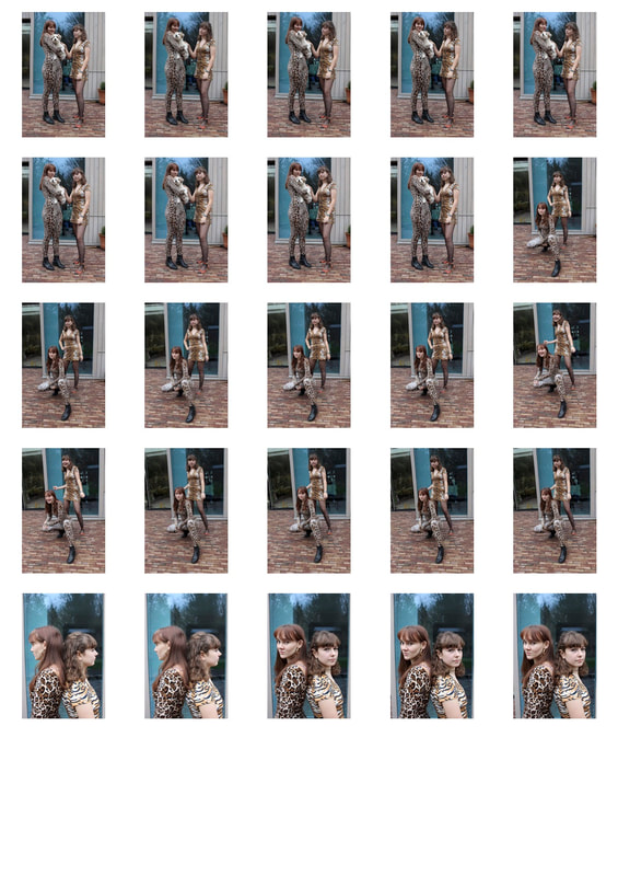
|
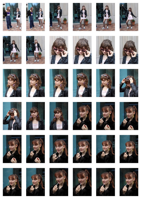
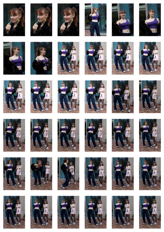
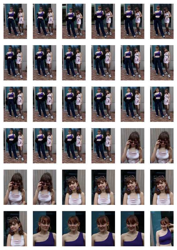
80s and 90s
Personally, I take much of my own style influence from the eras of the eighties and nineties, so these photos were some of my favourites to shoot, and I think they turned out the best.
|
|
|
|
I created two different edits of my favourite photos from this part of the shoot. My favourite is the hand mirror as the plain white background with a slide fade to the top corner accentuates the shadow giving contrast, and it sits at a good angle to create a range of shapes. I want to show the physical reflection in the two halves of the mirror, however I also took inspiration from my Reflection of Self strand to get the model looking directly at the camera, rather than at themselves in the mirror. This gives an unsettling feel and draws away from the world of the person in the photo as they look at the viewer, making it more personal.
|
|
In this photo, I wanted to show the reflection in a mirror, however the reflection created is clearly impossible. The repeated face effect gives a supernatural tone, and the angle the mirror is shot at, with a face on perspective, further emphasises the impossibility of the photo. I think this detaches the viewer from reality and makes them think more about the expression in the image. The hint at fashion in this photo is quite subtle, which I would have tried to make more obvious if I did this project again. My editing is also not always accurate as the hair was difficult to cut around in Photoshop.
Matching outfits
I liked the idea of having two models wearing similar outfits with slightly different twists to each, so I decided to improvise two styles whose basic elements were the same.
|
|
I made some physical prototypes made of cardboard to show how I wanted my idea to turn out. It proved to be quite difficult and when I came up with the idea to combine my two strands together I found this turned out much more effectively than this idea would have.
Reflection of Light
Mark Broyer
|
|
|
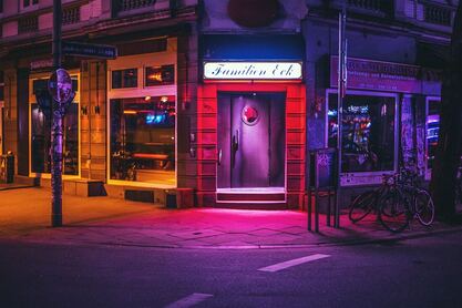
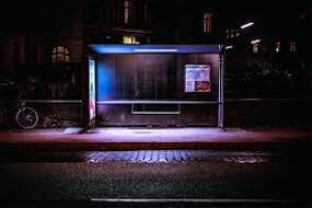
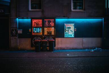
Mark Broyer was born in 1979 and works in Germany as an art director and photographer, specifically based in Hamburg. His photography project 'After Hours' is centred around the illuminations in the city at night, and aims to highlight the beauty in the ordinary. Broyer uses a small aperture, resulting in a large depth of field to ensure everything in his image is in focus, which at first appears to give the image no specific direction of where the viewer should focus on. The point of interest for the viewer is instead highlighted by the vivid colours and neon lights which are accentuated by the generally ordinary surroundings.
In this photo, Broyer uses the formal element of lines to give the photo a sense of direction and order. The curb, the wall and the windows are all framed to be perfectly parallel, and the perpendicular lines coming down created by the displays are effective in giving the photo its sense of uniformity, which is then contrasted by the blue and orange lighting merging together in the centre. The grime on the wall and the texture of the road give the photo tone and a sense of true representation of the city, which is not always bright and cheerful like the lights may suggest, which is something that I like about this photo. Broyer has also used the contrast between shadows and highlights to reflect the contradiction shown by cities which appear so radiant but also have a hidden darkness within them.
CONTINUE YOUR ANALYSIS AND SELECT A SPECIFIC IMAGE TO ANNOTATE.
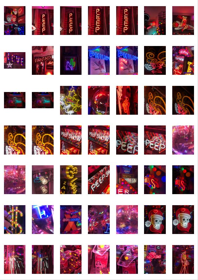
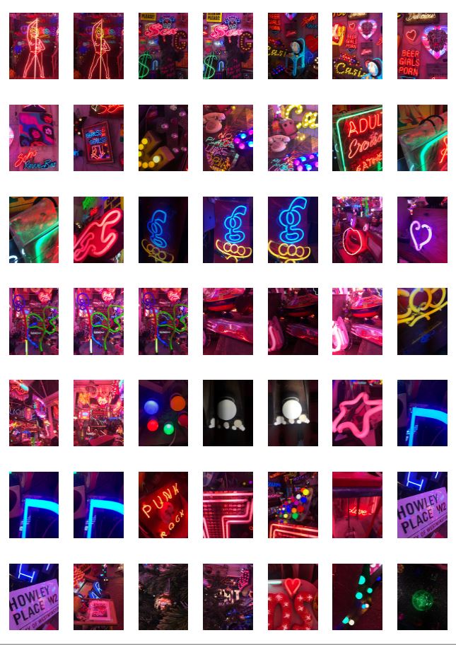
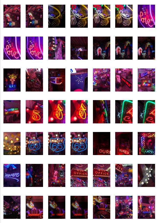
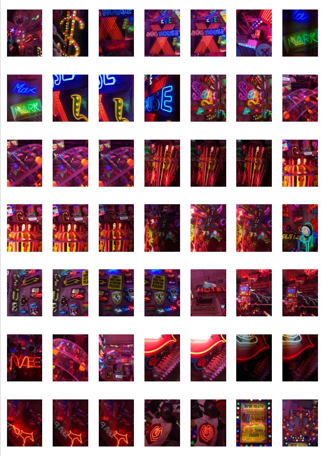
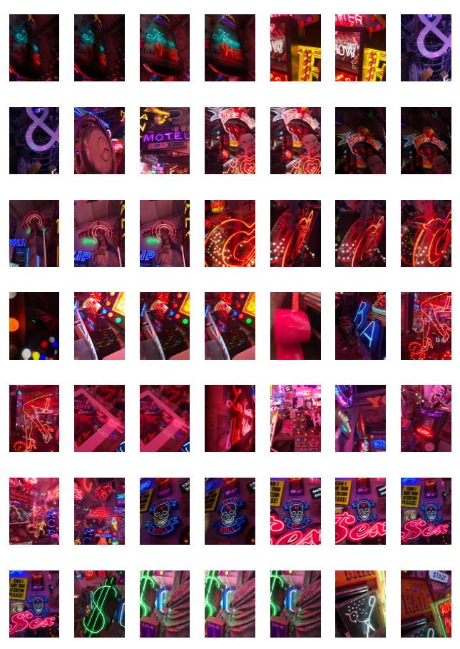
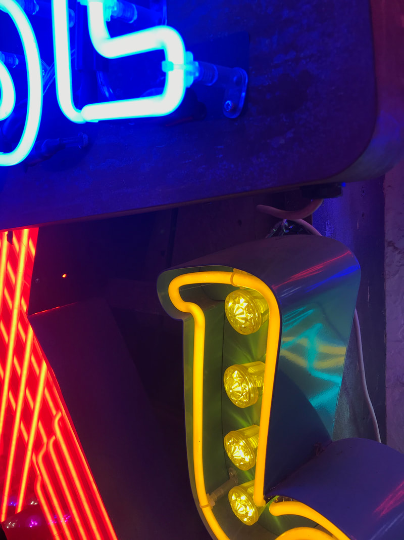
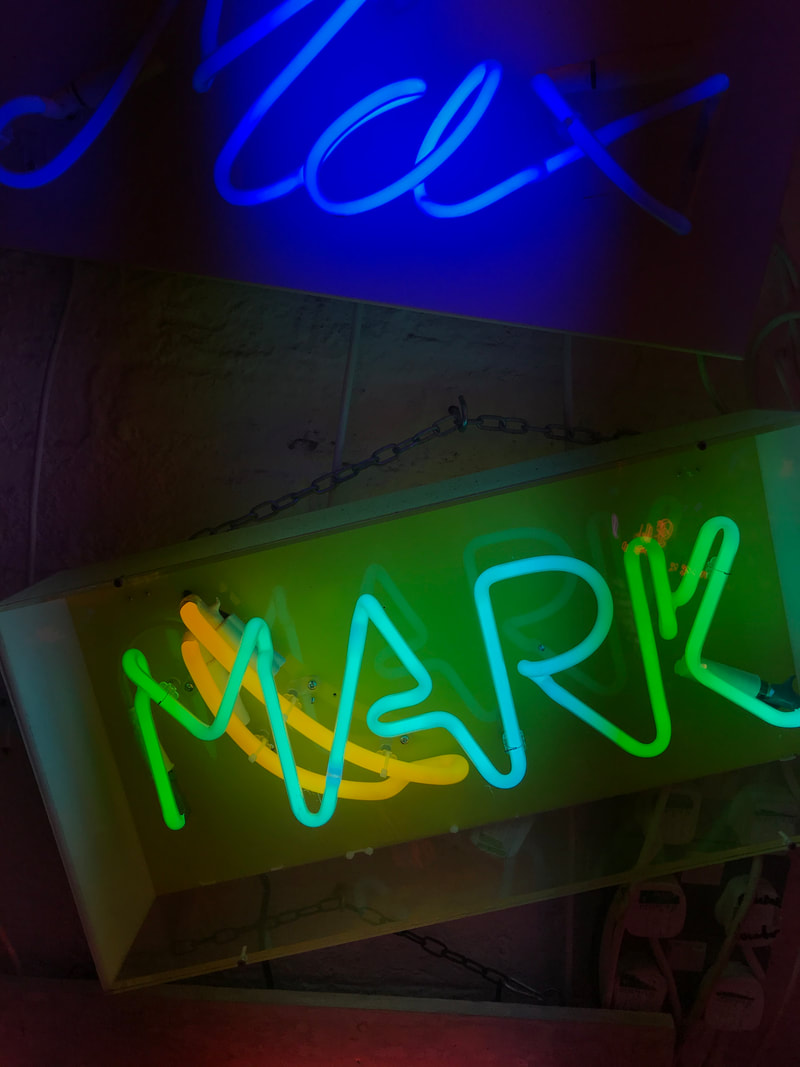
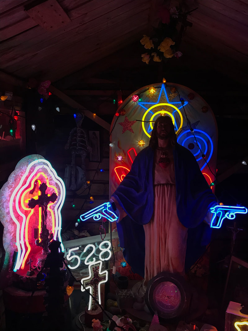
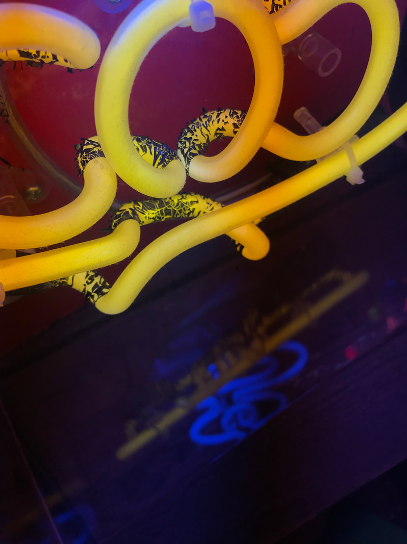
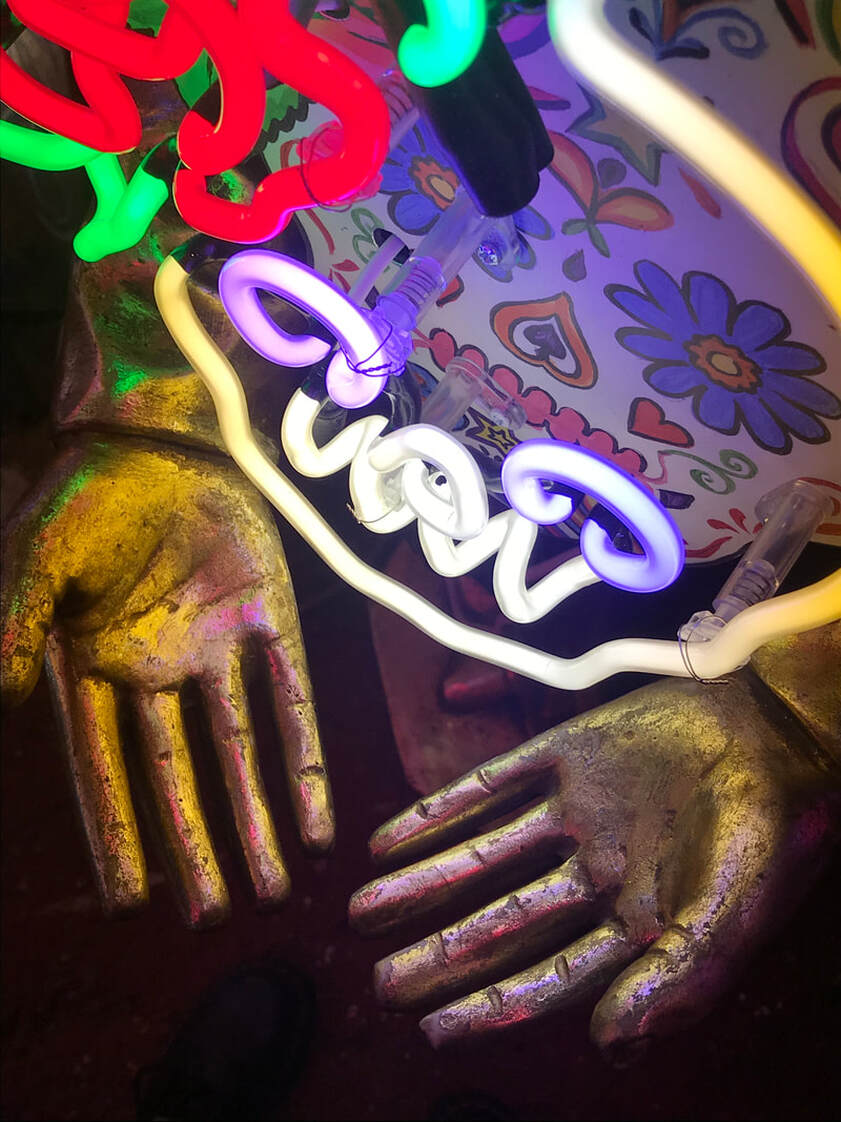
GO TO GOD'S OWN JUNKYARD IN WALTHAMSTOW TO DO A SHOOT WITH LOTS OF NEON LIGHTS.
GO TO GOD'S OWN JUNKYARD IN WALTHAMSTOW TO DO A SHOOT WITH LOTS OF NEON LIGHTS.
My Response
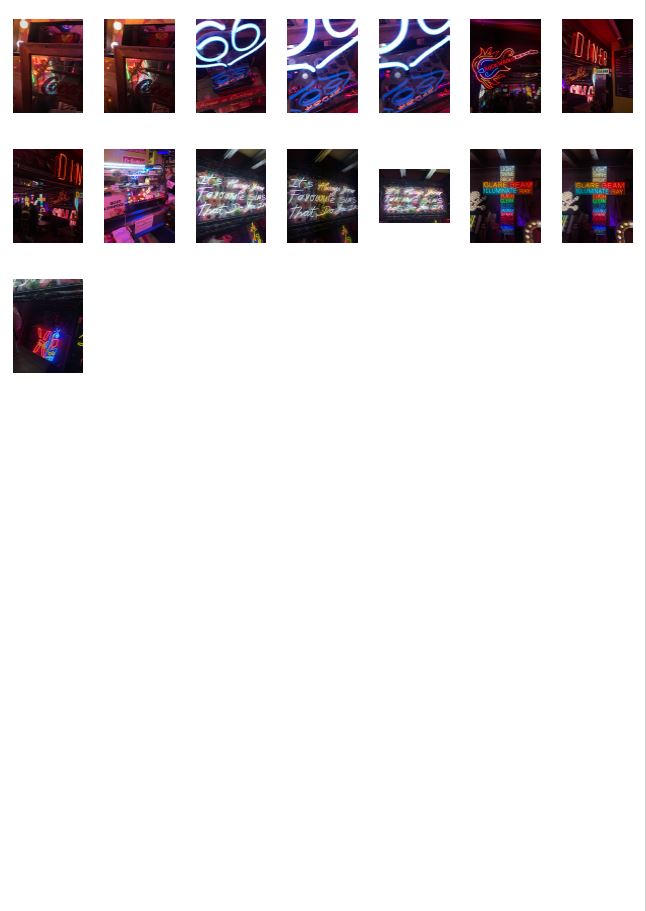
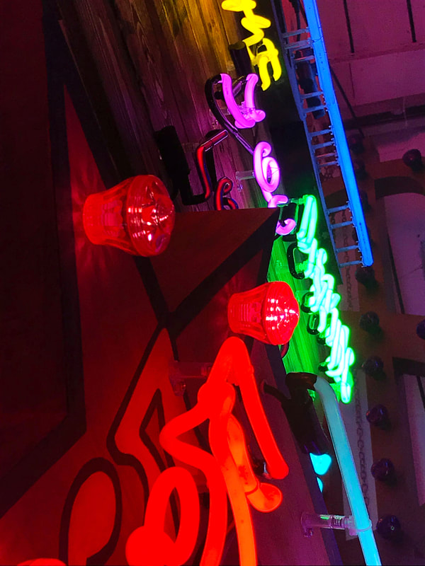
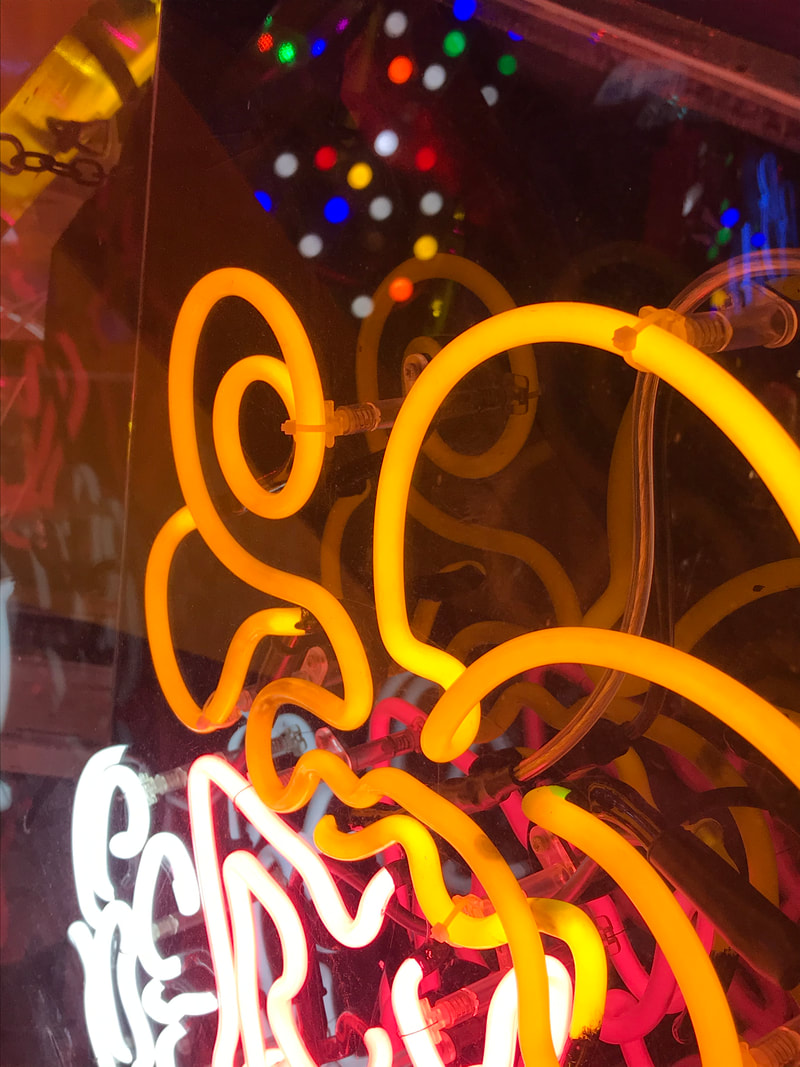
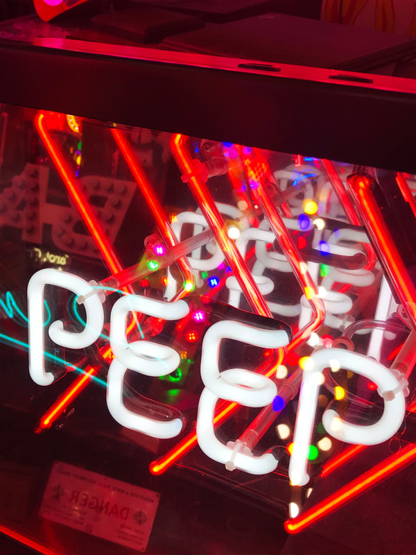
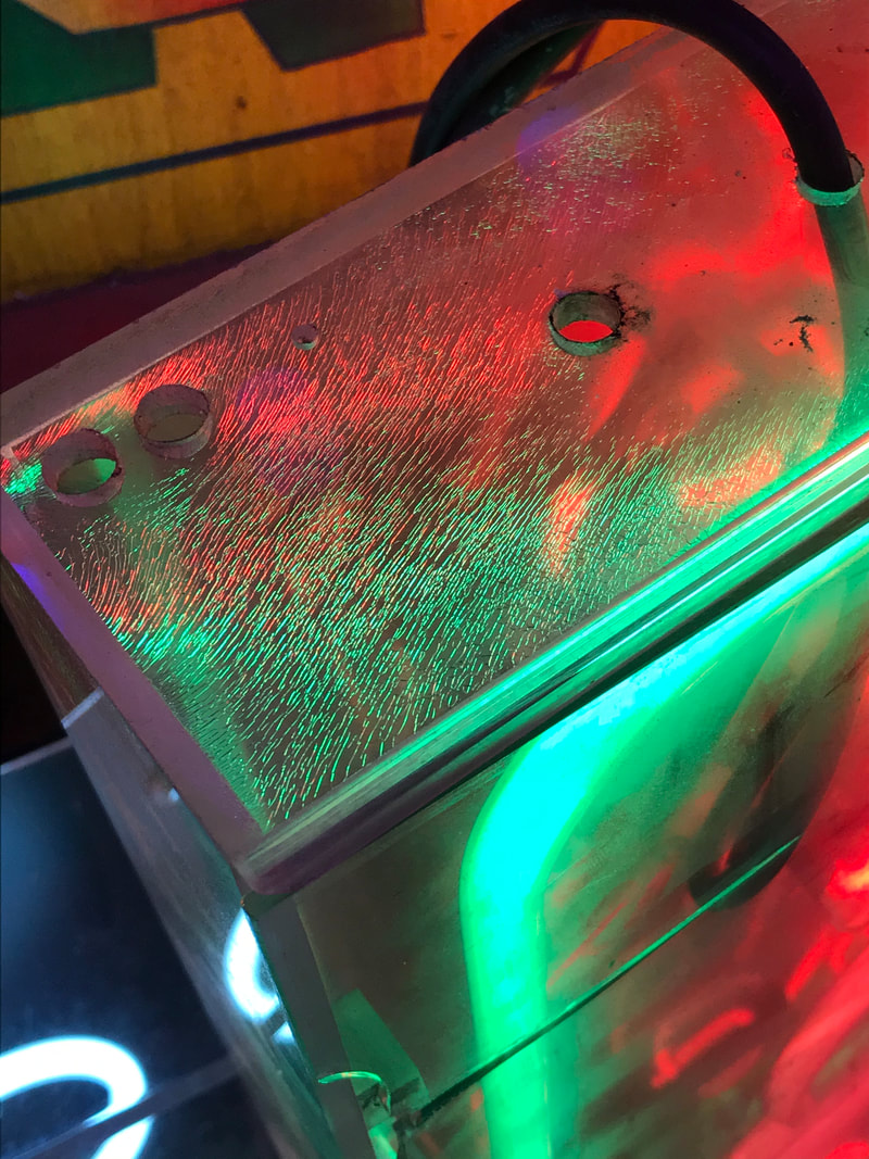
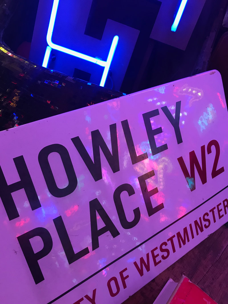
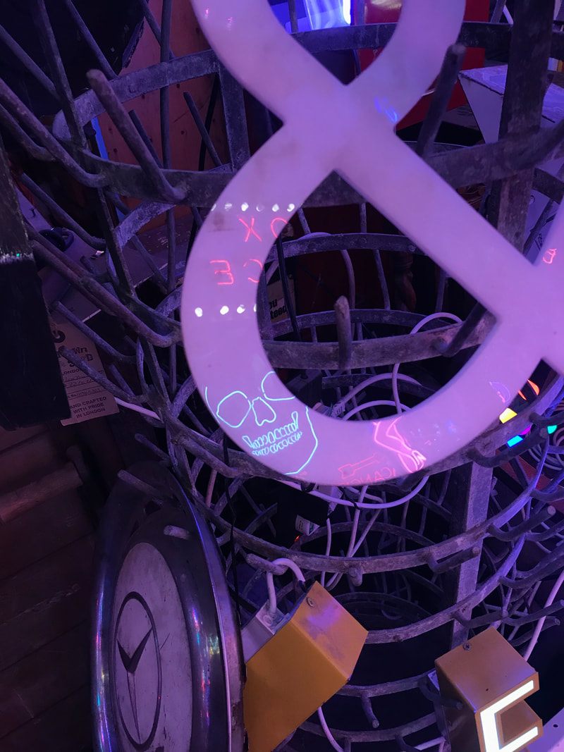
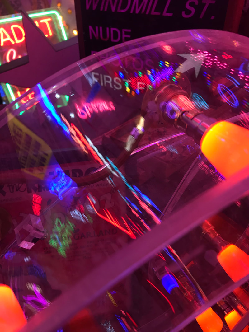
Inspired by Broyer’s work, I went to God's Own Junkyard in Walthamstow to do a shoot with a huge collection of neon lights. I used Broyer’s composition to influence my own, and attempted to make good use of negative space and contrast. I also tried to capture a range of colours within each singular photo, even if the general tone of the photo was quite similar throughout. I really enjoyed capturing the signs from multiple different angles which they wouldn’t normally be seen at, giving the photos original compositions and perspectives which normally you wouldn’t look at signs from.
|
|
|
|
|
|
|
|
|
|
|
|
|
|
|
|
|
|
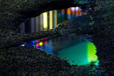
Slava Semenyuta
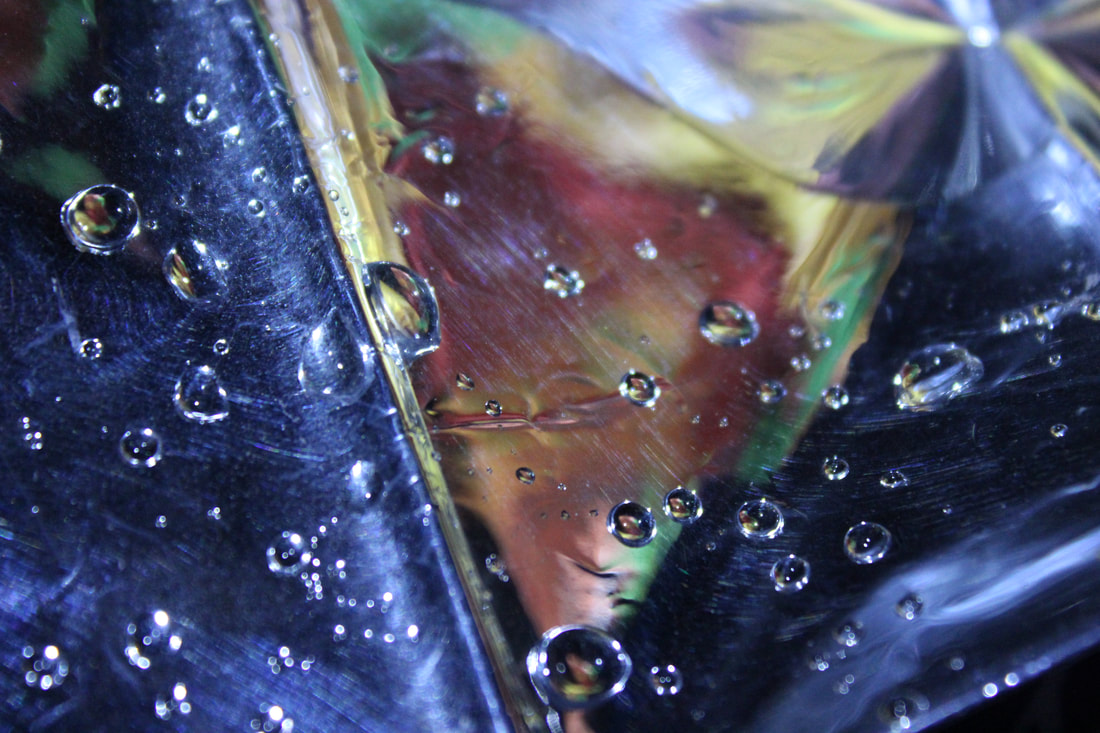
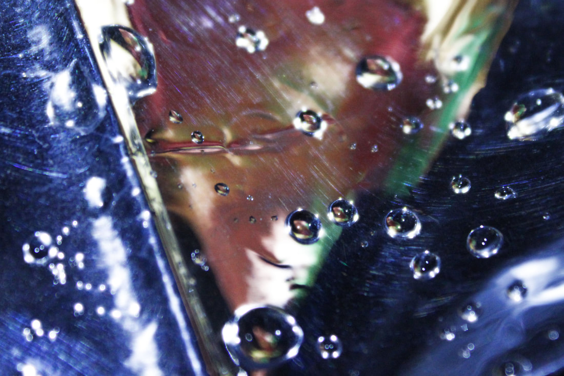
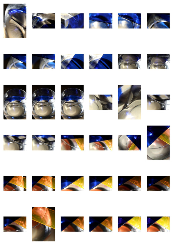
Slava Semenyuta is a Russian photographer who frequently incorporates reflection in his photography. He desribes his style as 'Acidic Realism', which shows 'ordinary objects which are displayed in unusual ways'. I think the sharp focus on the ground is a clever way to direct the viewer's eyes not only to the colour which prevails in the centre, but also the texture and patterns surrounding the liquid. I took inspiration from Semenyuta's work to make sure my reflections were not always the total focus of the photo, and to highlight the greater picture of the entire shot. This is an effective technique which can be used in any style of photography which I will carry forward with me.
|
|
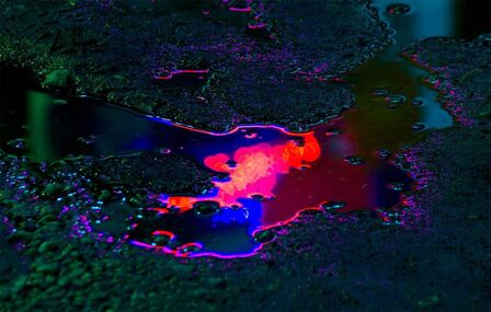
This is my favourite photo of his because of the spectrum of colour captured in the liquid. The surreal fade of the rainbow makes it look unnatural and alien-like, which is a staple of his 'acidic realism' style. I like the almost bokeh effect of the out of focus liquid in the bottom left corner, which is a subtle yet bright hint and leads the eye into the rest of the photo, giving the illusion of the formal element of lines without any physical lines being there. The shallow depth of field used gives a sharp focus to the liquid and makes it looks three dimensional as it contrasts so brightly with the dark surroundings.
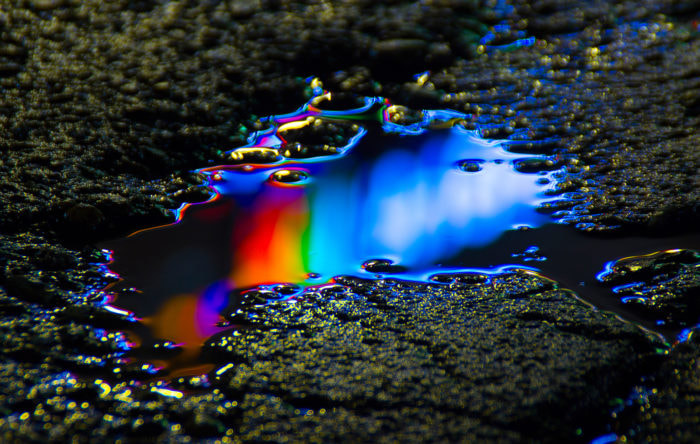
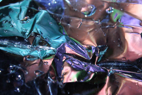
My First Response
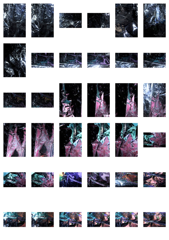
In my response, I wanted to convey a more abstract look at reality, similar to what Semenyuta does in his photos. I used a sheet of shiny, reflective plastic and ran water over it to create small pools of water on the surface. I then surrounded it with different coloured pieces of paper which I placed around the sink, so that when I shone a torch on them, the colours were reflected off the plastic and in the drops of water, which I think gives a really pretty abstract effect.
|
|
|
|
I like the divide created by the use of the formal element of lines in this photo, and I believe the focus on the drops of water in the foreground is effective in making this photo slightly surreal.
|
|
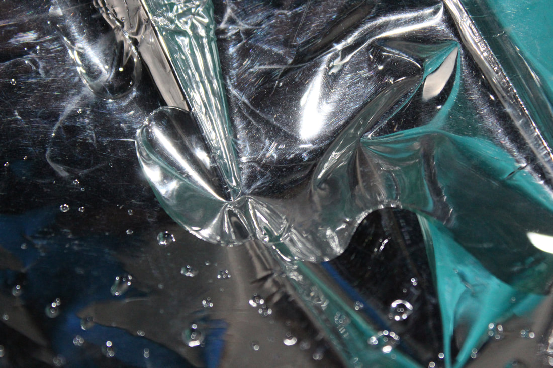
My favourite part of this photo is the concentrated, scrunched up centre which is surrounded by small dots of water which reflect the light. This enhances the blue waves created around the side which give a smooth effect and the scratched texture at the top which isn't so smooth and perfect looking.
|
|
|
|
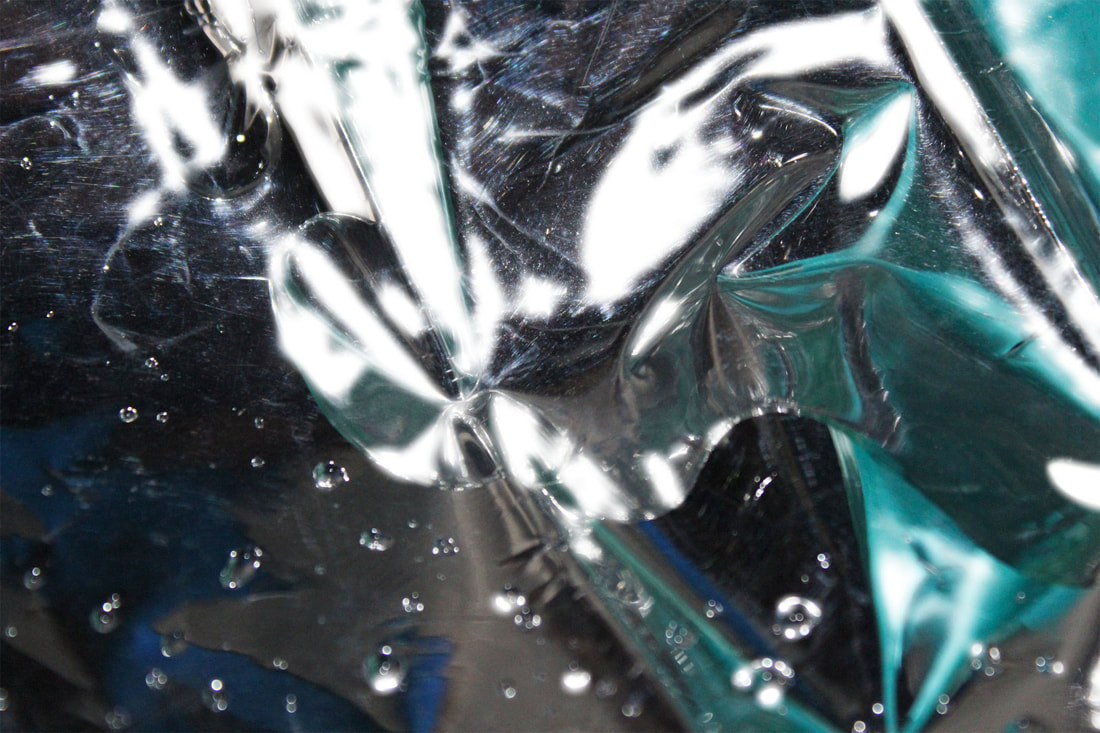
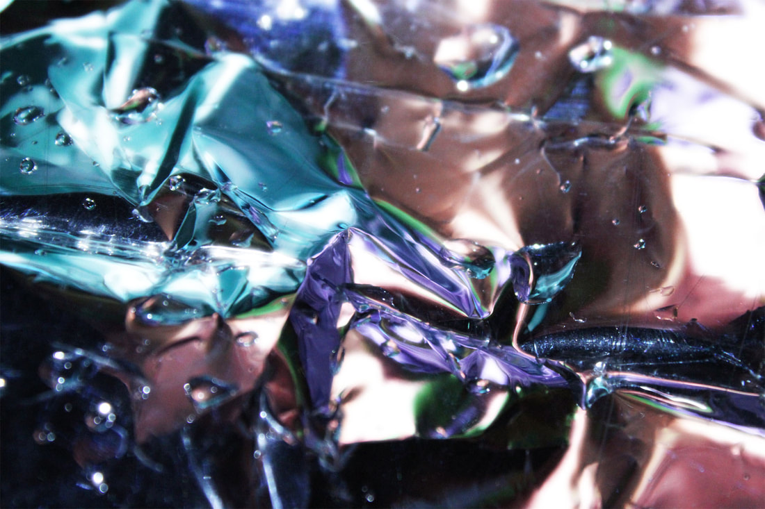
This is another one of my favourite photos, and I think it's one of the most technically effective photos due to the wide range of formal elements shown in it. The globes of water show the shapes, and their bright reflective outsides contrast the generally dark negative space. The line where the plastic was folded between the navy and orange colours create a v-shape in the mirror which gives the photo a divide but also continuity. I especially like how texture is shown in this photo, as the scratches on the plastic are visible which takes away from the general smoothness of the rest of the photo, which makes it unexpected and more effective.
Final Outcome Reflection - 1
Original unedited photo
My Final Piece - 1
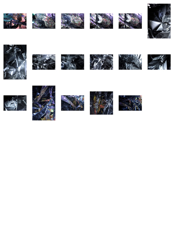
This is my favourite photo of this shoot as there is a wide range of colour, and because of the different angles the plastic reflected the water at appears to separate these colours into sections, giving the viewer multiple areas of focus. This is the most abstract photo from this development, an effect which is created by the jagged edges of the plastic and almost makes it appear transparent to reveal blurred colours behind the film.
My editing method
My Second Response
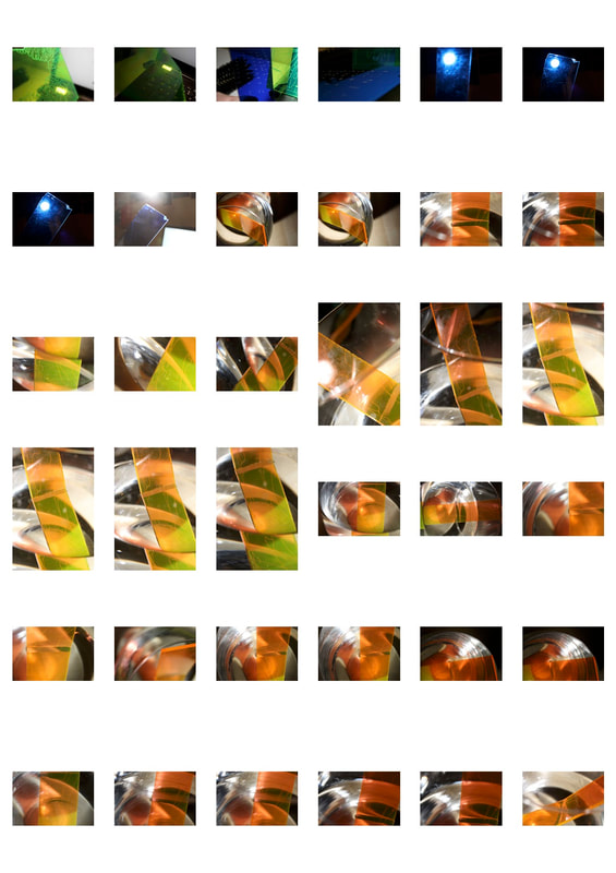
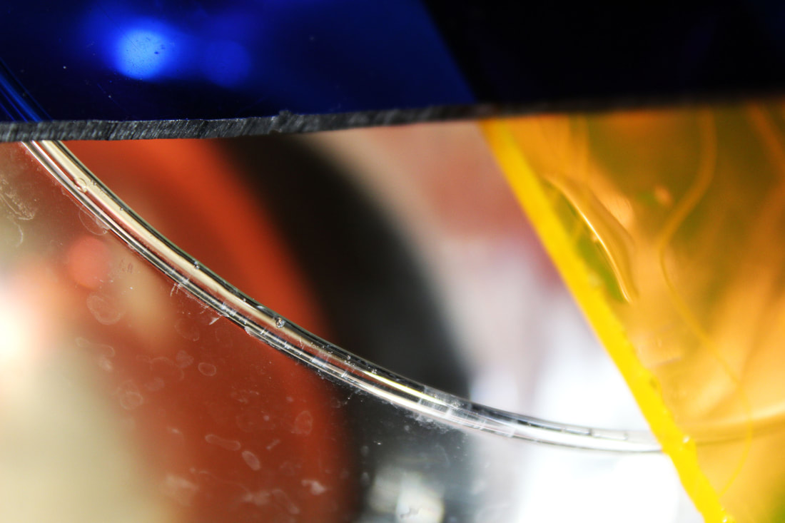
In my second development, I experimented using coloured filters to direct the light. In some photos, the beams were completely reflected in the acrylic, for example the photos I took of the light inside my fridge. In some of my other photos like the ones I took using a vase filled with water, the light travelled through the plastic and the colours were reflected in the water, however depending on how I angled the lamp and the combinations of colour filters I used, many different effects were created. The abstract effect is created through the viewer being unable to work out exactly what was being photographed, hinting at mystery behind the frame.
|
|
|
|
|
The focus of this photo is not as central as my other photos, which gives a nice contrast to the other photos in this shoot. I like the geometric shapes created by the overlapping of the two sheets of acrylic and the rim of the vase. The shallow depth of field leaves the background completely to the viewer's imagination, which is not seen in most of my other pictures. This adds a sense of mystery, and makes it less abstract than the other photos because the viewer has a deeper sense of a background or story being concealed behind this mask of glass and plastic.
In this photo, there is a luminous effect created b the acrylic sheet, as it reflects on the surface of the fridge and refracts the light. There is a strong sense of the formal elements of line and shape created by the angle of the light compared with where the plastic is placed at the tip of the triangle. I also aimed to capture contrast, coming from the white light at the centre, the vibrant orange and then the fade into red and brown at the edges. I think this is achieved effectively by the shallow depth of field and having only the acrylic in the foreground completely in focus, which highlights the fade from light to dark more as the colours blur into each other.
This photo is another one of my favourites, as it almost looks as if it could be a photo of the earth taken from space, giving a completely different perspective of viewing to my other photos. The cream streak cuts through the otherwise generally dark photo and accentuates the vivid reflection of white light above it. There are subtle hints of orange and blue throughout, giving an added contrasting feel. The texture is once again created by the marks on the glass, which in this photo I think are slightly more disappointing and unnecessary. However, they are made to work by the rest of the photo being so zoomed in, and the marks can almost be perceived as lens flares created by the light bouncing off the surface of the water.
Final Outcome Reflection - 2
I like the watery colouring of this photo which was created when the water reflected the various filters I had laid over the top of the vase. The vase being circular also gave a greater sense of distortion and flowing movement, which gives an uncertain feel which is cut through by the sharp line of water through the centre. The marks on the surface of the vase give it a texture, however they are not immediately eye catching. This gives the effect of perfect smoothness which is pleasing and satisfying to the eyes of the viewer, giving a fantasy viewpoint to the photo.
Final Outcome Reflection - 3
I think this photo came out extremely effectively as there is both the reflection of the corner of the light in the blue acrylic and the slightly distorted borders of the light when it travels through the blue prism, giving it a slightly imperfect feel. The negative space is used well to contrast the brightness in the middle, and overall in my opinion it is a good display of abstract photography of light and shapes.
My editing method
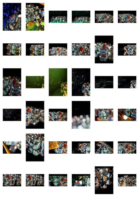
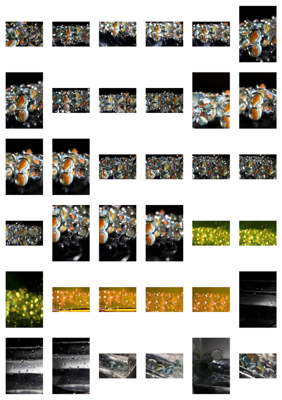
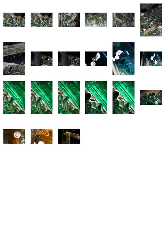
My Third Response
In my next response, I used many different objects including marbles, a mirror, coloured filters of plastic and acetate, and water. I was extremely interested in this shoot and had a lot of fun creating it, as I think the dispersions of light created were original and look very effective in capturing the beauty of light.
To create this effect, I used a standing mirror that could be rotated to be flat and parallel to the ground. I then balanced marbles of varying colours, patterns and sizes on it in different arrangements. The reflections of these marbles can be seen as sort of ghostly shadows beneath them in my photos. I shone a lamp onto the mirror and marbles, changing the angle to achieve varying distributions of light across the frame. I added further colour and reflections by holding acetate or a filter either in front of the lamp, or close enough to the marble so that the sphere refracted it with the glass.
To create this effect, I used a standing mirror that could be rotated to be flat and parallel to the ground. I then balanced marbles of varying colours, patterns and sizes on it in different arrangements. The reflections of these marbles can be seen as sort of ghostly shadows beneath them in my photos. I shone a lamp onto the mirror and marbles, changing the angle to achieve varying distributions of light across the frame. I added further colour and reflections by holding acetate or a filter either in front of the lamp, or close enough to the marble so that the sphere refracted it with the glass.
|
|
|
|
|
The shallow depth of field keeps the drops of water in the centre focused, causing the colour from the marbles to fade and merge together in the background. This achieves a busy, confused feel which I think effectively shows the conflicting ways which reflection may be represented through these different glass mediums.
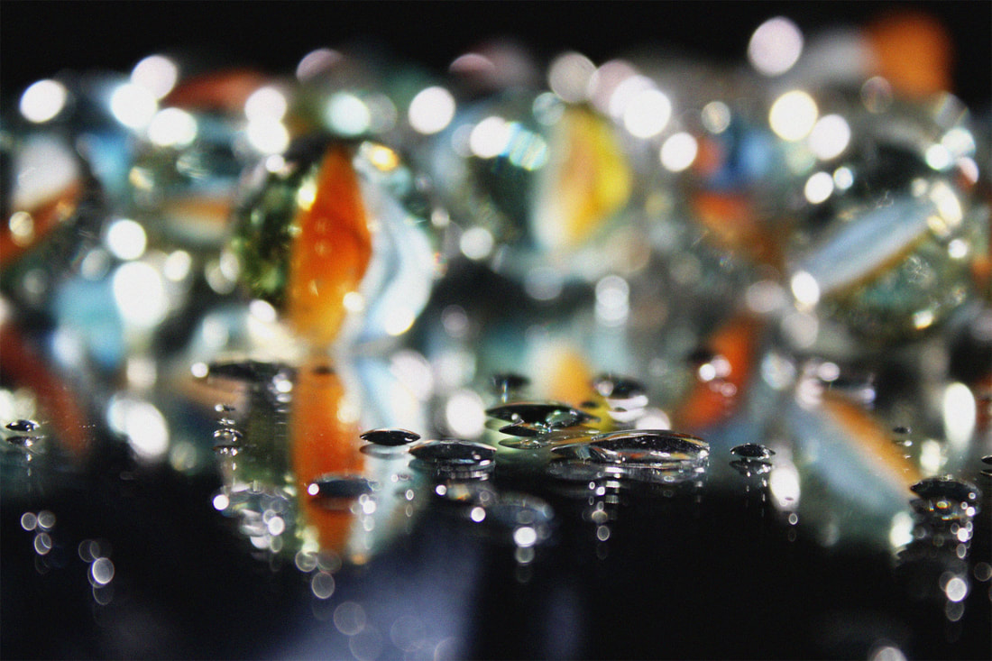
Final Outcome Reflection - 4
|
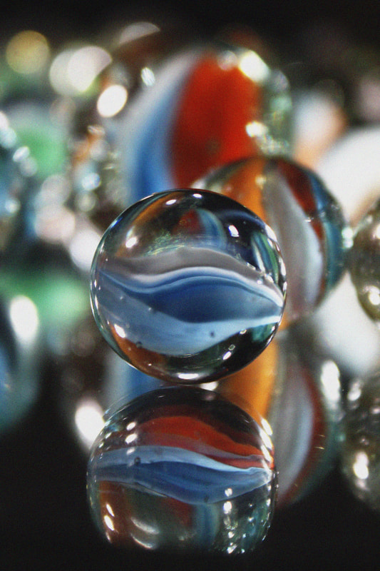
The shallow depth of field is the most effective element of this photo, as there appear to be multiple layers to the photo: the singular marble in focus at the front, the second marble displaced to the right and then the larger background marble and bokeh effect created by the lights. The marble in the foreground being reflected in the mirror gives the effect of duality, which is further enhanced because the reflection of the marble has a second displaced reflection, which happened as a cause of the perspective the photo was taken at. The faded colours in the background contrast the strong blues and oranges in the centre giving a 3D effect to the photo. |
|
Final Outcome Reflection - 5
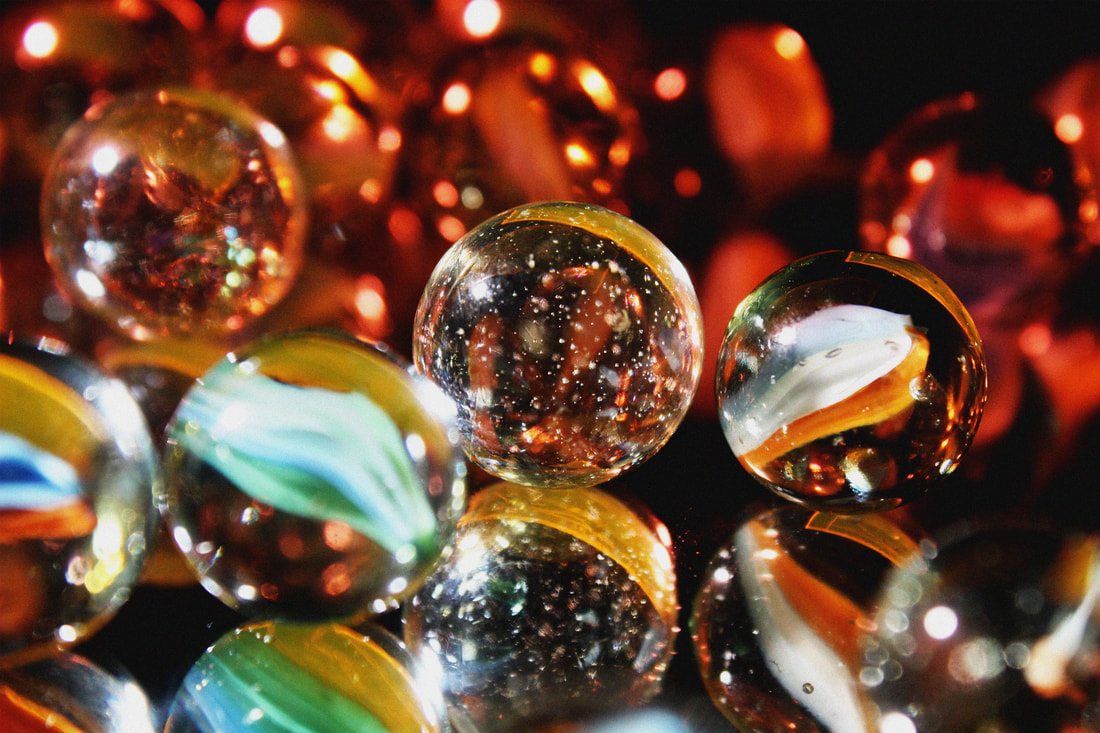
I like the repeated reflection of the orange acrylic in the marbles in this photo, which give a pop of a more vivid colour from the red background. The two marbles in focus are both completely different, as one is speckled and one has colour running through it, so each gives a different texture and mood to the overall photo, adding an element of contrast that isn't just related to tone and colour.
Final Outcome Reflection - 6
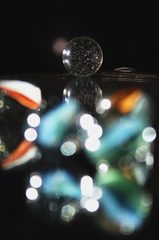
This is my favourite photo from this shoot because of the bokeh effect created by the out of focus reflection of the marbles in the mirror. This heavily contrasts the Sharp focus of the marble and its reflection in the background. I could have improved this by the side of the mirror less evident, as in a way it takes away from the smooth dark negative space surrounding the marbles. I achieved my intentions of the distorted reflections shown in glass by the vibrant abstract shapes of colour in the foreground.
My editing method
Final Piece - Fashion and Light Combined
After completing my three strands, I was tasked with creating a final piece to bring my whole Reflection unit to a close. Since I enjoyed making my fashion and light strands the best, I decided to fuse them together and create a final piece which incorporated them both.
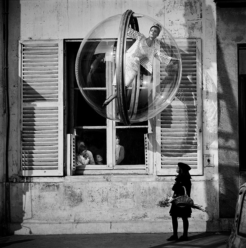
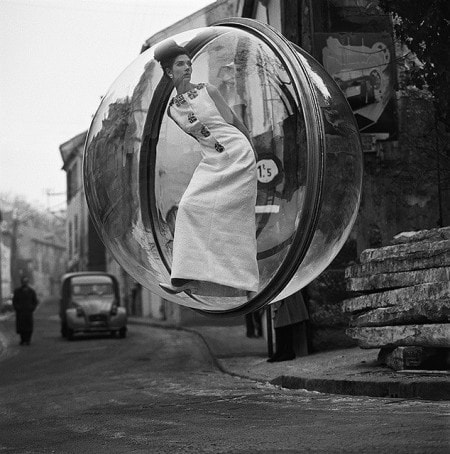
Melvin Sokolsky
I looked at Melvin Sokolsky's work from the 1960s to draw inspiration for my final piece. I think it's extremely creative, and he was very innovative and ahead of his time. Many people suspected his photos to be fake or heavily edited as they were taken on a film camera, however he assures you that the only touching up of the photos is the erasing of the wire which was used to suspend the bubble.
|
|
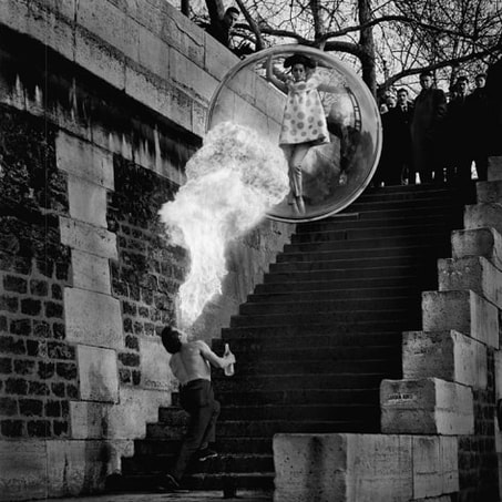
This is my favourite photo, and the one which I think is the most impressive. In the past, the limited technology would have made this photo extremely difficult to capture as seamlessly as Sokolsky does. The bright flare of fire in the centre leads into the bubble where the model stands calmly and watches, like the viewers at the top of the stairs. This photo makes heavy use of the formal element of shape, with the rectangles prevalent throughout the whole photo. The casual expression shown by the woman contrasts the exciting, dramatic event surrounding her.
My editing method
My Final Pieces
In my final pieces I combined 2 or 3 of my photos together to create effective surreal looking images inspired by Sokolsky's work. They were relatively abstract, and I combined most of the skills I had practised throughout this project into these three final pieces, giving a result I was proud of.
My intention was to convey the beauty surrounding the reflection of someone's internal identity through the clothing they were. I used the colours to represent the various emotions expressed by someone, which is why they include colours such as blue which usually convey sadness and pain, as well as vibrant colours like orange and pink which give a positive uplifting feel.
My intention was to convey the beauty surrounding the reflection of someone's internal identity through the clothing they were. I used the colours to represent the various emotions expressed by someone, which is why they include colours such as blue which usually convey sadness and pain, as well as vibrant colours like orange and pink which give a positive uplifting feel.
Final Outcome Reflection - 7
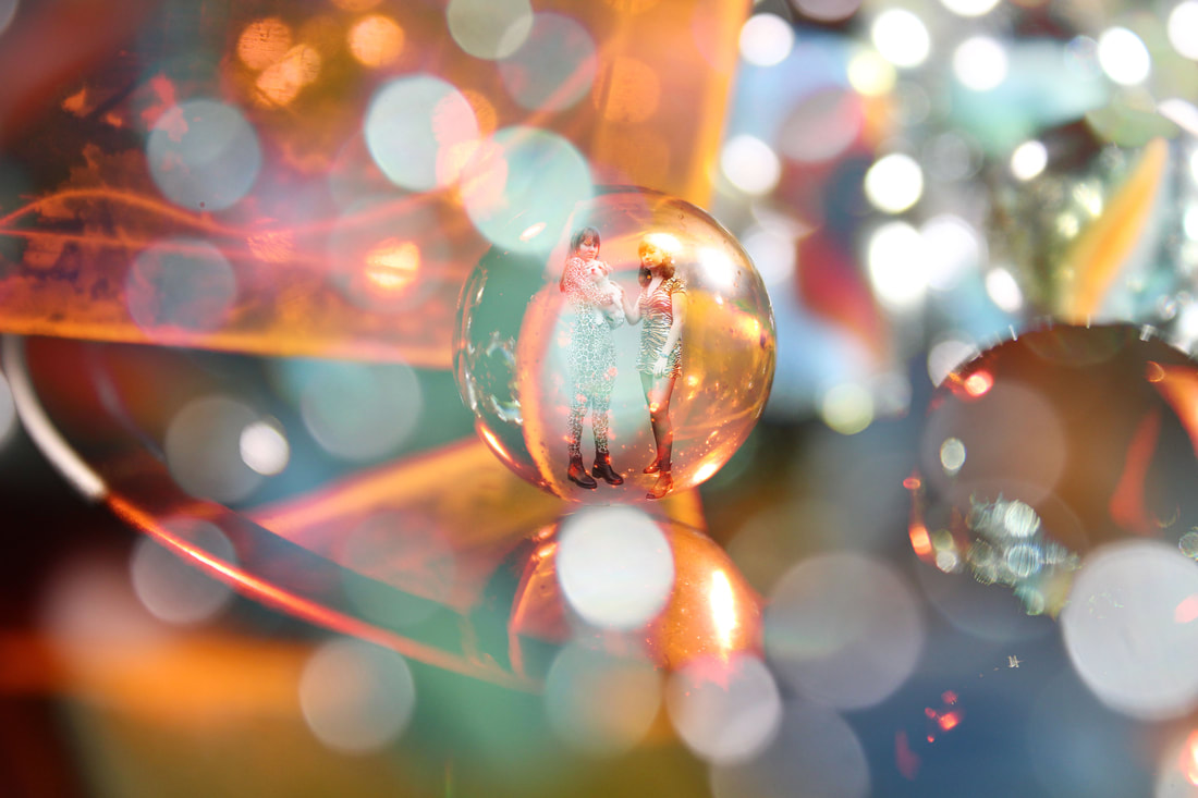
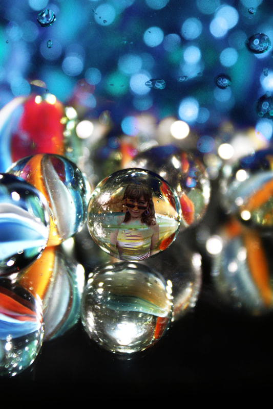
The sizing in this image is evidence of the distortion, as the models are positioned inside a marble which is resting on the edge of a mirror. I like the muted blue-grey tones which are superceded by the orange. This also gives a varying tone across the figures in the marble which I like. I could however have reflected them in the mirror, which may have given the photo greater continuity.
Final Outcome Reflection - 8
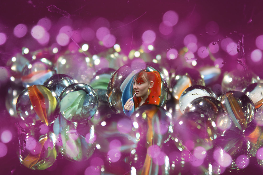
Using the purple lighting twice, at the bottom and top, gives this photo a more intimate, encased feel which I think shows the possible constrictions of self-expression. The texture of scratches could symbolise internal conflict which is not reflected on the surface of the neutral-faced model. The central marble stands out and the pattern within it traces the shape of the model which I think is a clever addition to this photo. However I think the photo could be slightly too busy, and there is an excessive use of the repetition of the lights.
Final Outcome Reflection - 9
In this photo, the use of the central focus is drawn in by the marbles at the side creating a line to the middle. I like the raining effect of the blue lights in the background, whcih could hint to an emotional being hanging over the head of the subject who is enclosed in the glass marbles. The reflections in the mirror are doubled, which give a glitched, confused effect which are effective in creating an underlying chaotic atmosphere to the photo. The use of numerous bright colours symbolises the range of various emotions throughout a person's personality, and gives a sense of humanity and realism.
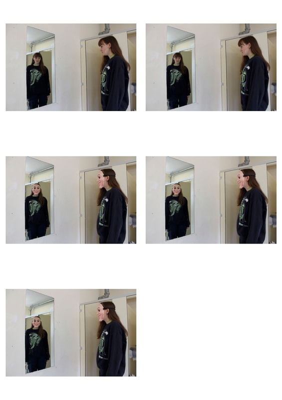
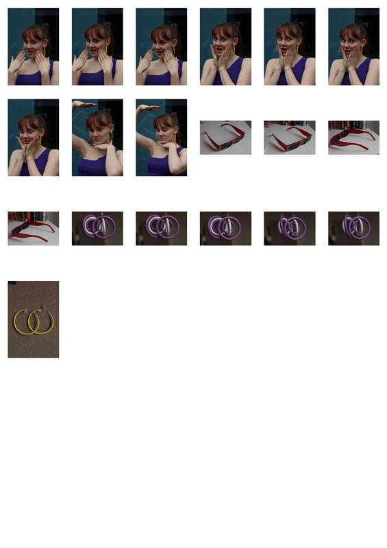
Respond to all the red feedback. Separate your first shoot into images with green ink and then, as if you've done a second shoot, the Antonio Gutierrez shoot. I would do another edit of Ella in glass with distorted reflection but change it to black and white so you're really emulating the work of Antonio Gutierrez.
Produce 2 more examples of your examples of your paper cut images but cropped - crop them in different ways to show a variety of compositions.
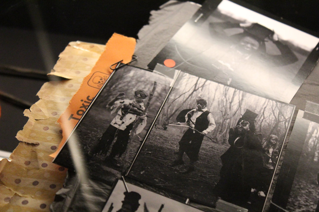
Upload all the photos you shot for the Halloween shoot and show your Photoshop edits so we understand how you created this as a process.
In addition to saying what your shoot is about, please state the aims of your shoots - what are you actually trying to achieve.
Really go into further depth with your analyses of your photos - www and ebi is fine but basic - really go into detail when you're analysing your images.
Make sure you analyse all your best images, including your final images but also say why you chose to create these pieces -right now, it's not clear. What inspired you to make them - you really need to think these through. Please add any new developments since your last upload.
Produce 2 more examples of your examples of your paper cut images but cropped - crop them in different ways to show a variety of compositions.
Upload all the photos you shot for the Halloween shoot and show your Photoshop edits so we understand how you created this as a process.
In addition to saying what your shoot is about, please state the aims of your shoots - what are you actually trying to achieve.
Really go into further depth with your analyses of your photos - www and ebi is fine but basic - really go into detail when you're analysing your images.
Make sure you analyse all your best images, including your final images but also say why you chose to create these pieces -right now, it's not clear. What inspired you to make them - you really need to think these through. Please add any new developments since your last upload.
