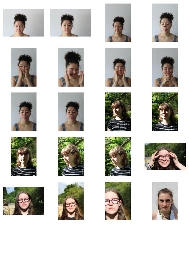
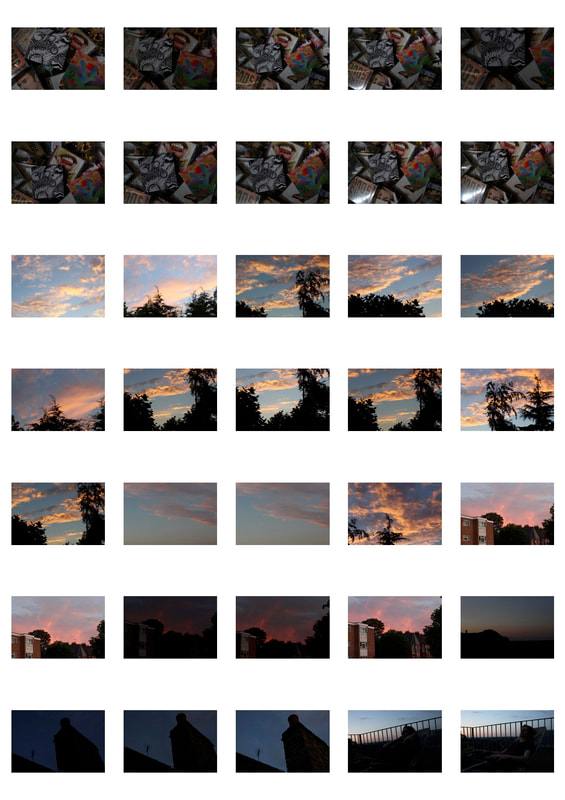
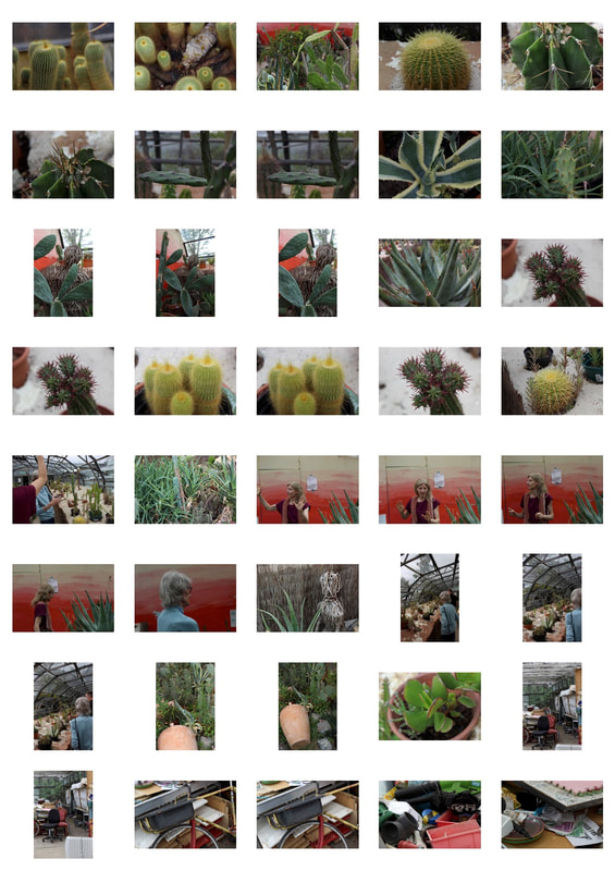
Portrait Transformation
|
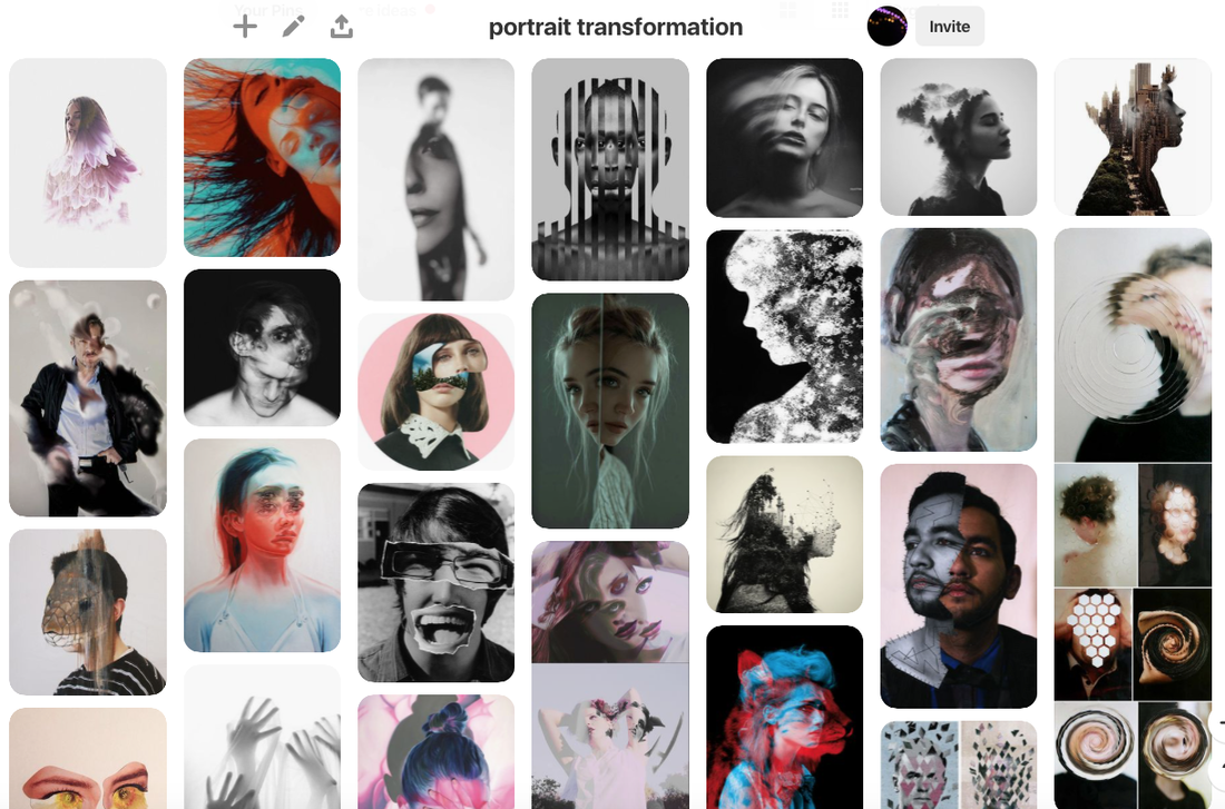
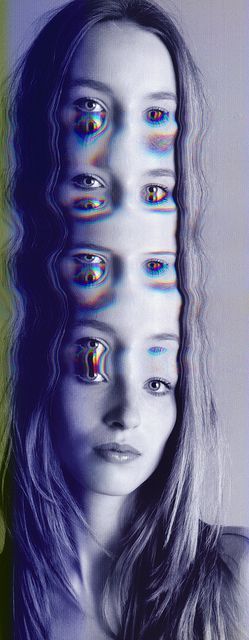
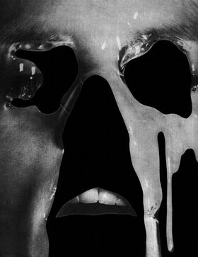
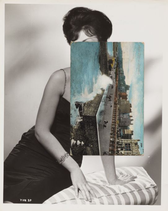
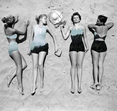
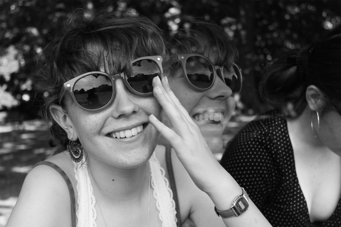
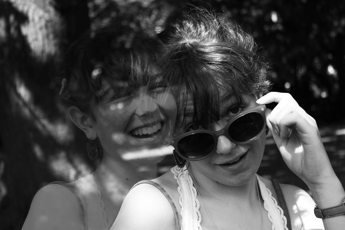
Portrait transformation is when the physical appearance of someone in a photograph or piece of artwork is altered and distorted so that it no longer resembles their natural appearance. This can be done in many different ways, for example through editing and photoshop methods, as shown on the right. The face has been elongated and repeated, adding a warping effect to the eye.
|
|
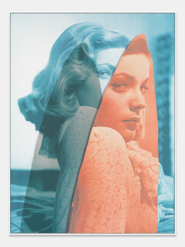
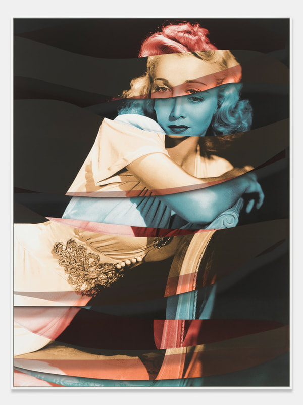
Urs Fischer
Urs Fischer is a Swiss photographer and visual artist born in 1973, who now lives and works in New York. In these pieces of portrait transformation, he collaborated with the photographer Stefan Altenburger to create a set of transformed images.
Two different photos have been combined in different layers and colours to create a sense of natural movement. As you can tell by the names of the pieces, 'Rain', 'Red Mountain', and 'Wind', Fischer and Altenburger were inspired by nature combined with human photography to create colourful, creative images which stand out brightly and look three-dimensional.
Two different photos have been combined in different layers and colours to create a sense of natural movement. As you can tell by the names of the pieces, 'Rain', 'Red Mountain', and 'Wind', Fischer and Altenburger were inspired by nature combined with human photography to create colourful, creative images which stand out brightly and look three-dimensional.
Rain, 2019
|
Red Mountain, 2018
|
Wind, 2019
|
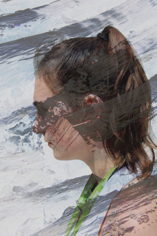
'Wind' is my favourite photo by Fischer, as he has created a three dimensional effect through the use of the three primary colour layers. The strands give movement depicting the wind, and the shape and face of the woman has been sliced into repeating and mismatching sections, conveying the chaos and disorder wind can cause. |
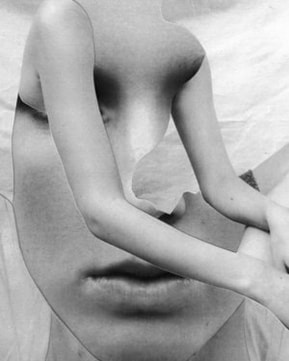
Jesse Draxler
Jesse Draxler is an American artist born in 1981, who specialises in abstraction. His dark creations use human shapes made out of collaged photos of people to create effective and often creepy images. He explores themes of terror and human mortality, and is influenced by the idea that time is limited and every decision a person makes builds up to their inevitable death.
I think his use of contrast and shape is very effective, as he creates an illusion could almost make the photo seem natural, even though the shapes in themselves are impossible to make naturally.
I think his use of contrast and shape is very effective, as he creates an illusion could almost make the photo seem natural, even though the shapes in themselves are impossible to make naturally.
|
|
|
|
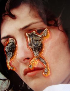
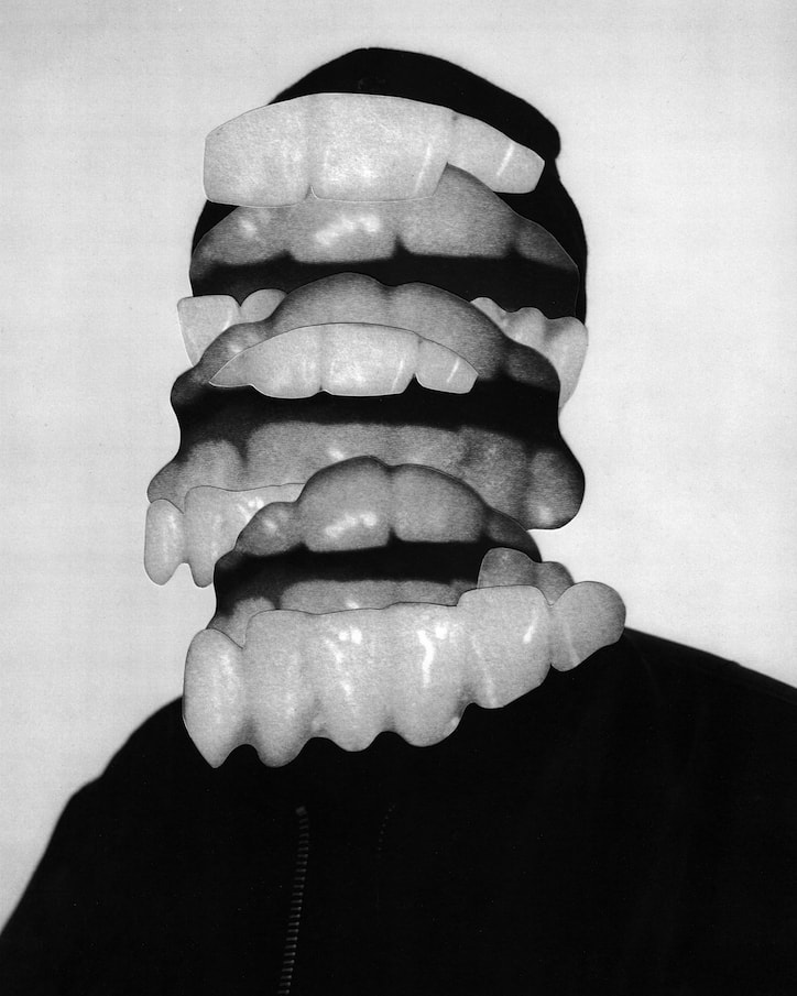
This photo is one of Draxler's most interesting ones, as he has concealed all the facial features of the person he is shooting with unsettling, disturbing cut outs of teeth. The mismatching interlocking of the sets of teeth gives a disorganised, troubling mood, and could represent an inner sense of concern and anxiety the subject feels, or which Draxler wants to represent. It could also symbolise a ferocity within the character of the people. |
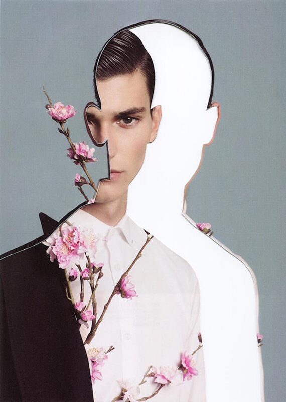
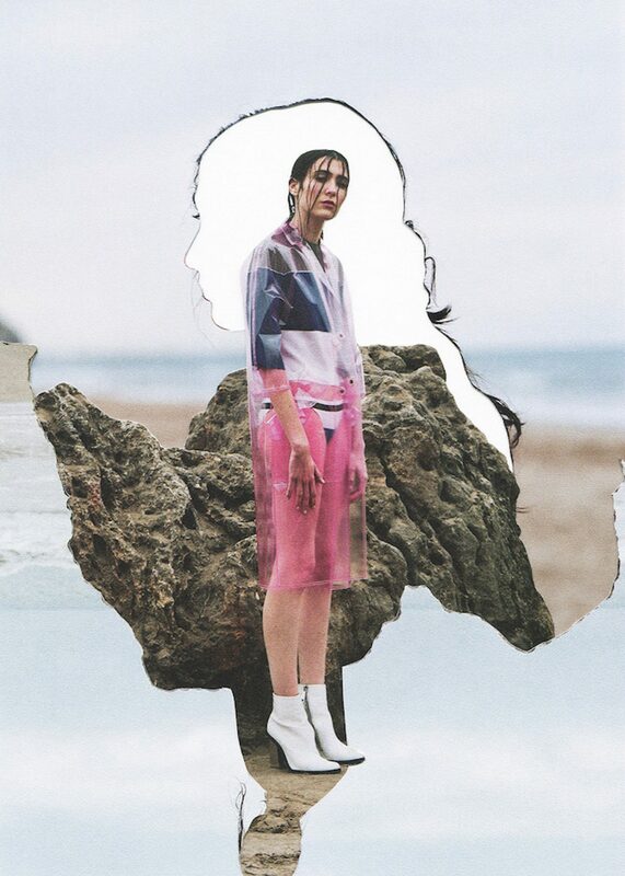
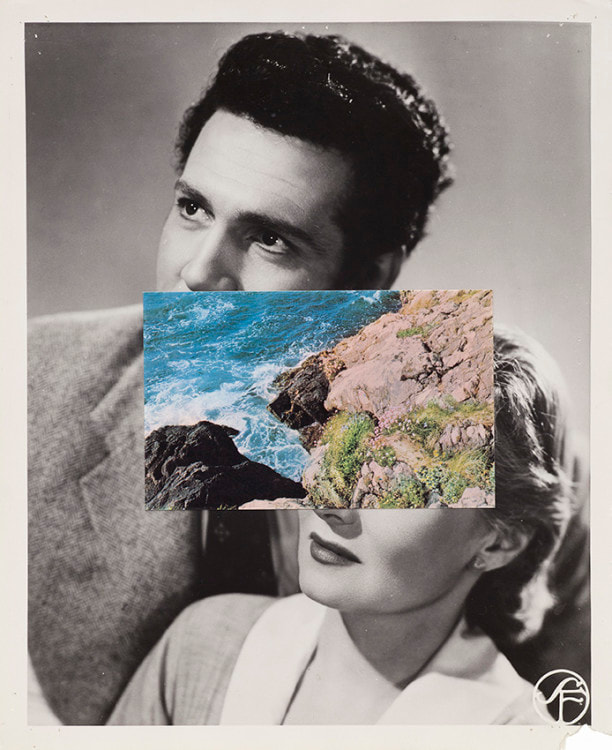
Pablo Thecuadro
Madrid based artist Pablo Thecaudro was born in 1992, and uses mixed medium to create his bold collaged photographs. He expresses the duality of "who we want to be versus who we really are." The efficacy of human shape and form blended with fashion and nature creates a stark contrast, and enables you to see deep inside the personalities of the models, whilst still only being presented with the parts of their life they want to show. He wants us to consider how someone's physical appearance isn't always exactly who they desire to be or who they are on the inside, and that the parts of ourselves that we show to the world are only a fraction of us as people.
|
|
|
|
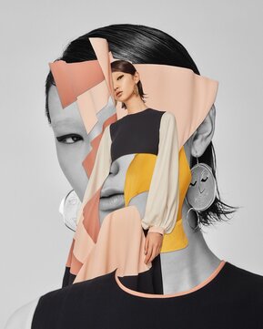
This photo is one of my favourites by Thecaudro because of his use of the difference between nature and people as it's focal point, as well as involving modern fashion. The reflection of the woman's figure in the sand on the beach creates an abstract mirroring of her persona, eliminating her face, whilst the outline of her side profile encloses a stark, textured photo of a rock and a blank canvas in the background. The rock and plain white area contrast the main focus of the image which is her full body portrait, and could represent the emptiness and hardwearing of her feelings. I like the use of light, toned down beige and blue colours which accentuate the vivid pink of her skirt and the texture of the rock. |
Rankin Destroy
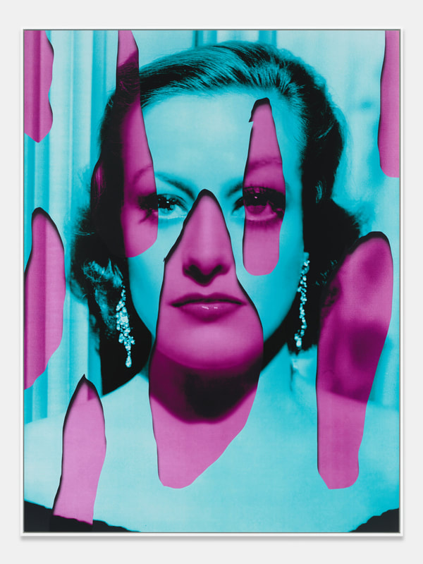
'Destroy' is a 2009 project by photographer John Rankin, in which he took photos of over 70 musical artists and challenged them to 'destroy' the images however they wanted. Some of the artists decided to reflect parts of their personality or life through their destroyed portraits, however some chose to do whatever they thought looked good.
|
|
|
|
This distortion is my favourite, as graphic design and drawing has been added to enhance the features of their faces and give a creepier yet more colourful overall look to the photo, rather than it just being almost exclusively monochrome. Rankin has thought about the composition, which includes not making the subjects completely central. This makes it appear imperfect and slightly off-putting. Once the alterations have been made to their faces and the background, only their clothes remain the same. This could signify the possibility that their true character is not shown directly on their person, but rather the things that they do and wear. This is a powerful and thought provoking image, which contrasts the general idea of natural beauty.
Celebrity Portrait Transformation
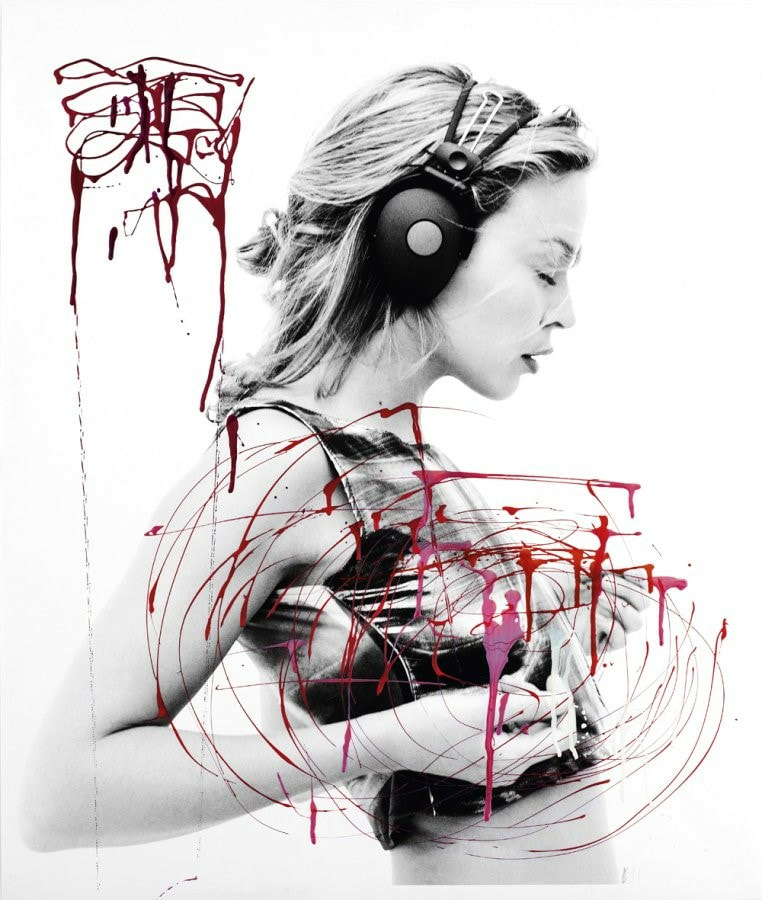
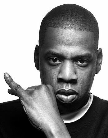
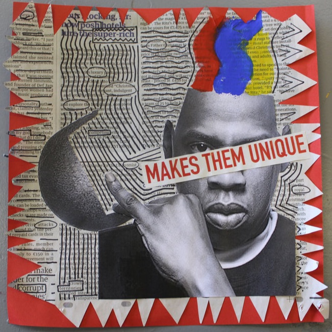
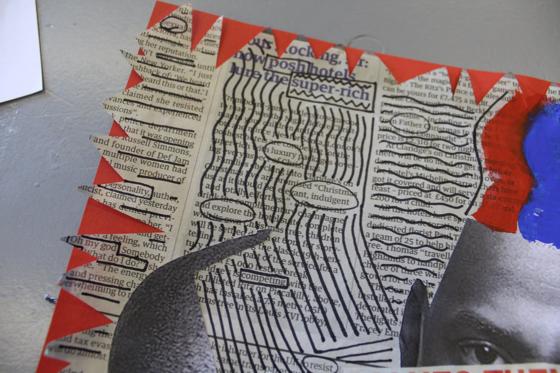
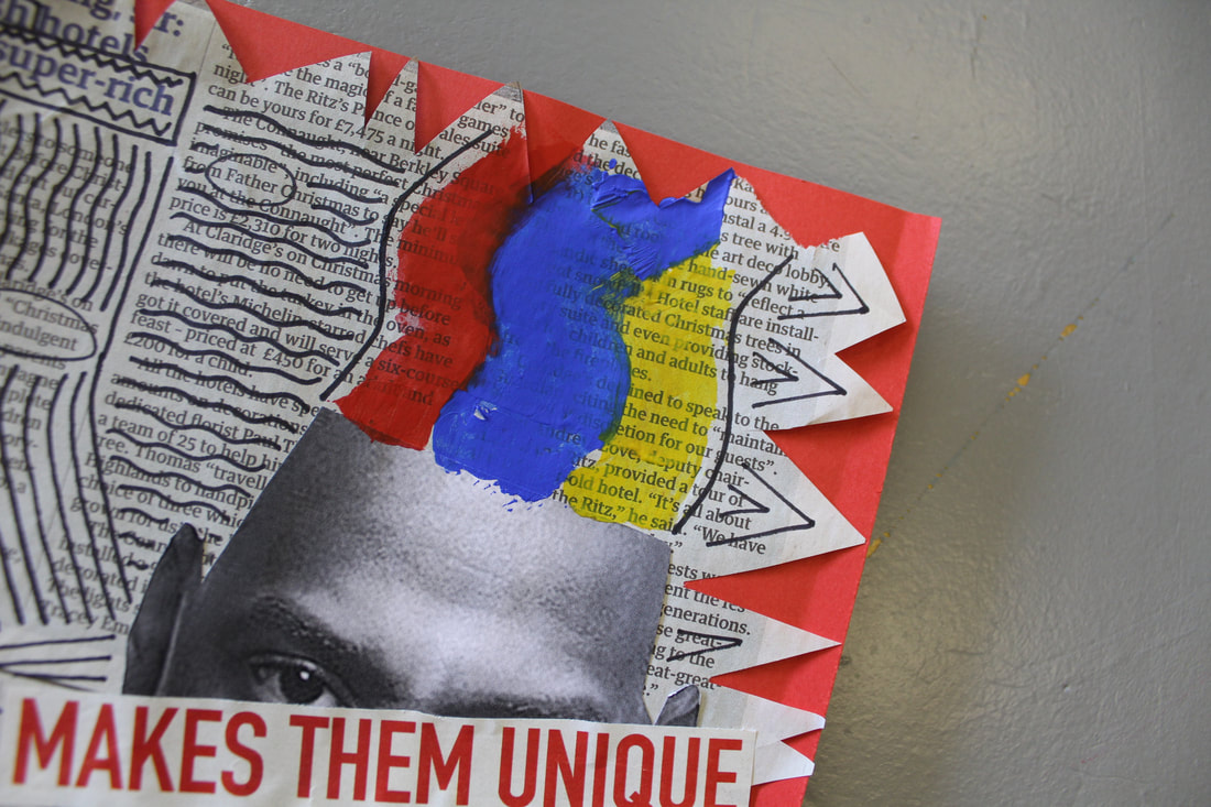
I chose to destroy a photo of Jay-Z, with the concept of money and fame at the forefront of my idea. Using a black and white image of Jay-Z contrasted the bright colours I used in the creation. I also circled words in a random newspaper cutting which are associated with corruption and power, to show the underlying deception and inequalities of the music industry and abnormally rich celebrities.
|
|
|
|
In this collage I like the messy and imperfect look of the final piece, however I think if I had been more careful with the method I used to create the lines of paint emerging from his head it would give a more professional touch.
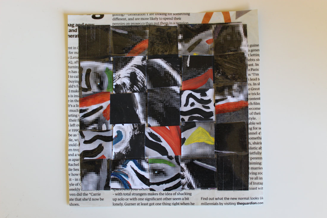
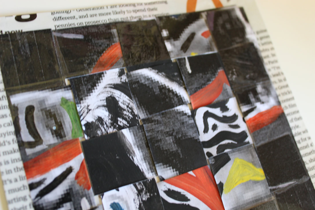
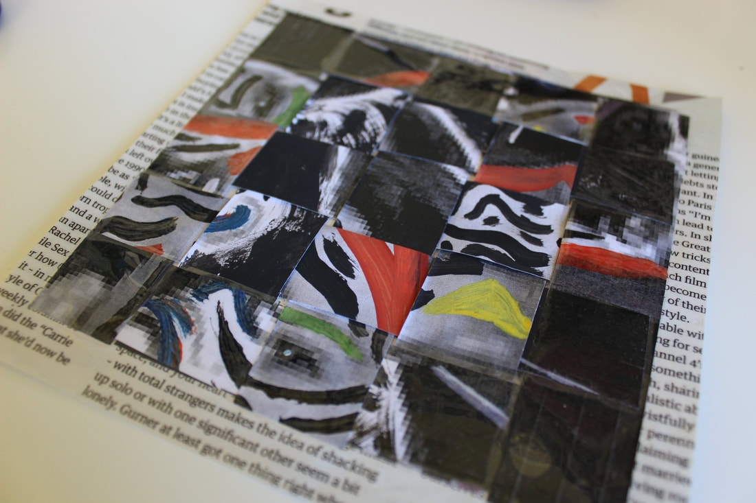
My Own Portrait Transformation
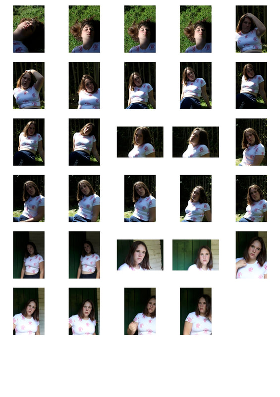
In the second part of this task I was required to 'destroy' a photo of myself. I used a pixelated, black and white photo which was effective as it was synonymous with the idea of my overall piece. I wanted to show my personality whilst also showing that the inside is not always directly represented by what's on the outside. I outlined some of my facial features with colour, before cutting the whole photo into strips and weaving them together. I like how it came out because when you first look at the image, it's difficult to tell that it's me. I like how the contrast between the bright coloured highlights and the grayscale image make the overall piece stand out from the relatively plain magazine background I placed it over. I used tape on the borders, but left the middle nine squares blank. This enhances how the outside may be shiny and seem complete, whereas on the inside there is a stark contrast.
I was inspired by the work of Rankin as all of the photos he created in collaboration with the celebrities ended up completely different to the original photos. I wanted to express the freeness of the image through the interwoven strips and the lines I drew over my face.
I was inspired by the work of Rankin as all of the photos he created in collaboration with the celebrities ended up completely different to the original photos. I wanted to express the freeness of the image through the interwoven strips and the lines I drew over my face.
|
|
I like the use of the colours which pop out from the black and white to give a contrast of tone and brightness. I could have selected a background which was more relevant to my personality so that my character was conveyed more directly through the magazine cutting. To improve even further, I could have made the photo slightly more identifiable as me, maybe leaving bigger squares or more recognisable facial features.
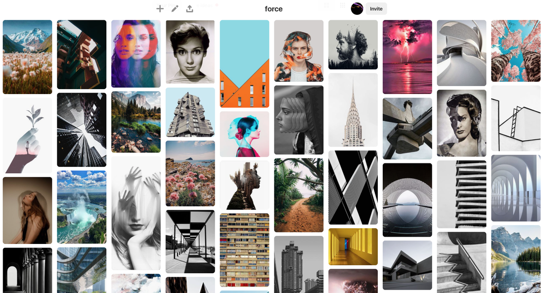
Force of Nature
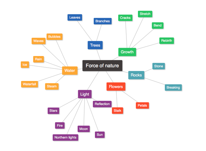
The force nature has can be defined as the power it claims over the human world or the events it can cause, which can be catastrophic or extremely beautiful and inspiring. These can both be captured in photography to produce astonishingly emotive or pleasing images.
|
|
|
|
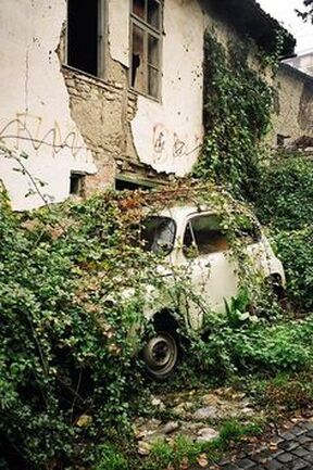
In this photo, nature is seen reclaiming its natural territory, dominating the abandoned, derelict setting of the building and car.
|
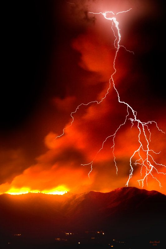
The striking colours and electricity from the lightning in this photo emphasises the power the natural world has over everything, and diminishes the human world.
|
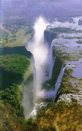
The power of nature is seen here as it separates sections of the land and creates a deep, relentless chasm filled with water.
|
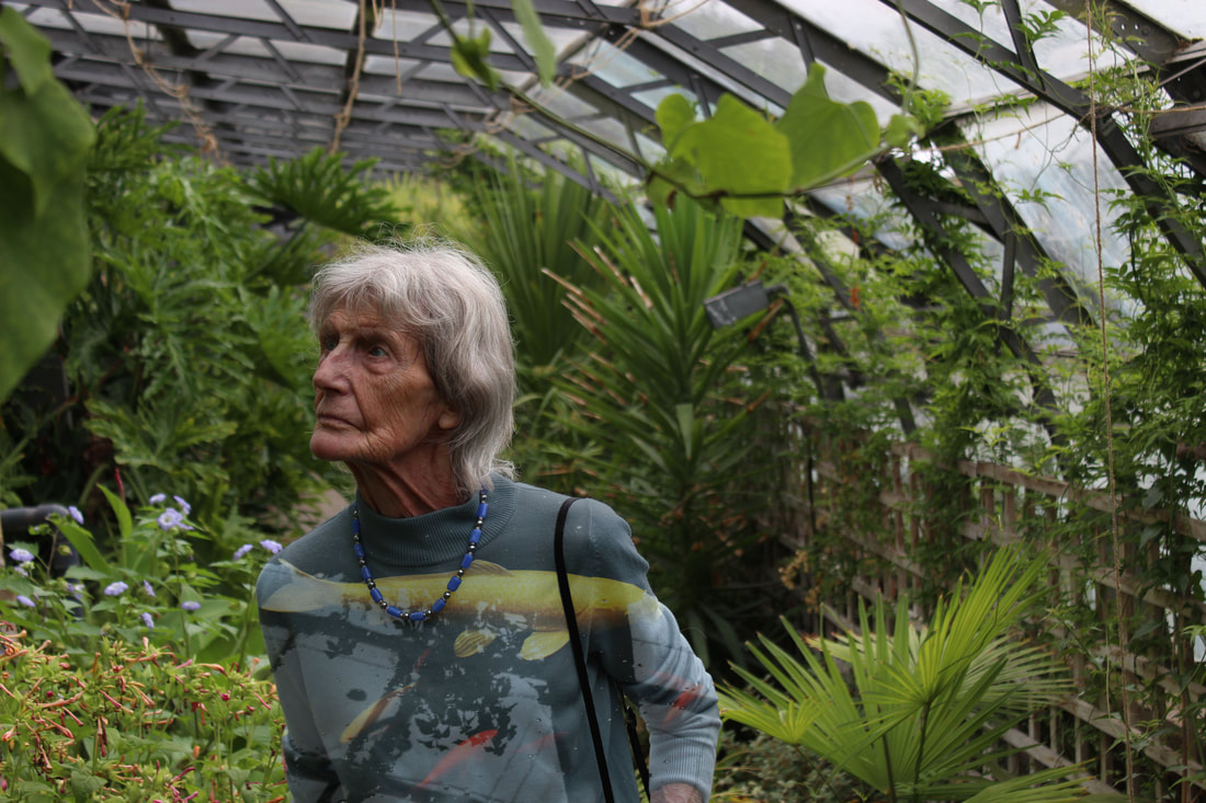
Christoffer Relander
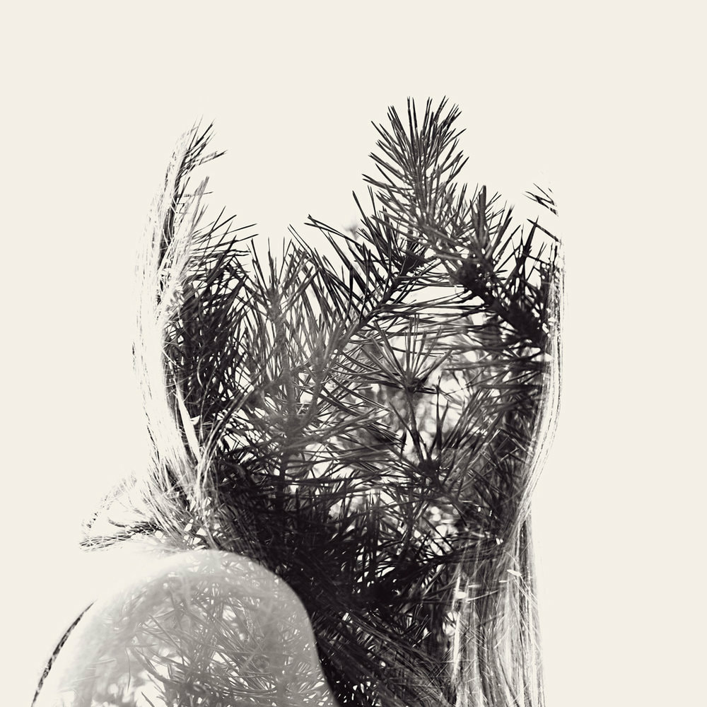
Relander is not considering any specific individual in this piece of work, and addresses people as a more general focus. He is more interested in the combination of nature and human life which makes his photos unique.
|
Christoffer Relander creates surreal portraits where he blends aspects of nature with human life. He does this by removing a person's identifiable features and replaces them with an element of the natural world by the process of double exposure. He wants his audience to consider the relationship between man and nature and how much of an influence the natural world has on our everyday lives.
|
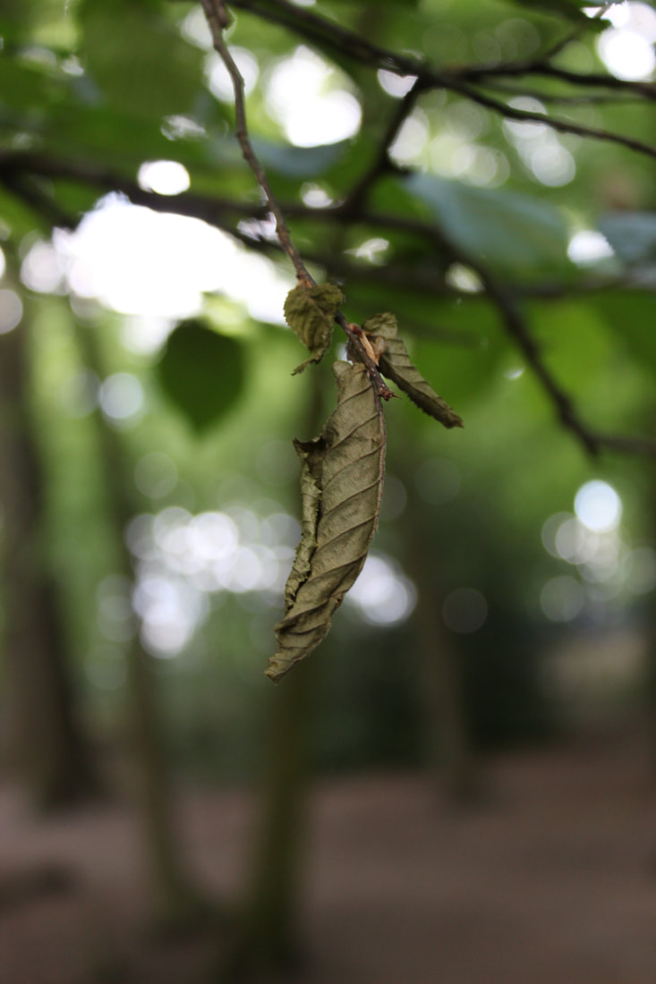
This is one of my favourite photos by Relander due to the shards of bark which protrude from the side of the face, giving texture and depth to the photo. It also adds direction, leading to the leaves which branch from the top of the subject's head. Relander portrays the duality between humanity and nature, yet this photo represents the harmony they can come together to create.
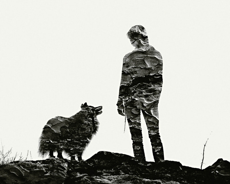
Double Exposure
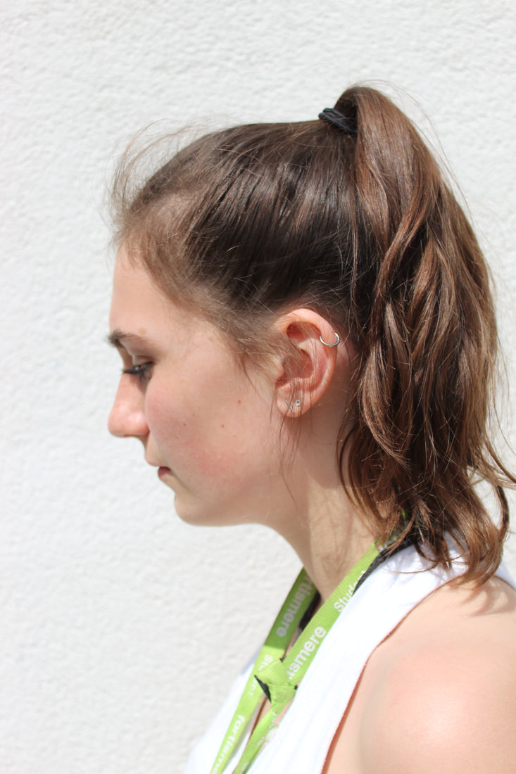
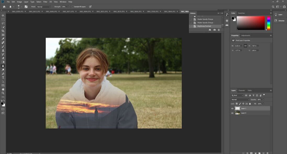
Double exposure is a technique of blending two photos together which Christopher Relander uses to create his images fusing nature and portrait photography. I took a portrait photo and combined it with a photo of an aspect of the natural world as Christopher Relander does.
My original photos are below, followed by the edits I created using the double exposure editing method.
My original photos are below, followed by the edits I created using the double exposure editing method.
|
|
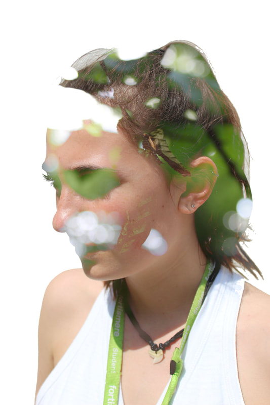
This is my favourite double exposure photo I created because her eye and the surrounding shadow has been concealed with the blurred green of the background. This was created by using a shallow depth of field when shooting the photo of the leaf. I wanted to replicate Relander's style with a more subtle twist, so her face is still visible through the overlayed image.
|
|
I like this photo because of the inverted colour of the nature, creating an alternative view of looking at the photo and it is not instantly clear what the background is of. Although I believe, my photos clearly reflect my intentions of this task due to the careful editing and good focus of the photos, I could further improve by experimenting more with colour, a background and different compositions. I could add more than one image of nature to enhance the effect of duality.
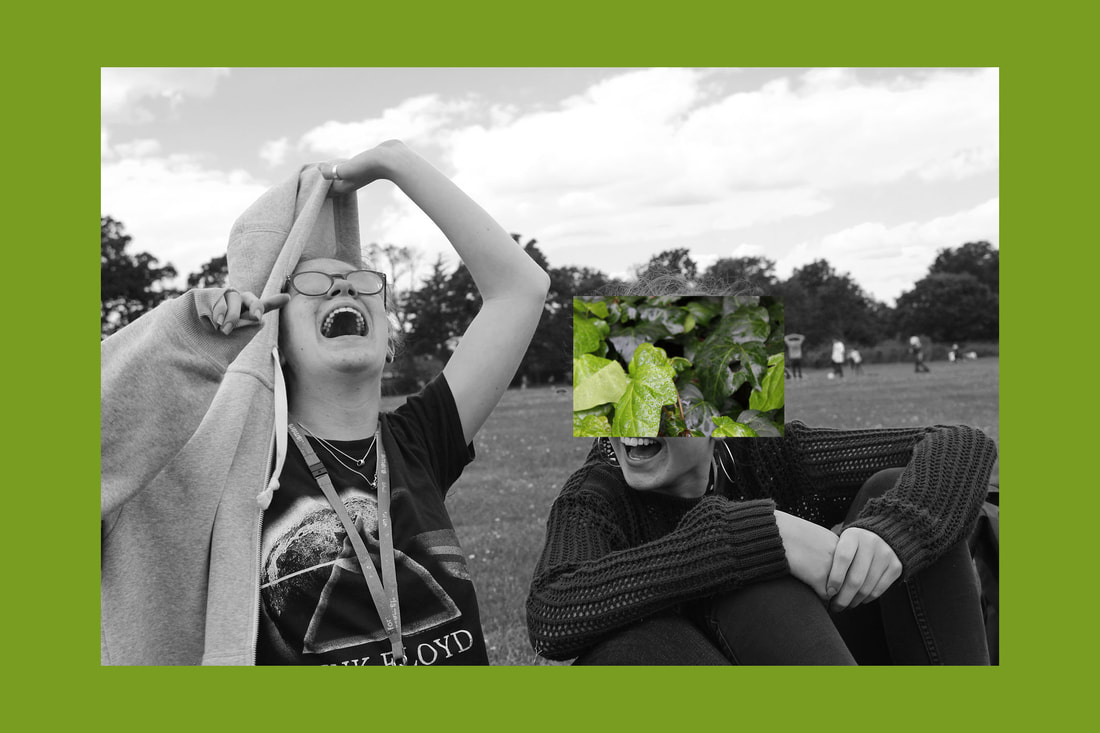
The Force of Nature
In this task I wanted to represent the contrast between the natural world and the man made structures which surround it, and the battle nature faces to reclaim its territory using simply its own force.
|
|
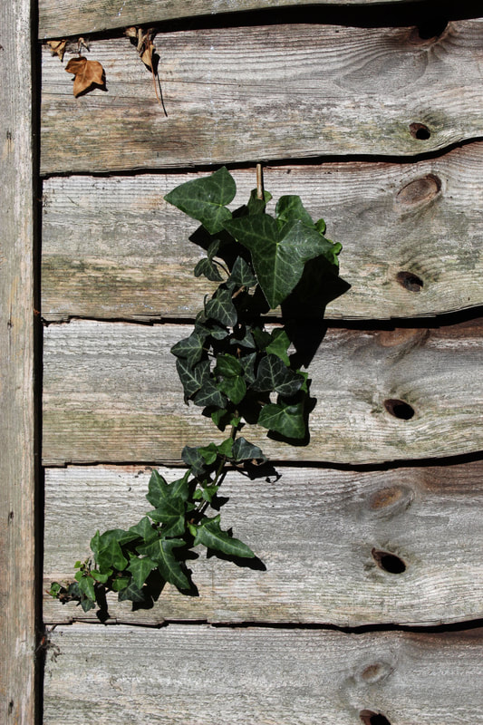
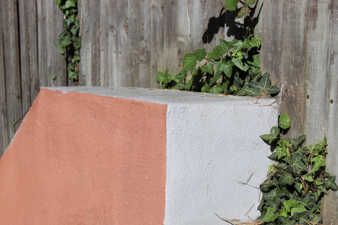
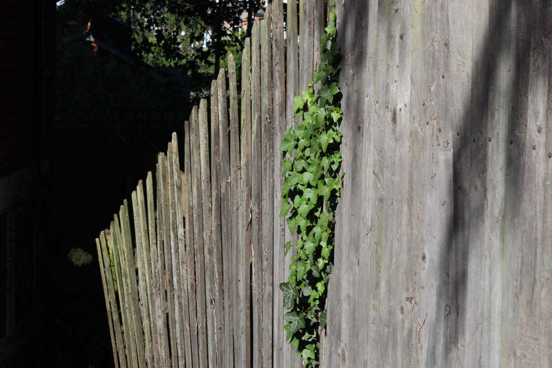
The best part of these photos is the contrasting colours I used, as well as incorporating many of the the formal elements such as line, colour and shape. I could find other elements of nature that reclaim territory other than mainly focusing on ivy.
Multiple Exposure
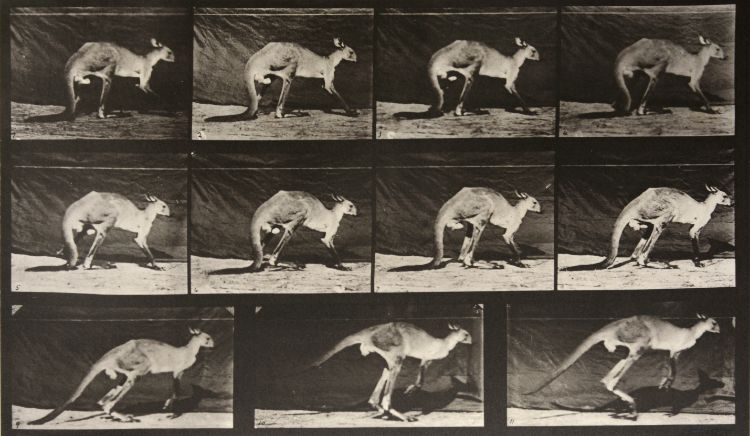
Eadweard Muybridge
Eadweard Muybridge was an English-American born in 1830, and was one of the first photographers to experiment with multiple exposure and taking many photos in sequence. He aimed to capture 'motion in stop-motion' images, and first used many cameras set up in a row to take photos of animals moving. This contact sheet of many photos of a kangaroo shows the progression as the kangaroo moves forward.
My Response
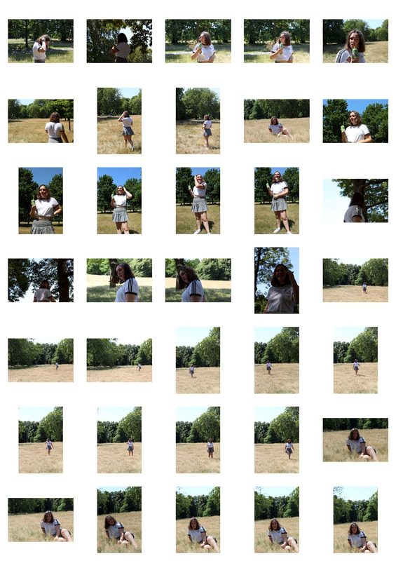
In my response, I intended to reflect Eadweard Muybridge's style of photography in a more modern way by putting all the images into one of the photos to show all the photos side by side. I took multiple photos, aiming to stay in the same place whilst Daphne moved. I then combined all the photos into one to give the repetitive effect.
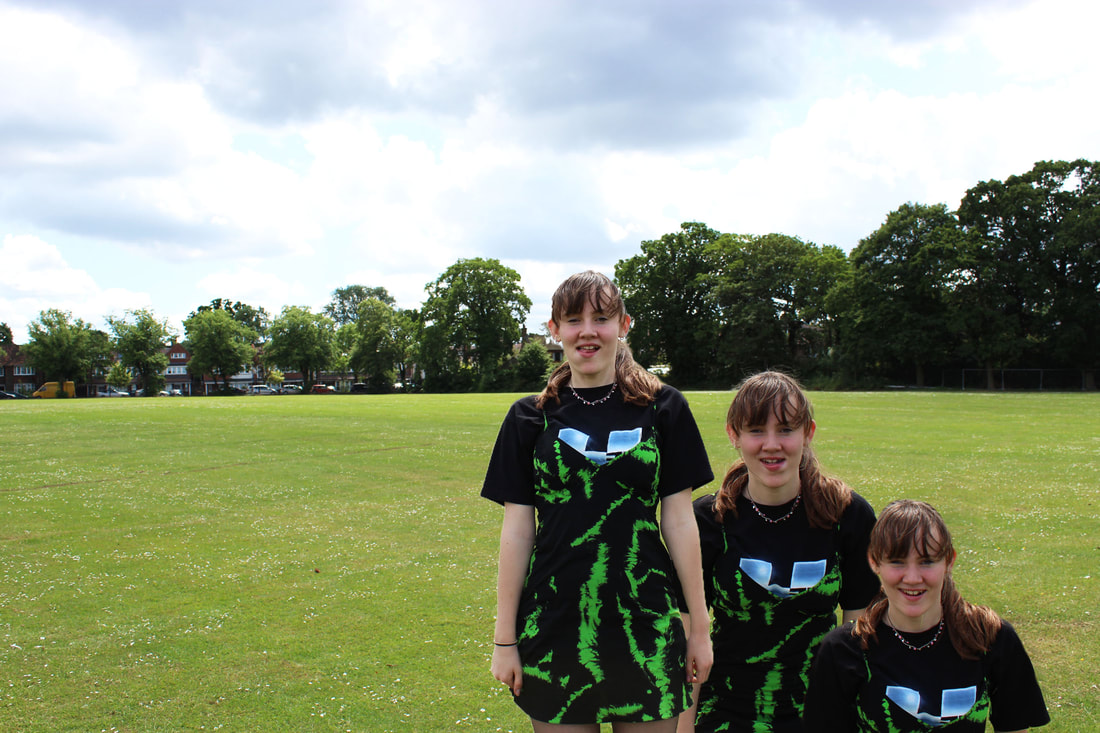
The editing method was fairly simple as all I had to do was erase around the subject, however this was made more difficult as I had not stayed in the exact same position when taking all the photos. I should have used a tripod to ensure my camera was steady and I didn't move.
The subject is in the frame and each photos of her blend together quite well, but I could take more photos and do different poses other than just standing and kneeling, eg. more depth and movement. This would make the photo more interesting to look at, as it is quite plain. My erasing was not always accurate, which ruins the smooth, seamless effect at the edges.
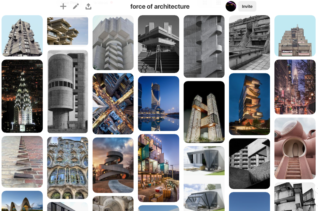
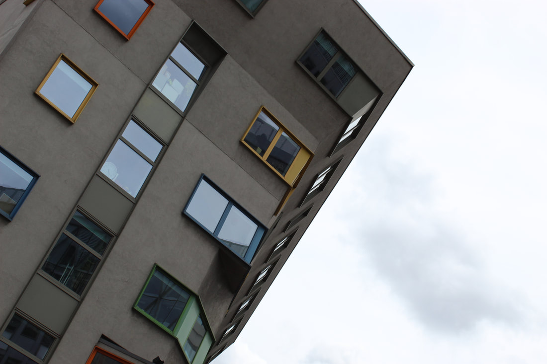
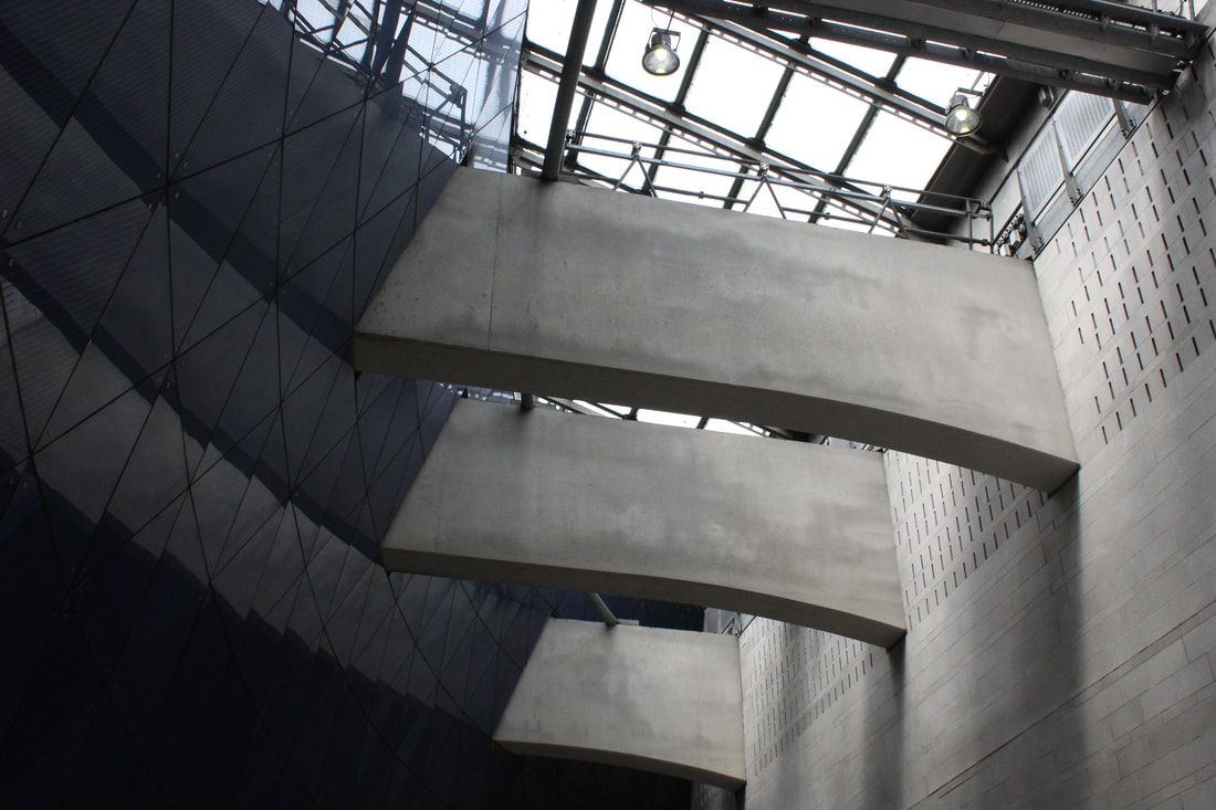
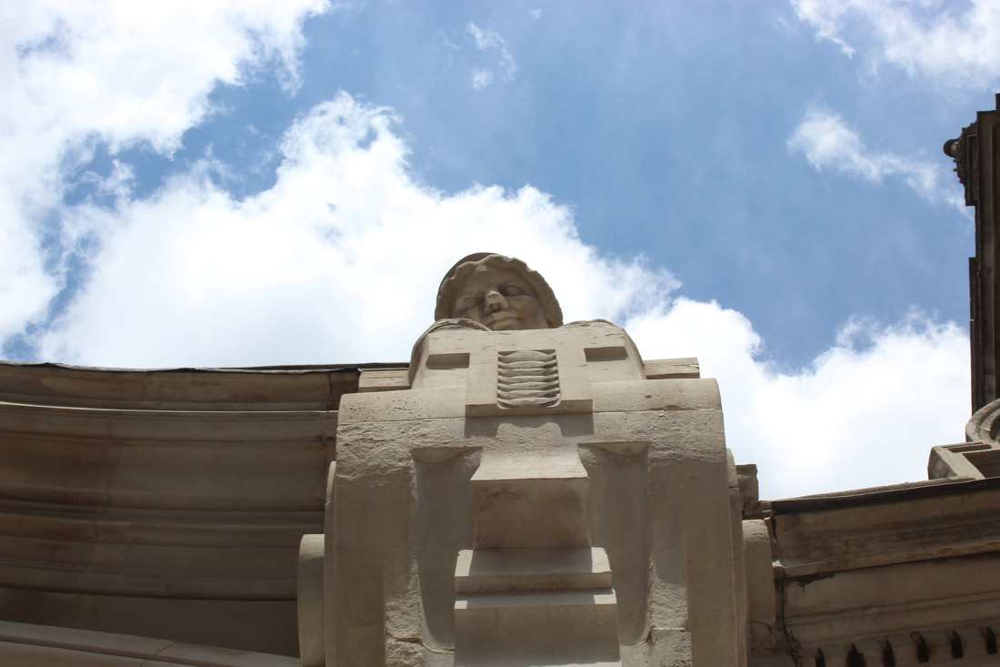
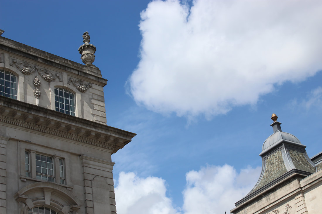
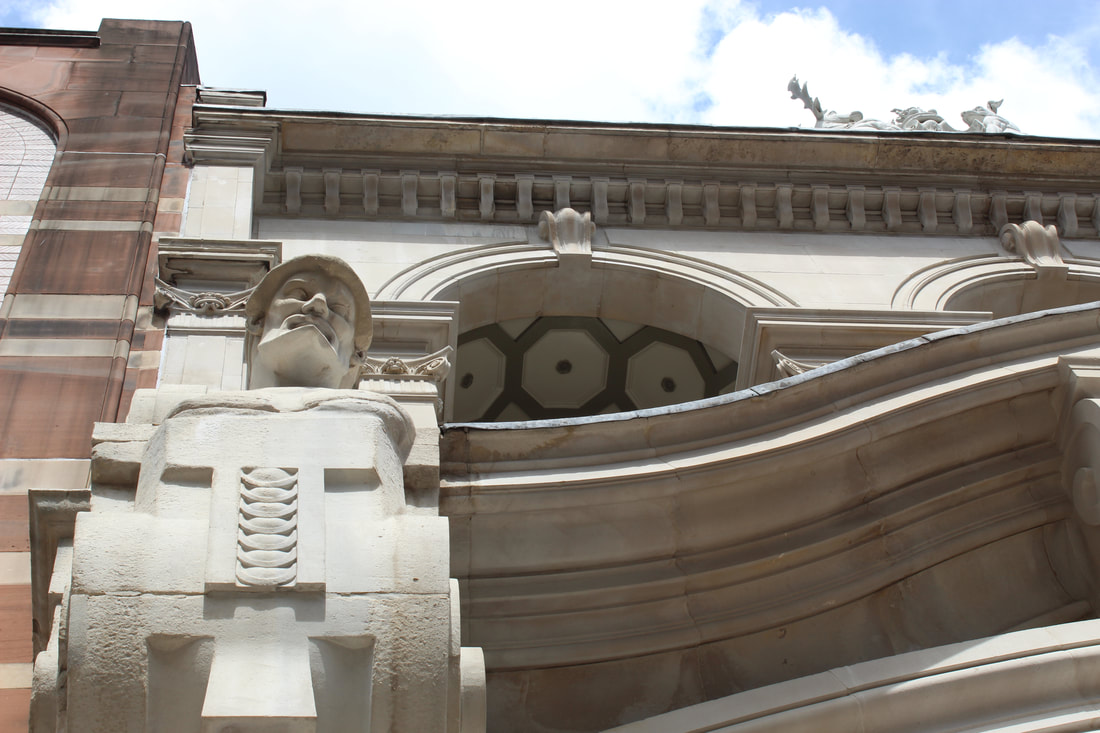
Force of Architecture
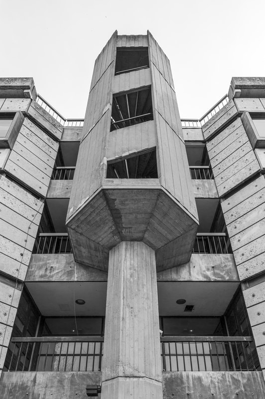
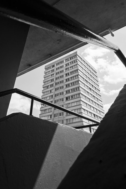
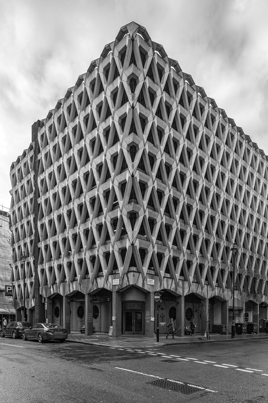
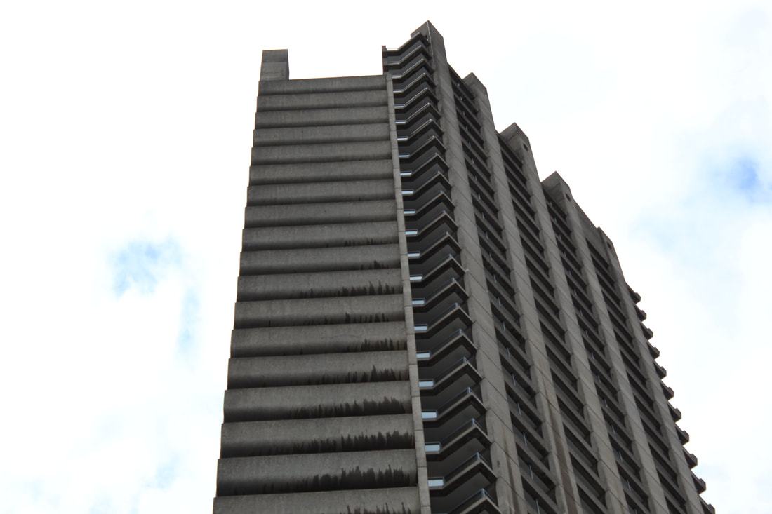
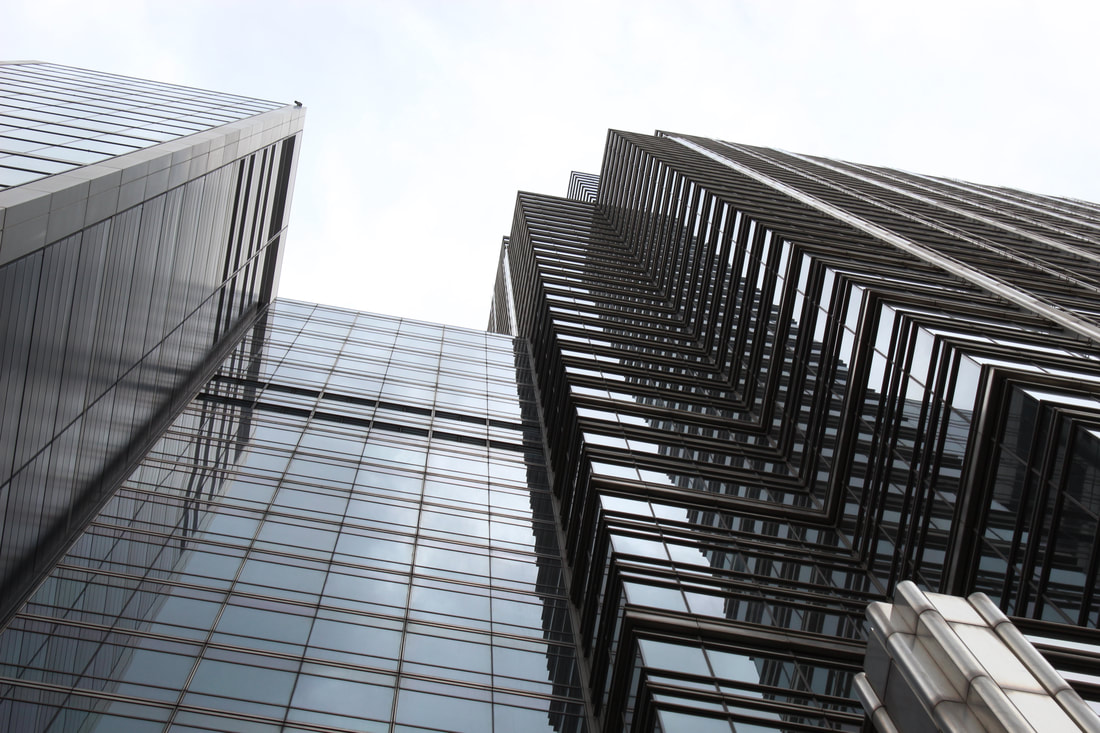
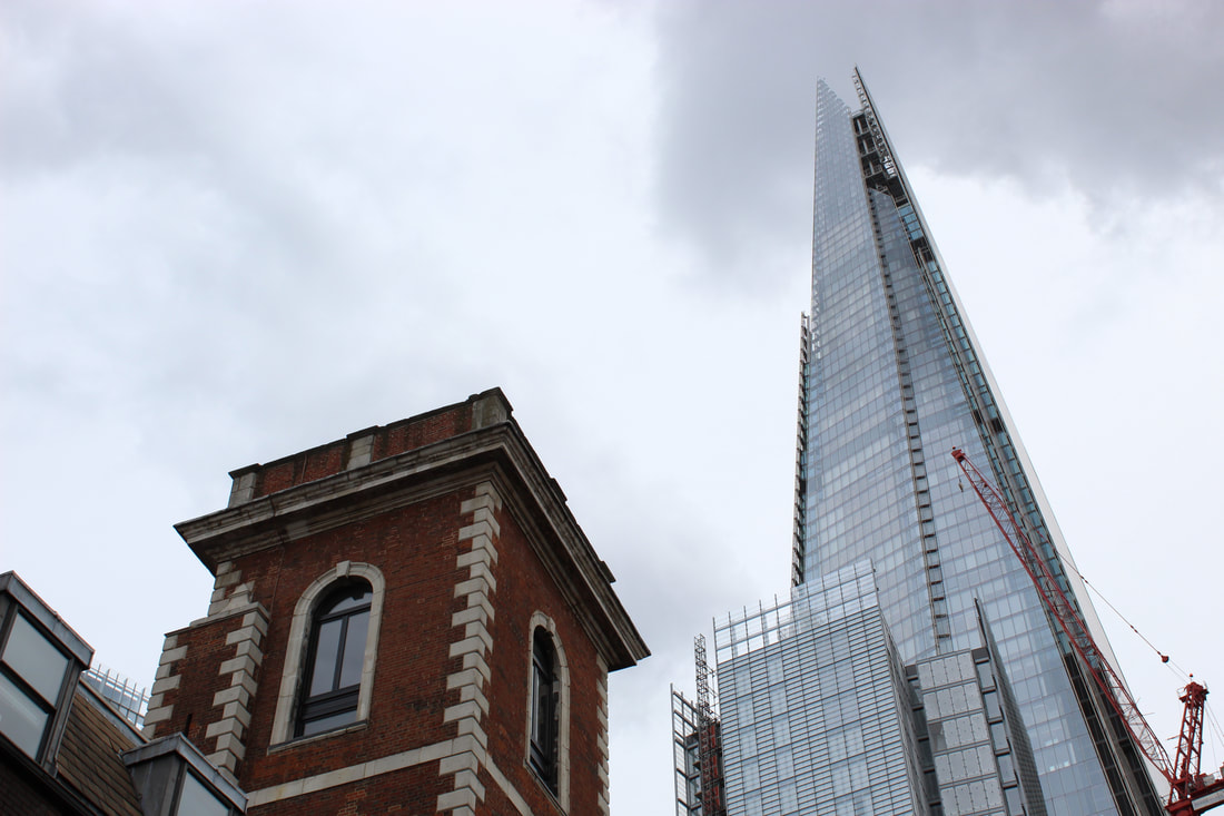
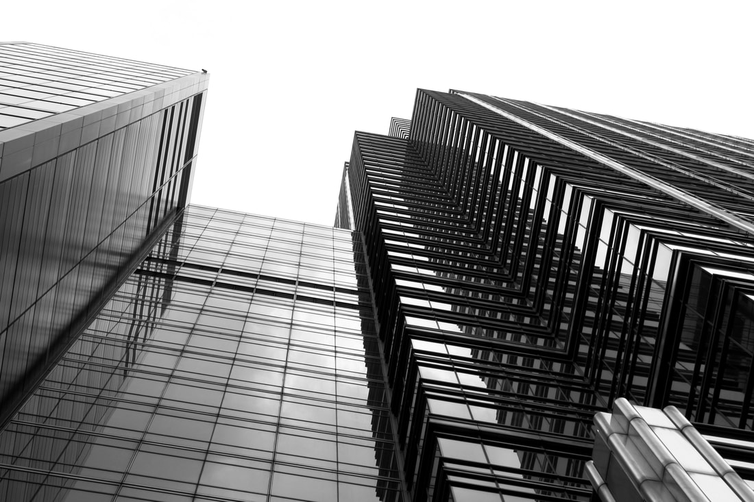
Simon Phipps
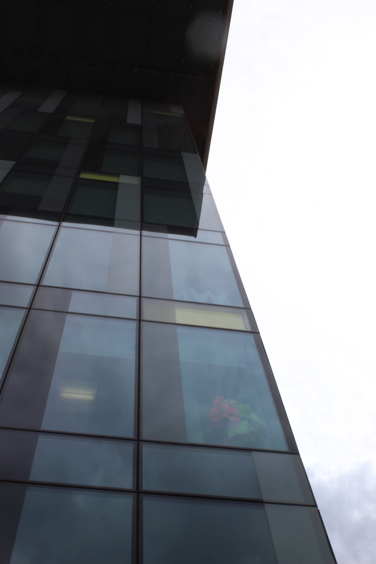
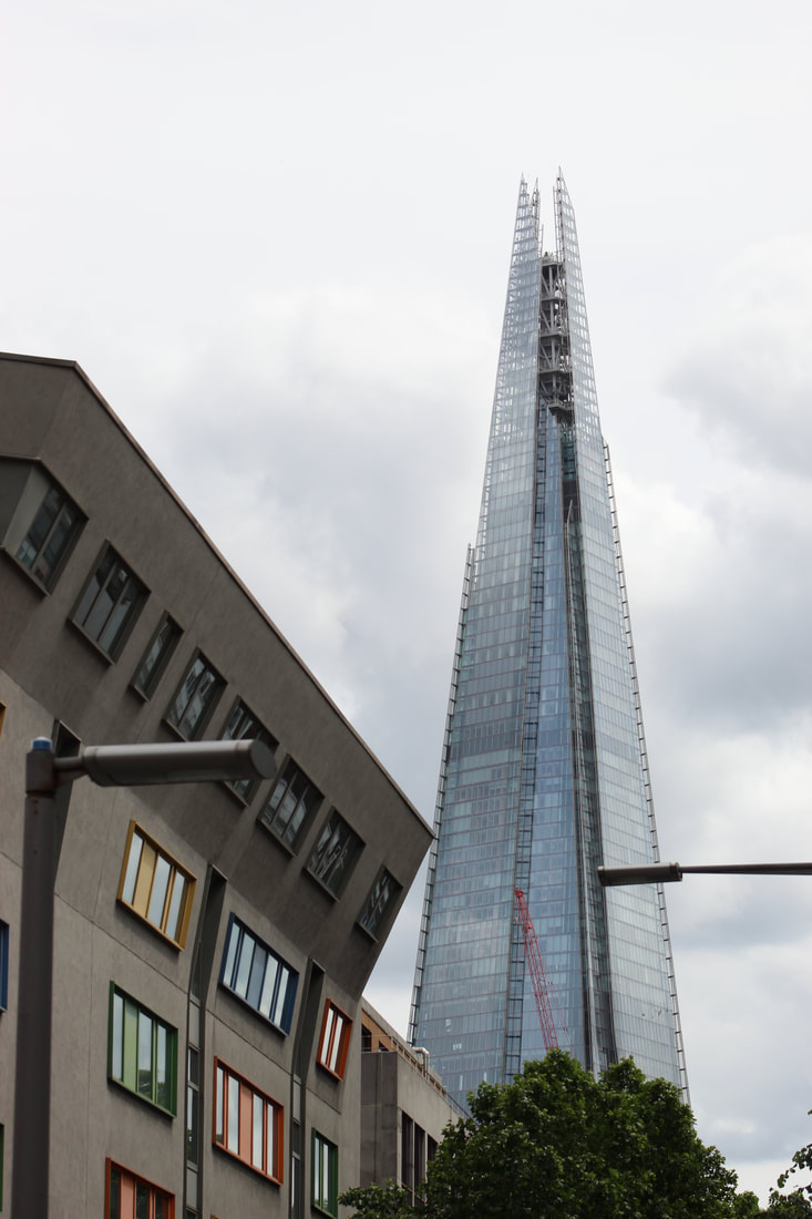
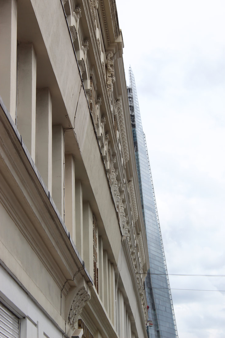
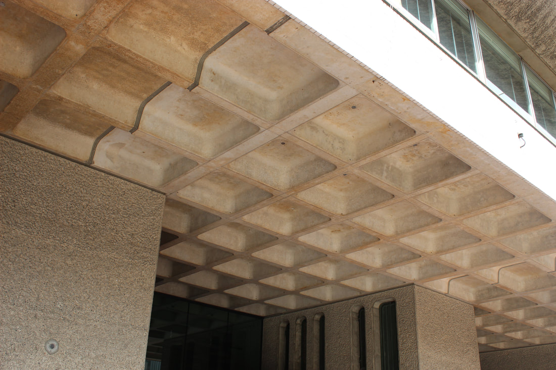
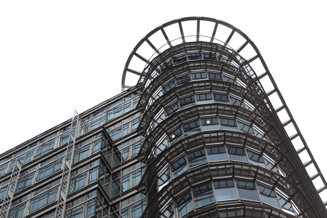
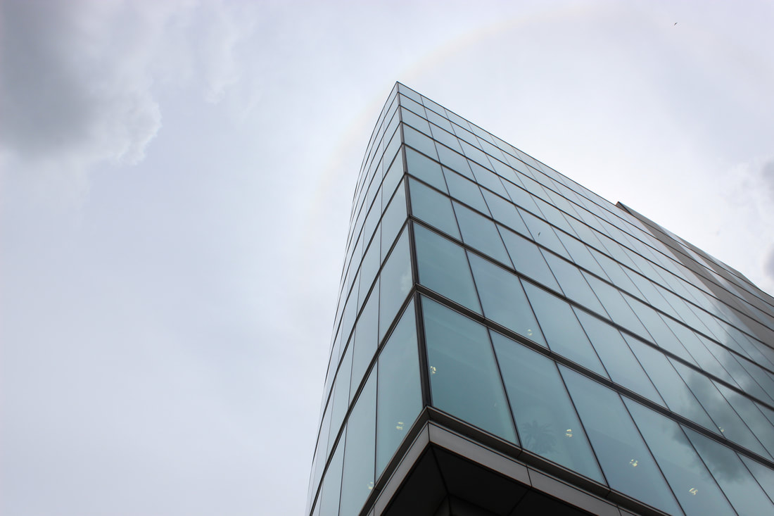
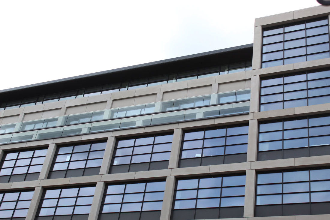
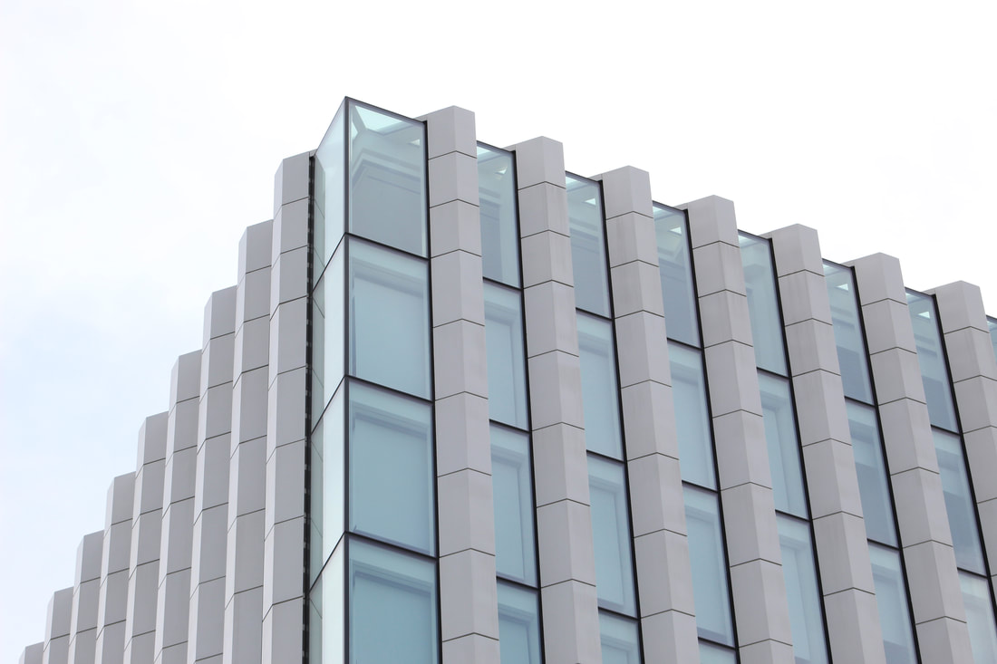
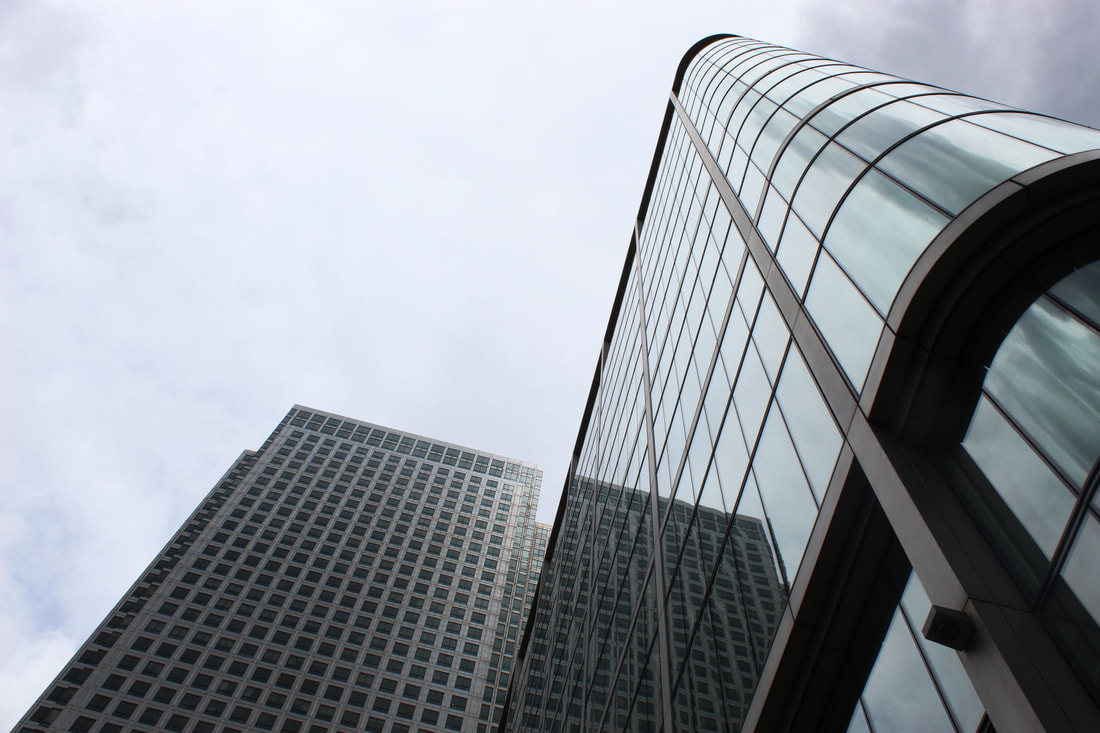
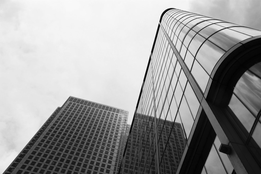
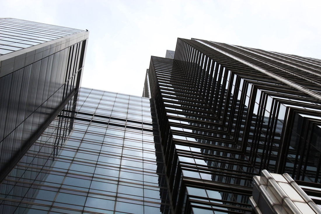
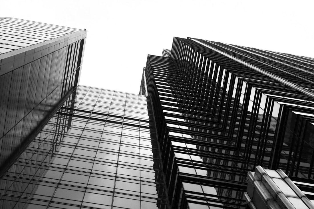
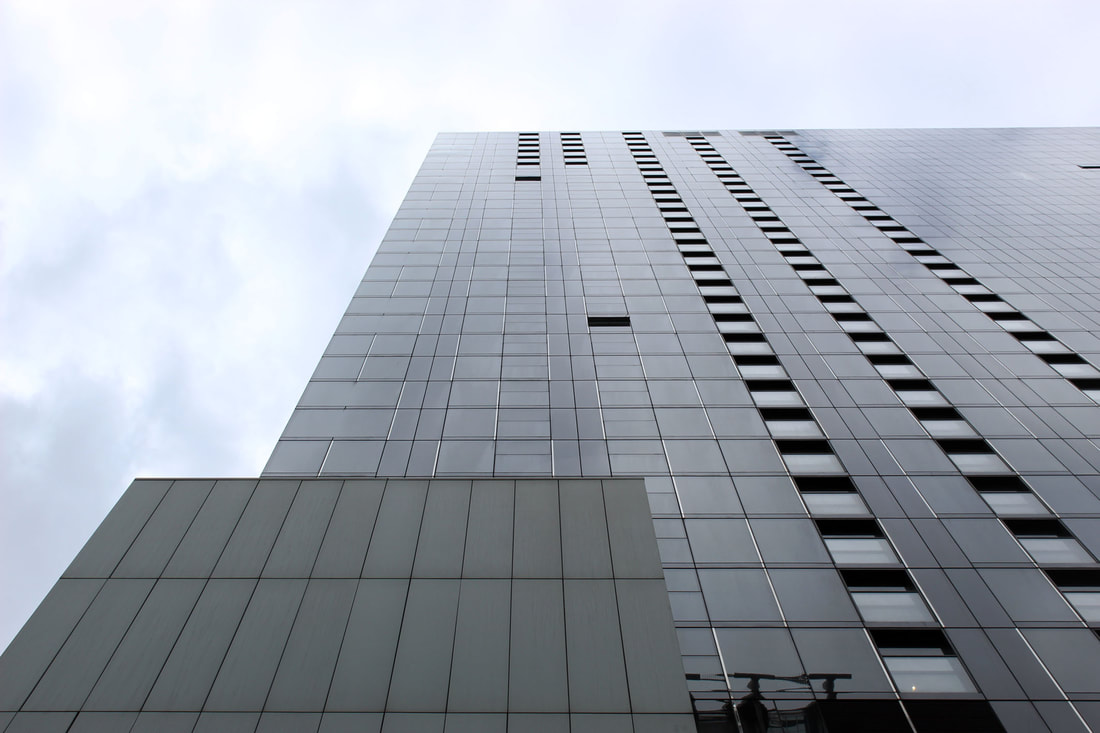
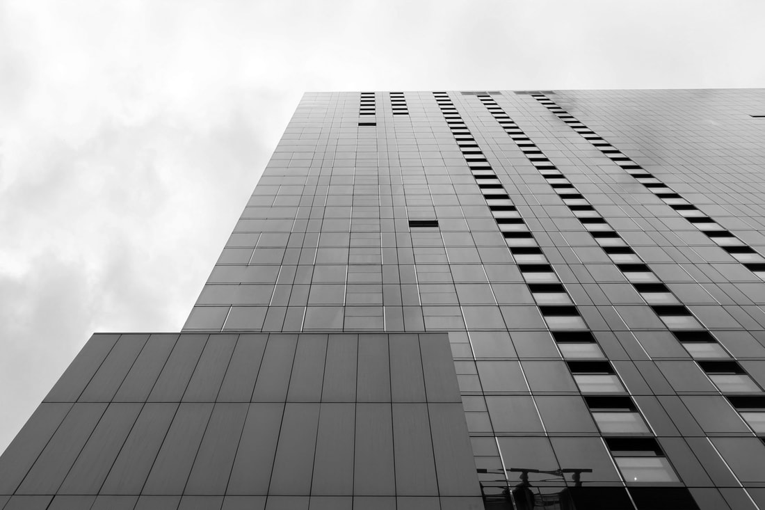
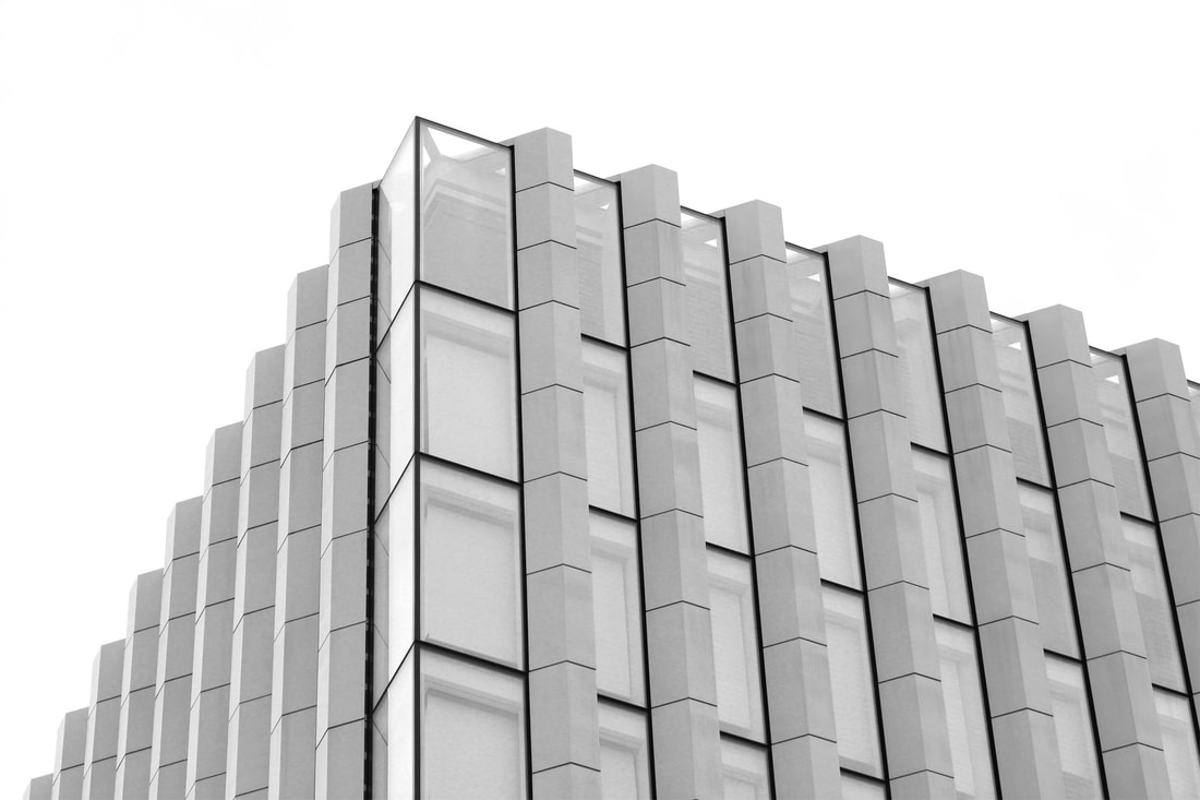
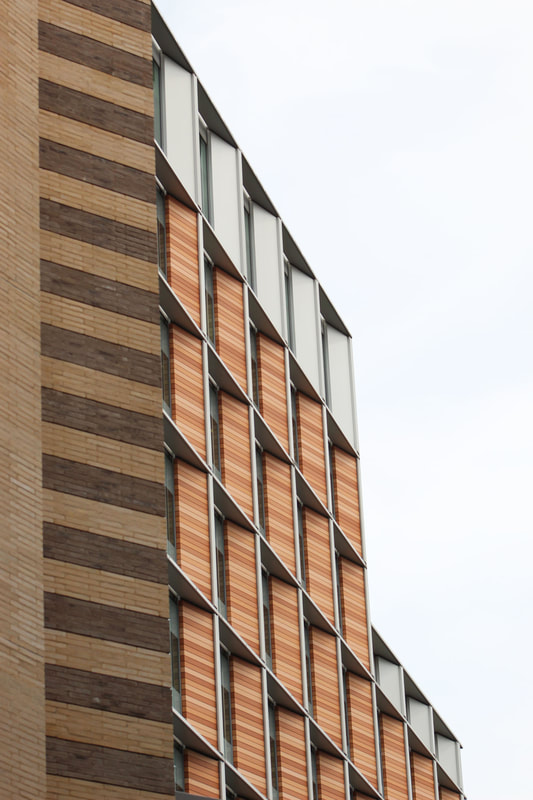
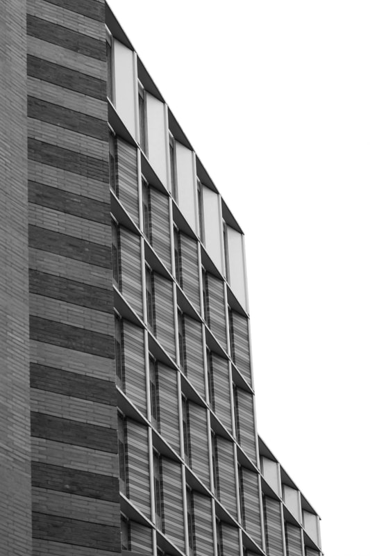
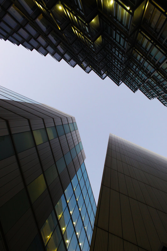
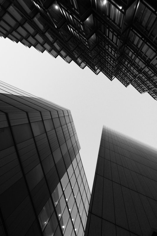
Simon Phipps takes photos of individualistic, quirky buildings, often in the UK. He is focused on modernist and brutalist architecture, which is usually plain and grey and doesn't aim to hide the material the building is made of. By placing a black and white filter over his images, he makes us focus more on the shapes and composition within the image, rather than the colours of the image. It also makes the varying textures and tones in the photo more distinct. I was inspired by his use of perspective and the importance of lines and geometric shapes in his images.
|
|
|
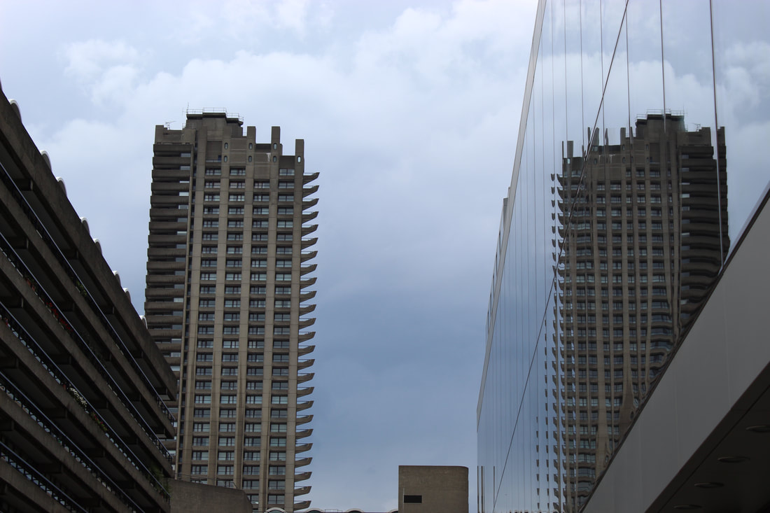
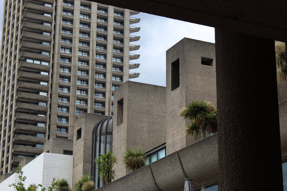
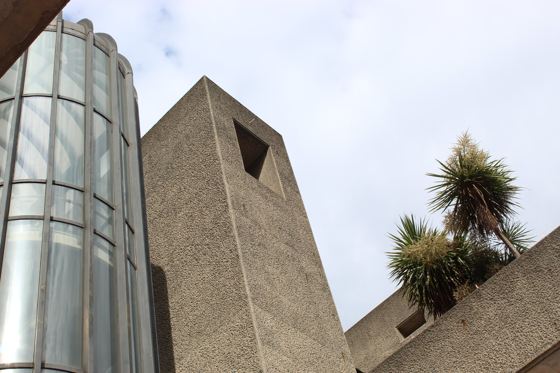
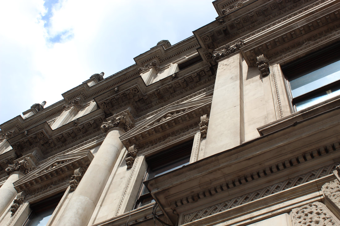
My Response
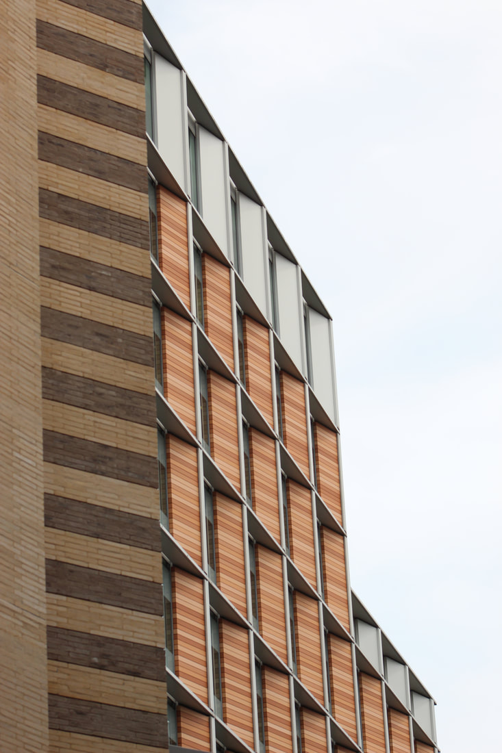
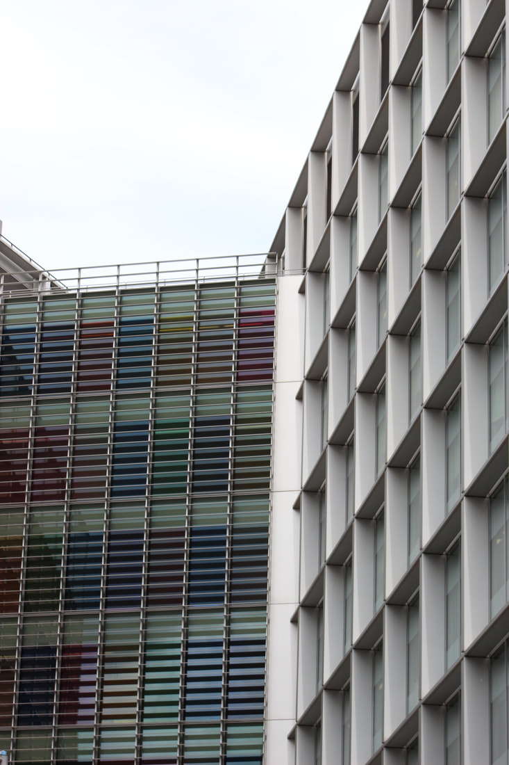
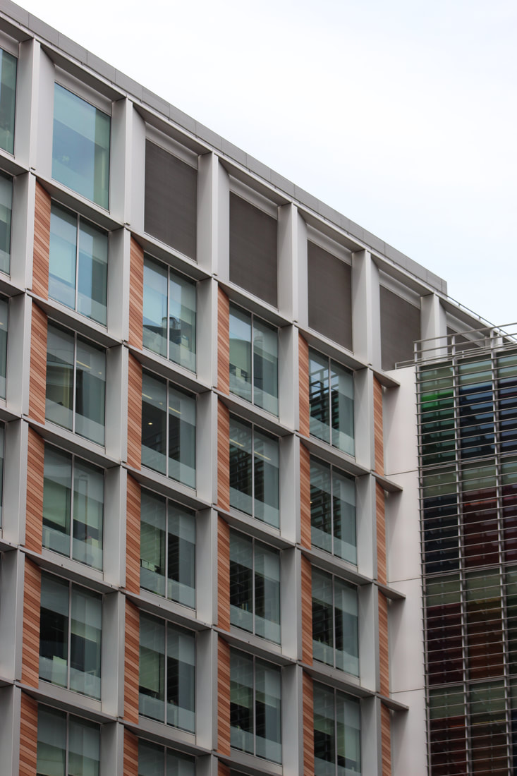
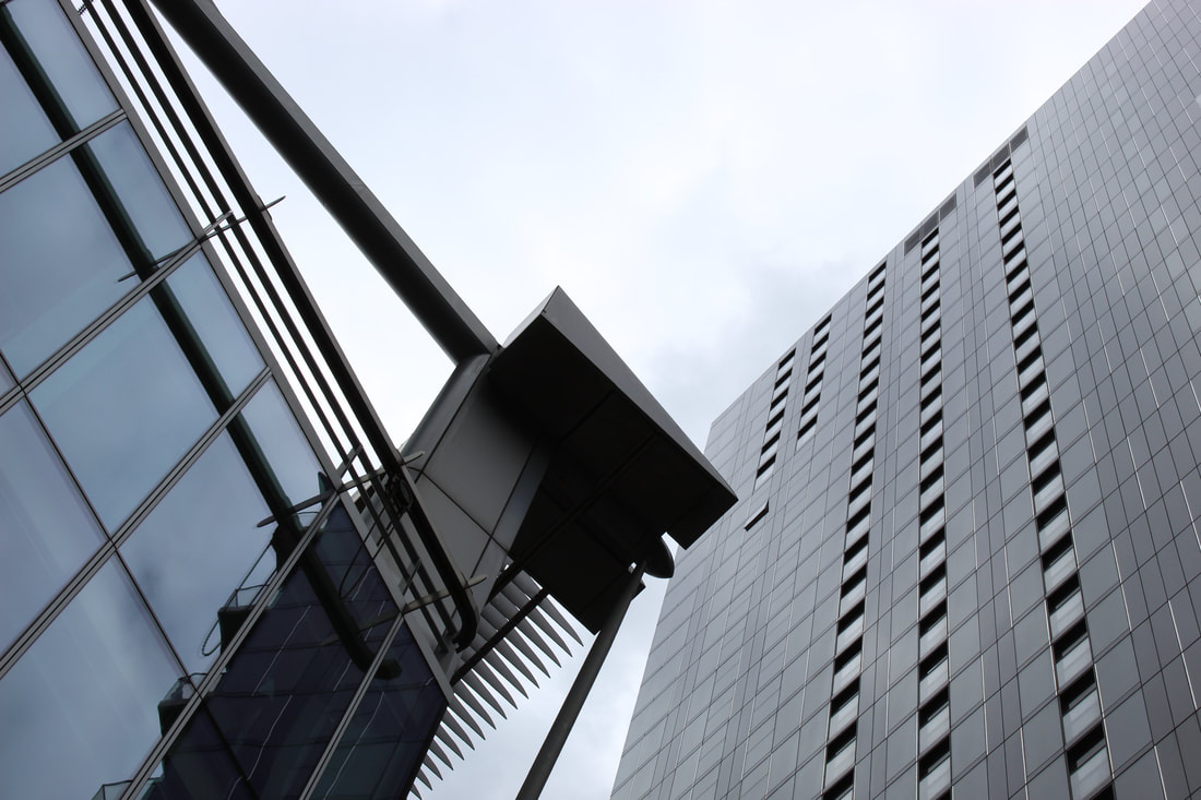
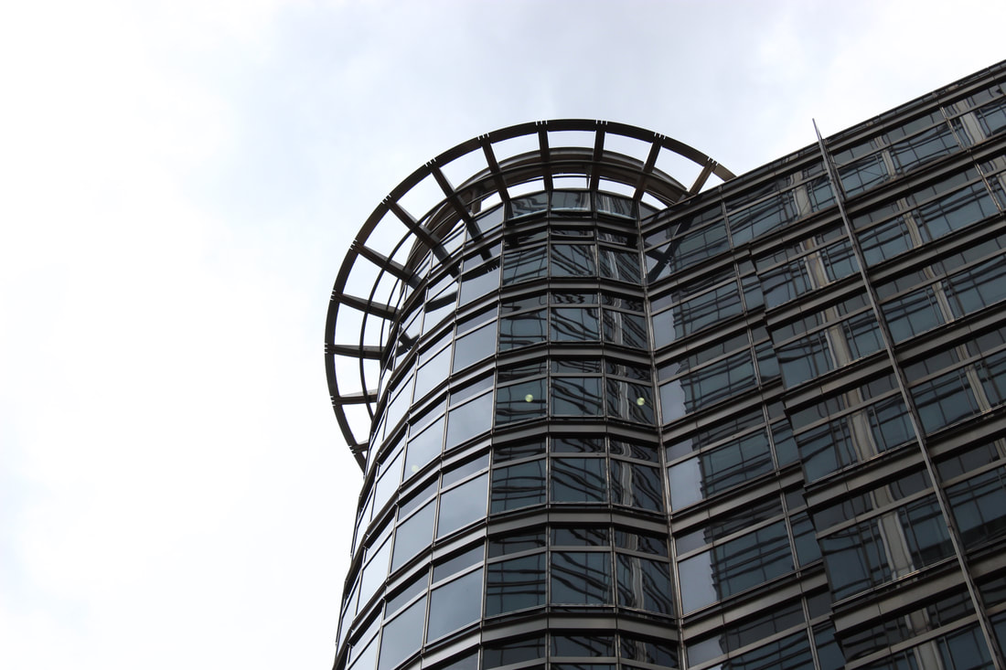
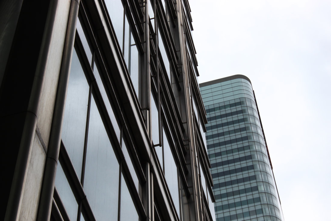
In this task I wanted to show the power architecture has and how it can change the atmosphere and feel of the surroundings depending on the materials used and perspective. I enjoyed taking photos from unusual angles and looking at buildings in ways which I wouldn't have noticed or appreciated if I hadn't been focused on them.
|
|
|
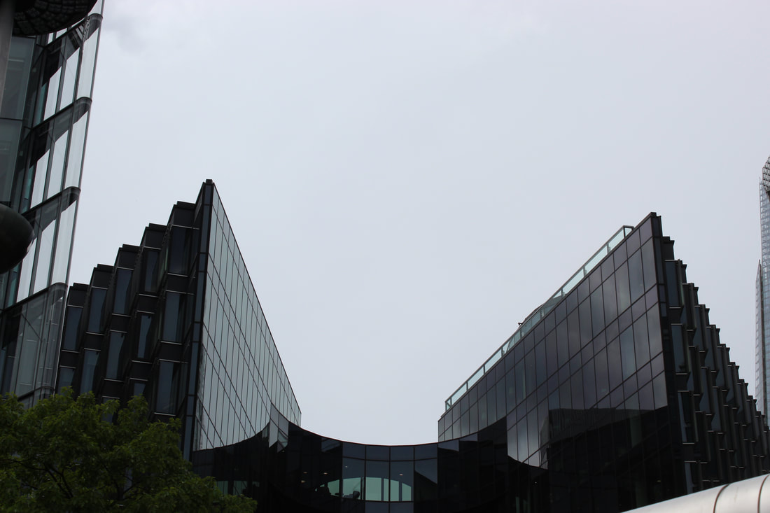
These are my favourite photos I took for the three strands, Negative Space, Line and Perspective, and Geometric Shapes. I like how they all appear to tower above the viewer because of the angle of the camera. To reflect Phipps' style more closely I also included the images in black and white.
Negative Space
Negative space is the plain area of the photo which surrounds the subject. The use of it is effective as it can direct the viewer to what part of the photo they should focus on and removes distraction from the photo.
Line and Perspective
Lines are used as a direction for the eyes to follow in the photo. Perspective is the angle and distance from which the photo is taken. They are important for the photographer to consider so they can deliver the message of their photo clearly to the viewer. It gives the photographer control of what the viewer will ultimately see in their photograph.
Geometric Shapes
Geometric shapes are used to create interesting and often unexpected compositions in a photo of objects that might usually be seen as bland and dull.

WWW: I took lots of photos of interesting architecture incorporating most or all of the formal elements.
EBI: Try and get some perspectives from above as well as from below or to the side.
EBI: Try and get some perspectives from above as well as from below or to the side.
|
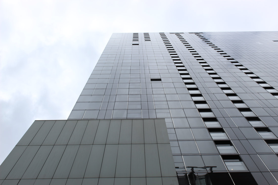
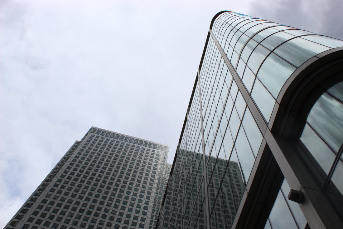
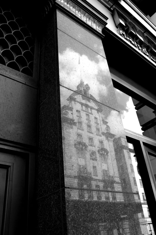
I think this photo is powerful due to the high contrast between light and dark and the unexpected smooth reflection of one building in another. This shows the decorative impact architecture can have on its surroundings, and adds a unique twist to an otherwise generally ordinary photo of a building. The low, side on perspective used creates a towering effect and creates lines which extrapolate up the photo, giving added sense of direction and purpose. |
|
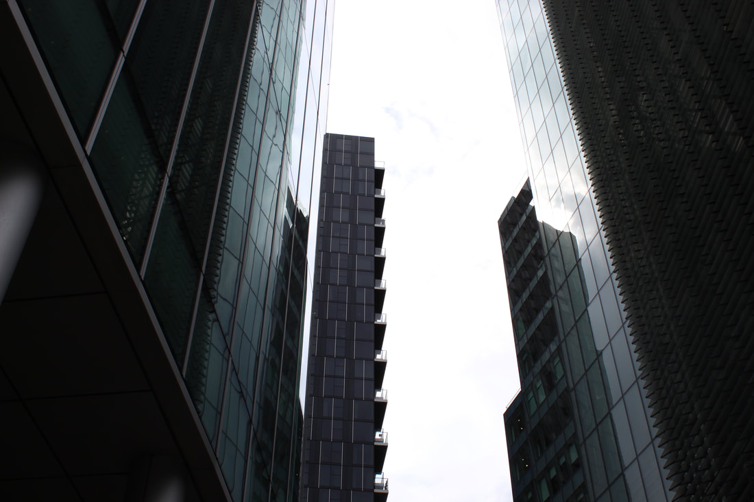
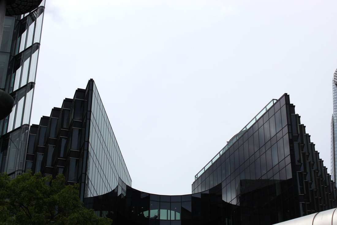
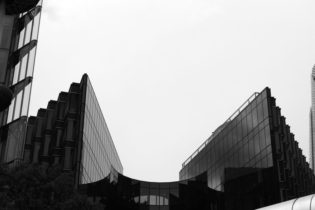
The recurring squares and perpendicular lines are what give this photo an interesting and quirky direction, as the structure appears to be unrealistic and exaggerated. The reflection of the outlines of the windows give an in depth feel, and the low perspective gives the ominous, looming sense. I like the use of negative space, as the towers seem to protrude into a blank, deserted area. The centre of the photo could be improved as in some areas it looks a little overexposed, so some of the lines are not as defined as they could be.
My Second Response
|
|
|
|
|
|
|
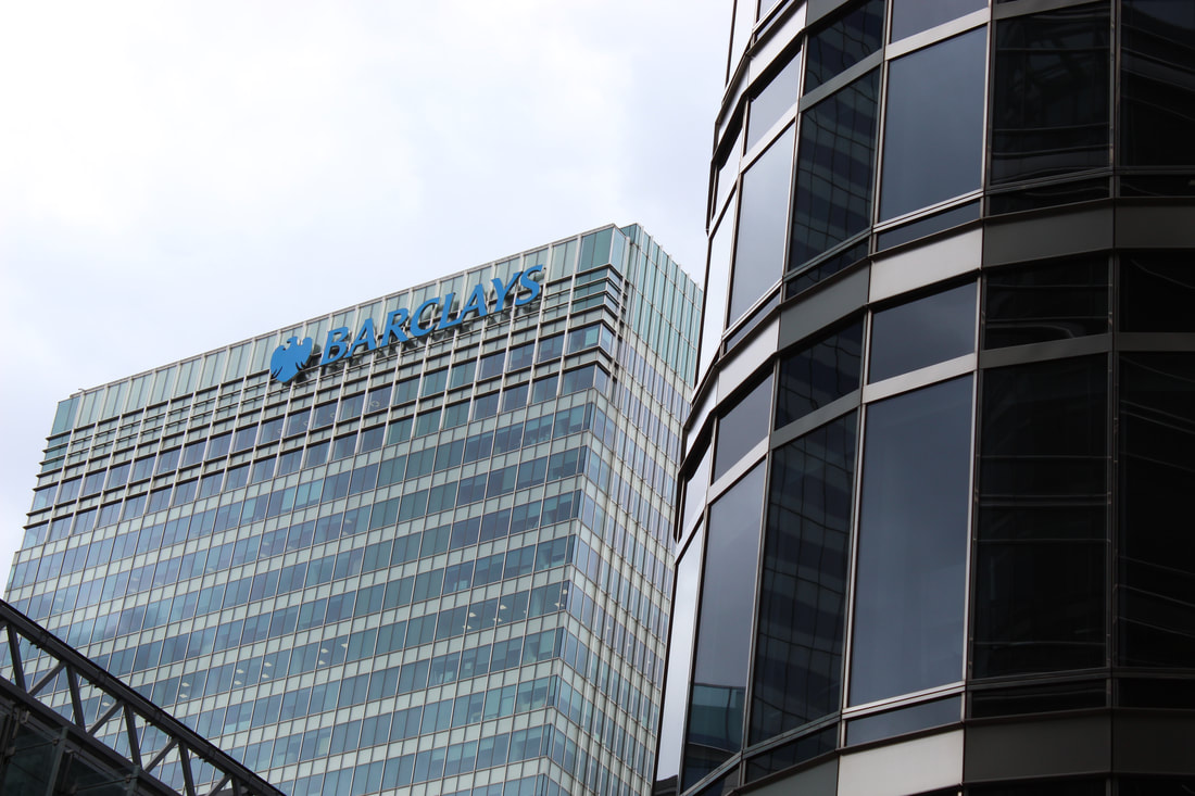
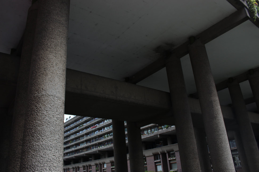
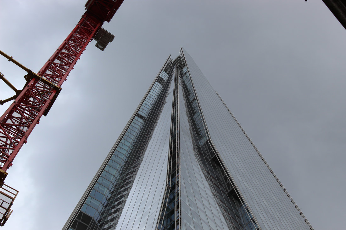
This is one of my favourite photos, as the perspective is from directly below the building and gives an ominous, towering feel. The jagged outline of the top building is enhanced by the straight parallel lines created by the other two buildings.
|
|
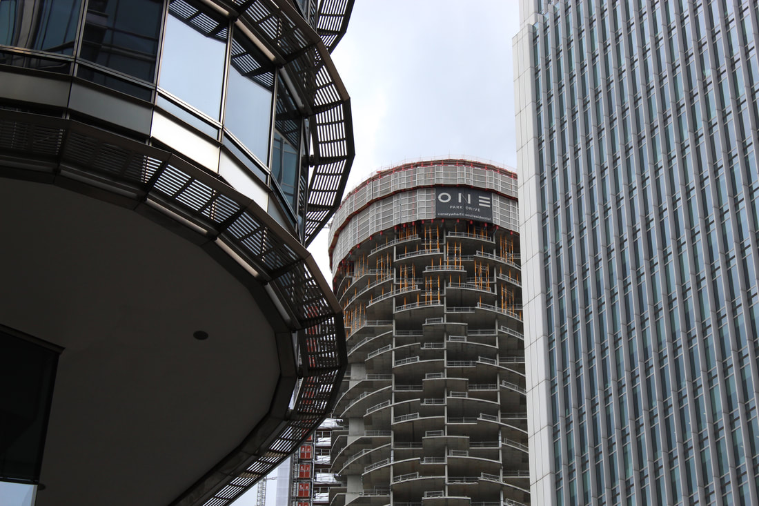
The use of negative space separates the main focus from the abstract looking building on the right, and the semi-opaque building shows a web of stairs which I wanted to represent the confusion and rush of city life. The calm, plain white negative space contrasts this and makes the buildings stand out more.
Three Strands of Reflection
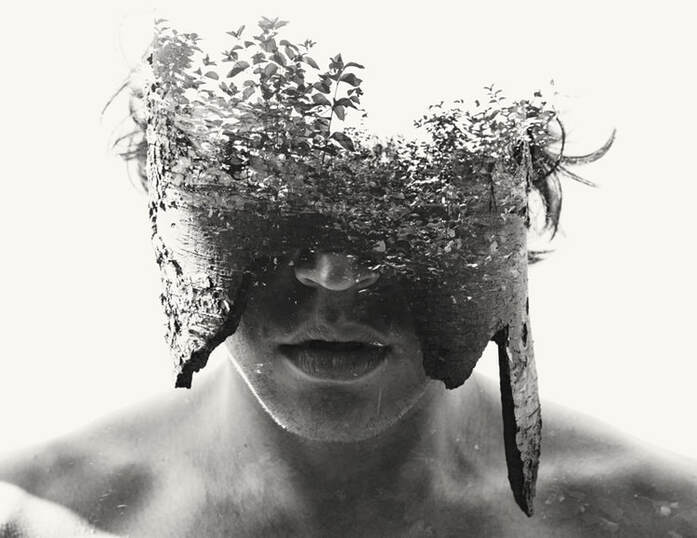
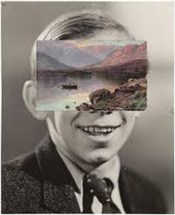
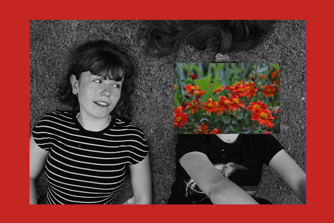
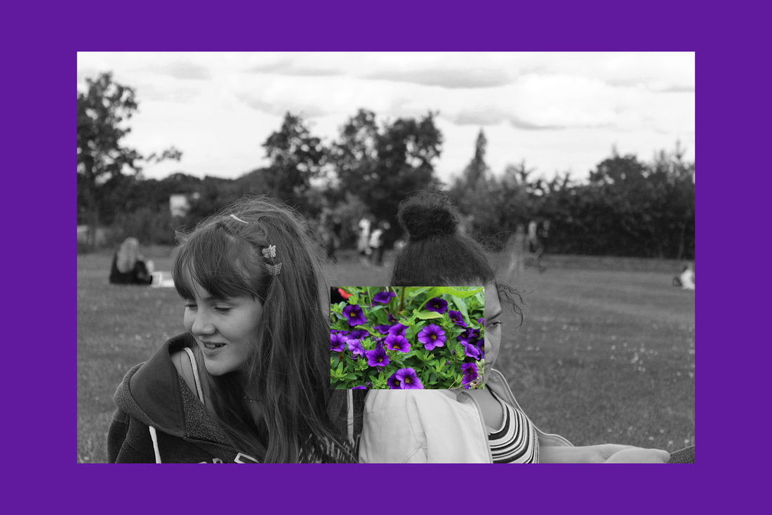
Force of Identity: John Stezaker - Mask Project
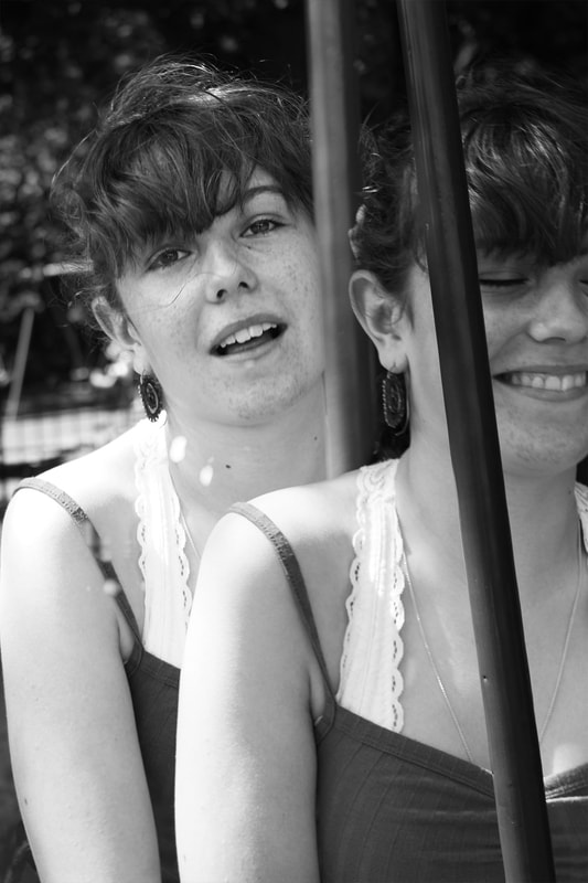
In his Mask Project, John Stezaker placed colour photos of nature over portraits of famous actors and actresses from the 1940s and 50s, concealing part or all of their face. Through erasure of the facial features, he makes the viewer consider the anonymous person's identity and expression behind the 'mask', which simultaneously opens a window to a completely different aspect of the world. I thought this was effective, as the contrast between colour and black and white makes the two photos polarize each other, and it is possible to see them separately and combined together as one picture.
|
|
|
My Response
Inspired by Stezaker's Mask Project, I took photos of my friends and family, and concealed parts of their face with photos I took of nature in my local area. To add my own personal twist, I also decided to add colour borders to make a key colour from the image of nature really stand out.
|
|
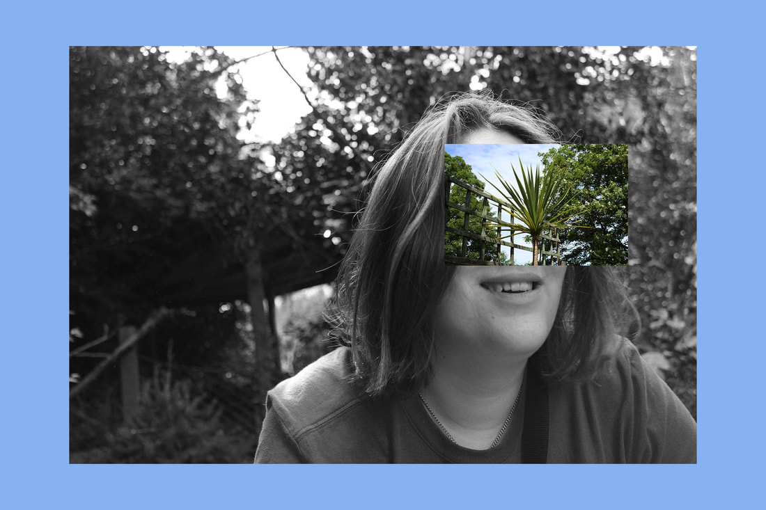
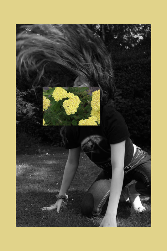
The way I edited and created these images was different to what I'd done before. First, I edited my photo of the subject to be black and white, as well as altering brightness, contrast and making any other minor edits to get my ideal portrait. Next, I created a plain colour background, using a key colour selected from the nature photograph and placed my edited portrait in the centre of it, creating the border around the picture. After editing my photo of nature, I placed it over a key feature of the person I was concealing.
WWW: Good contrast between the black and white photo and the coloured photo and border
EBI: Use more of the formal elements in my photos
EBI: Use more of the formal elements in my photos
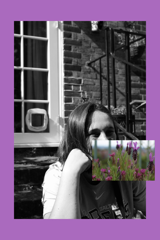
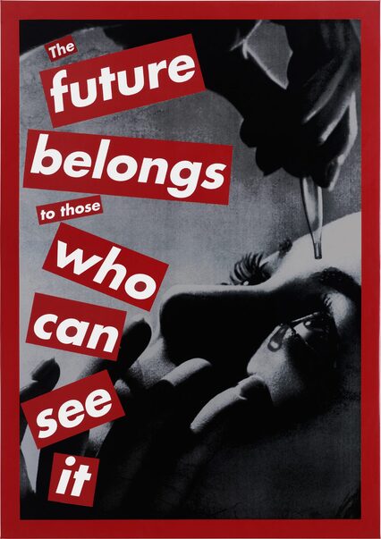
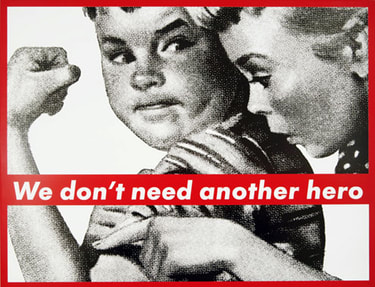
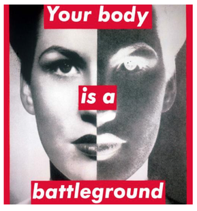
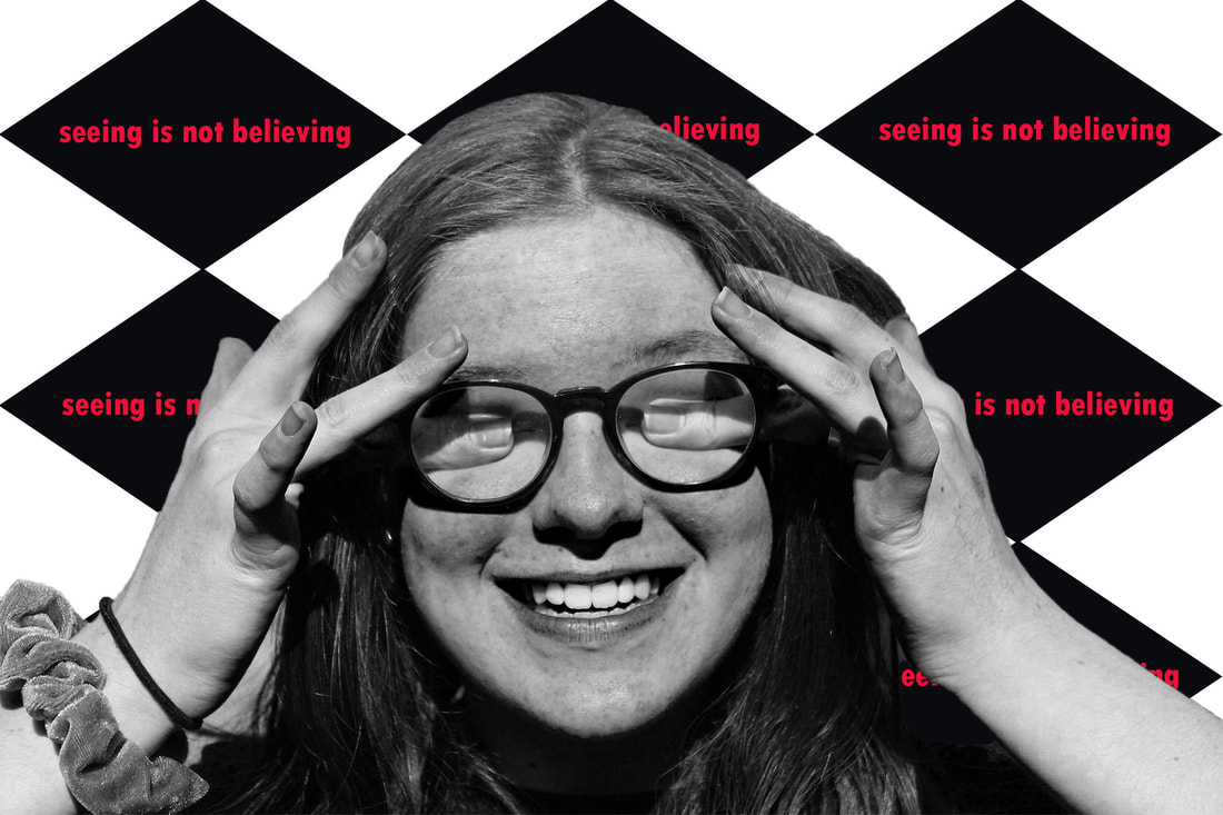
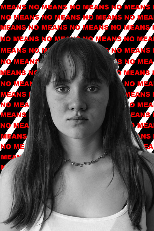
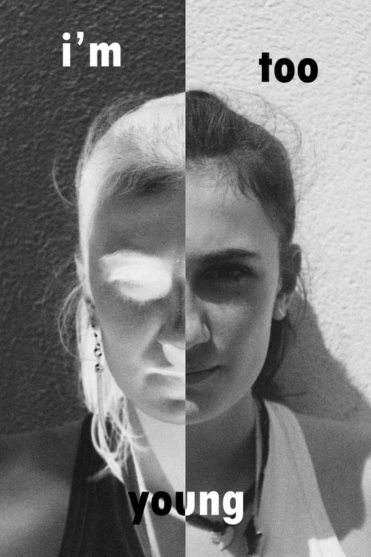
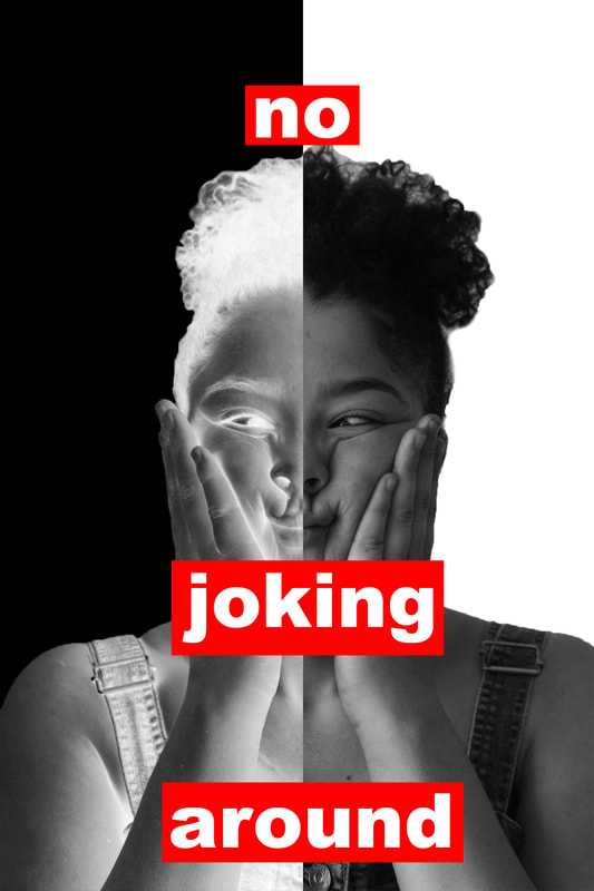
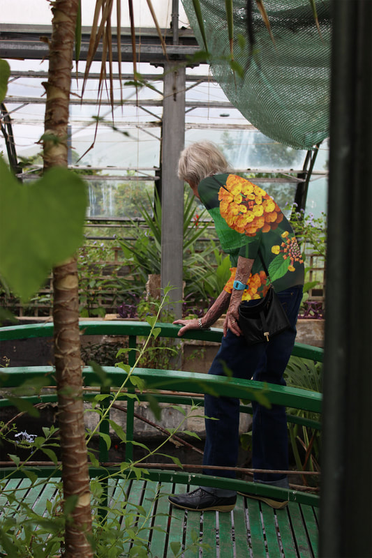
Force of Politics and Propaganda: Barbara Kruger
Barbra Kruger is an artist born in 1945, who specialises in collages. I was inspired by her feminist artwork to create protest photography through portraits. I made the messages of my photos intentionally inexplicit, so they are therefore open to interpretation. I like this as it adds a sense of mystery, which is less obvious in Barbra Kruger's original work.
|
|
My response
My editing method
|
For my first two images, I started by erasing the background behind the subject and edited their photo to be black and white. Afterwards, I placed them onto a blank canvas and used a shape stamp tool to create the patterned background. I completed the photo by adding the red writing.
|
|
|
For my last two photos, I began by making the portrait grayscale, and edited the contrast to add more tone. I also added grain to more closely replicate the old fashioned nature of Barbra Kruger's artwork.
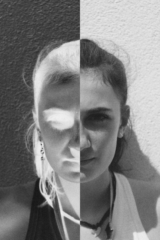
Next, I used the marquee tool to select a rectangular section that was exactly one half of the photo. I had made sure that in the photos I selected to use, the subject's features were centrally aligned to get the line straight down the middle of their face. I then inverted the colours on one side of their face to give the creepy, contrasting effect. Once again, I finished by adding the writing. WWW: My photos are original and yet still inspired by Kruger's work EBI: Take photos from different perspectives. |
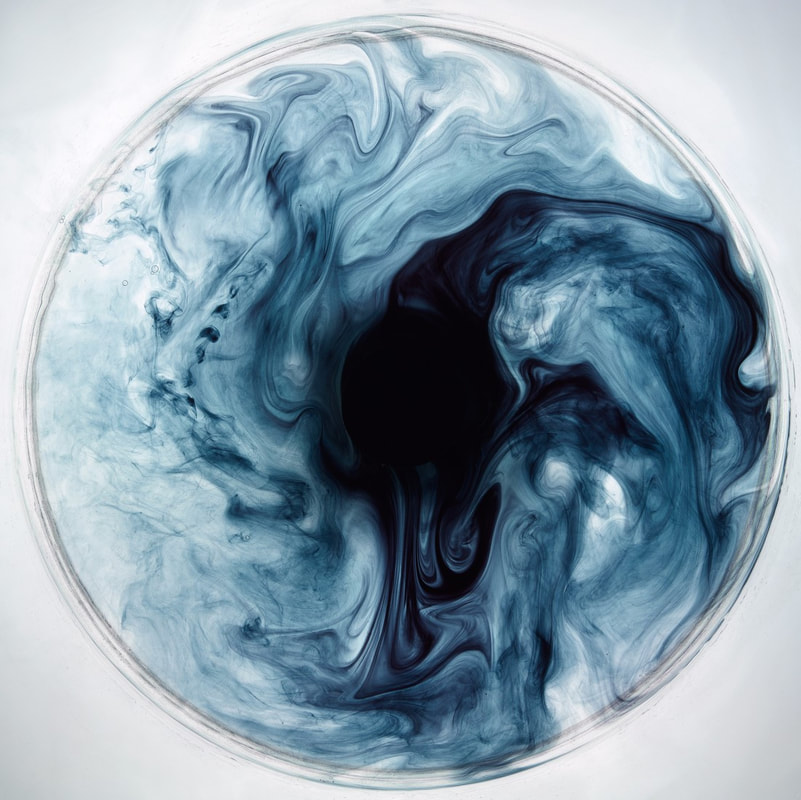
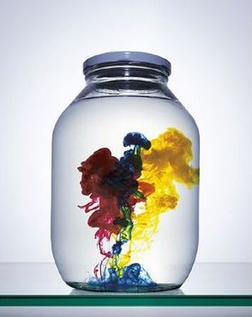
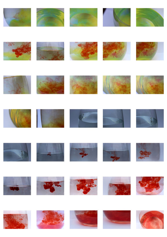
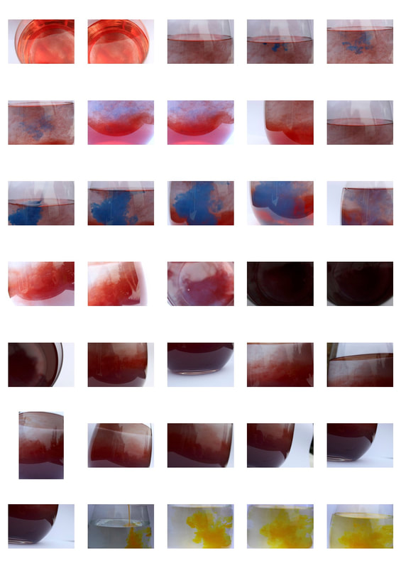
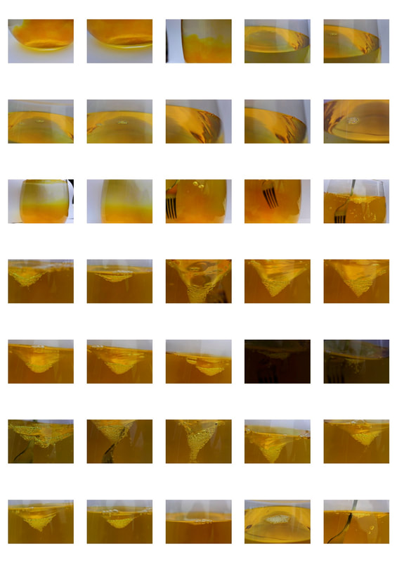
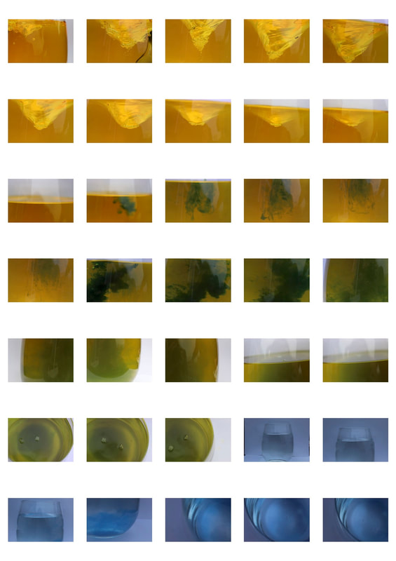
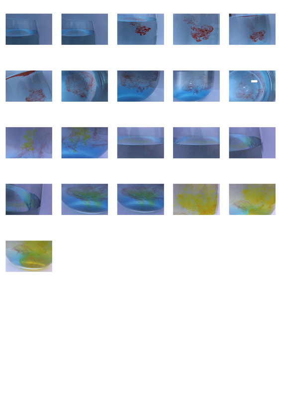
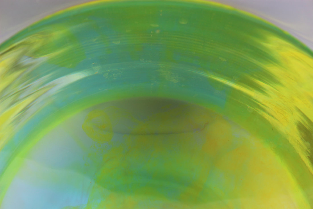
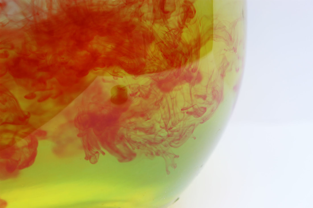
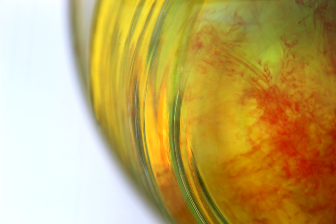
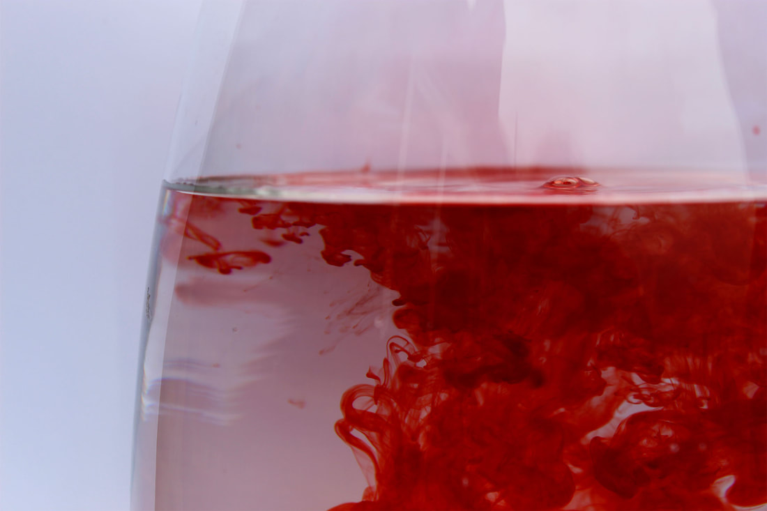
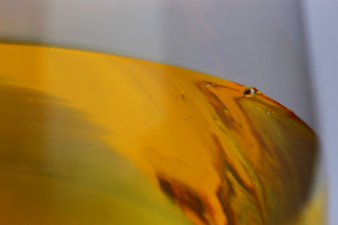
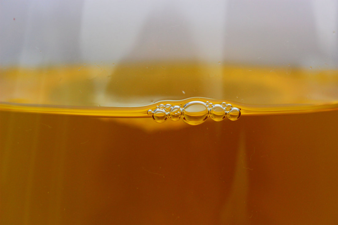
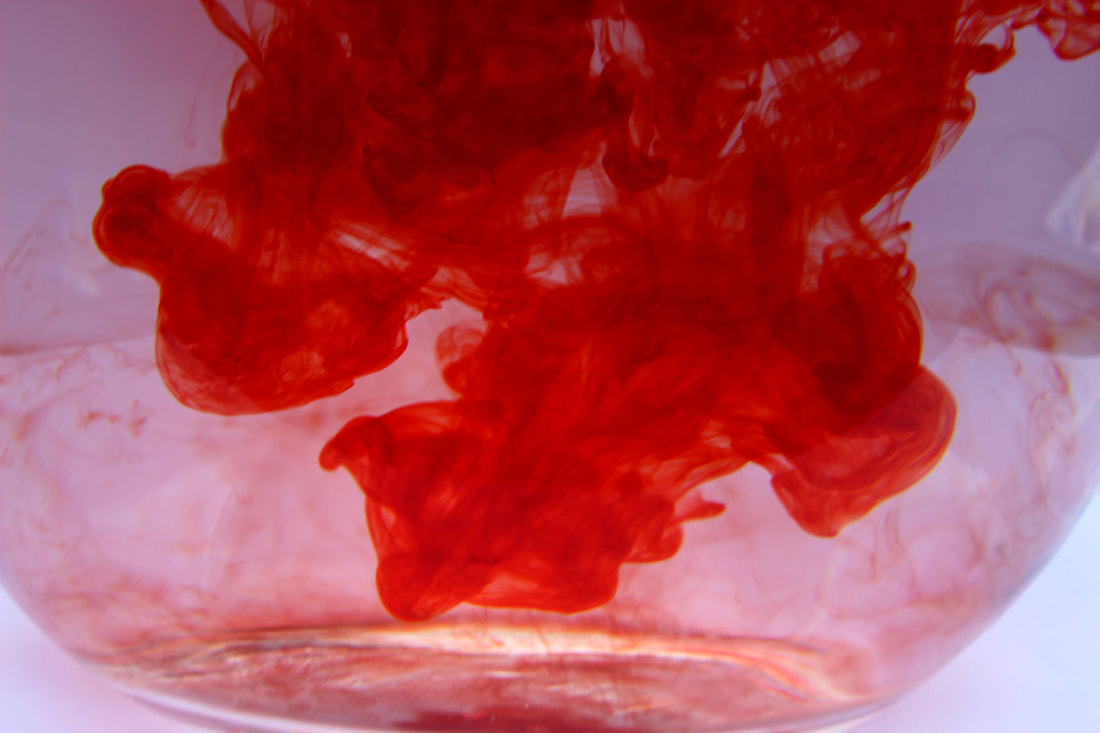
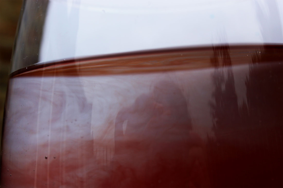
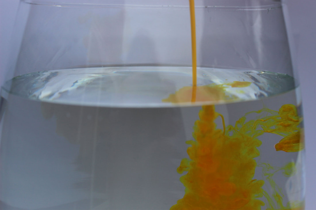
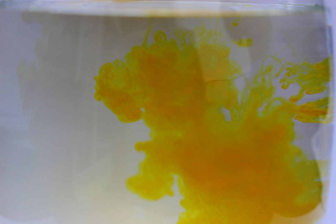
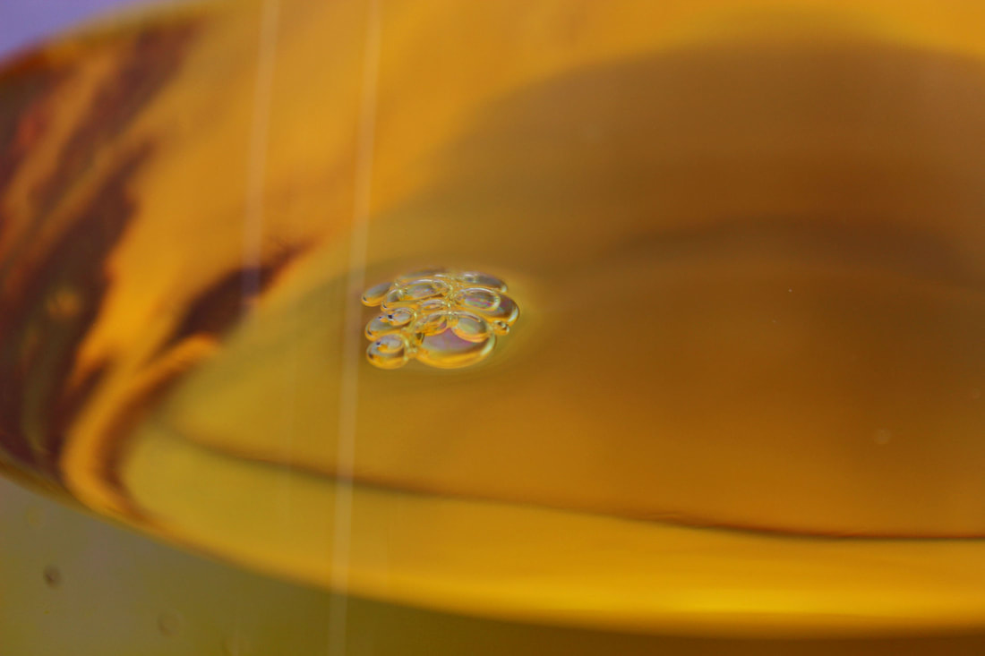
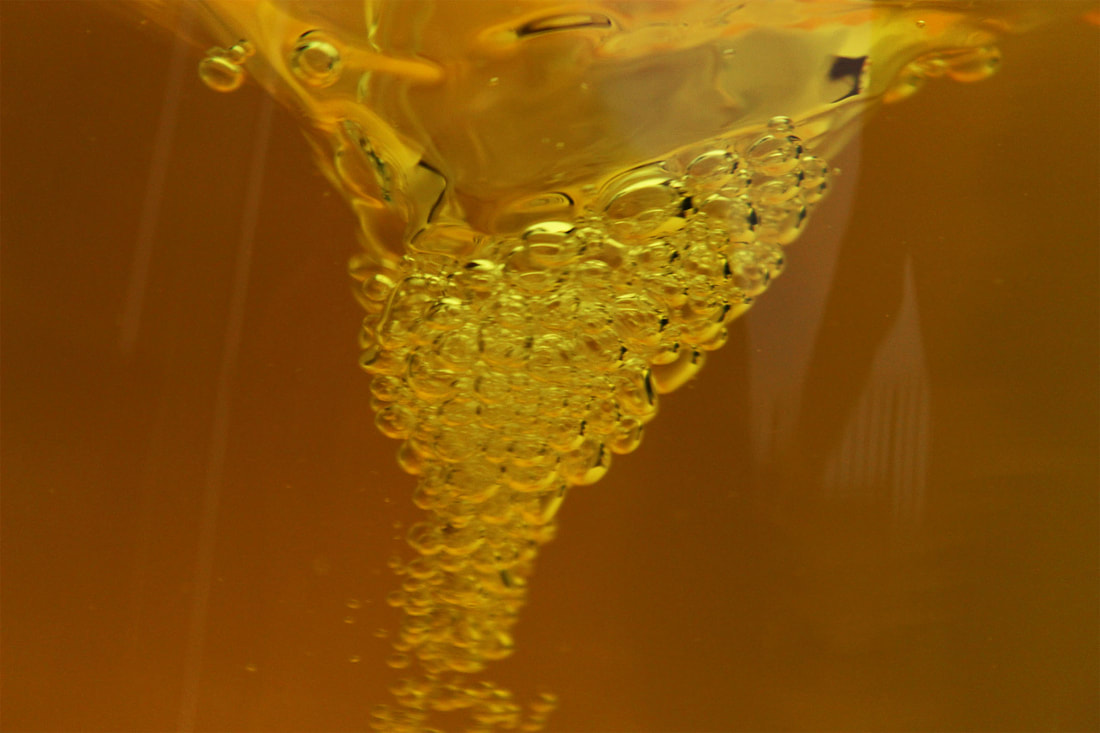
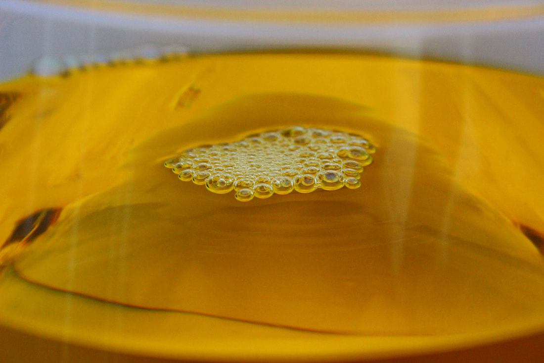
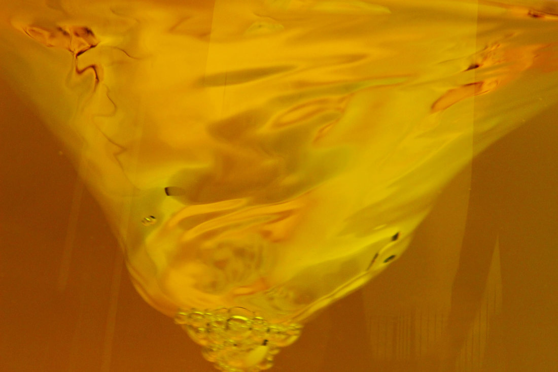
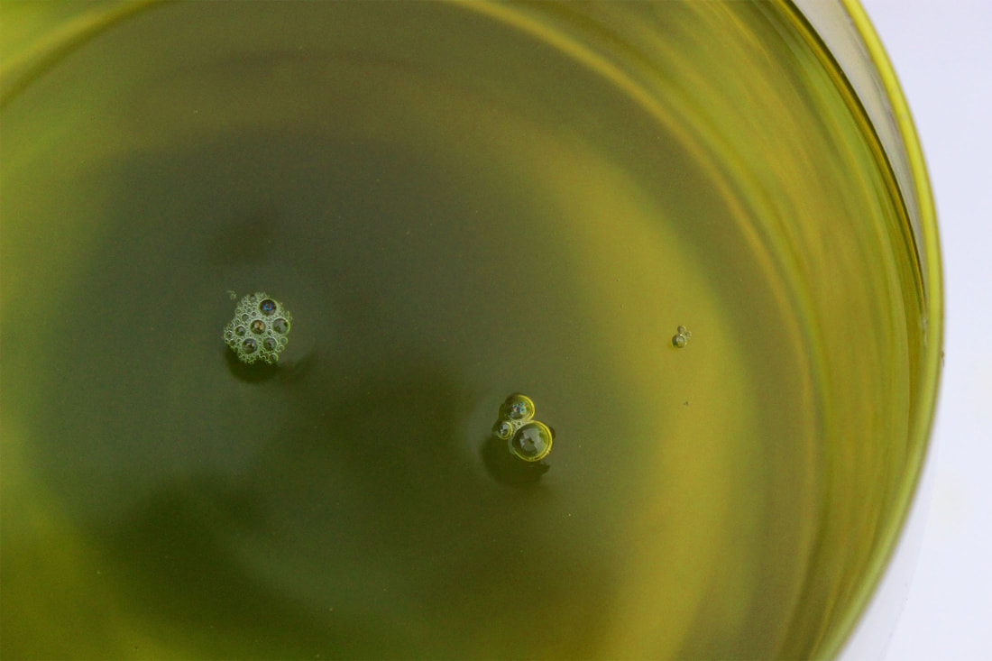
Force of Movement and Colour: Dan Tobin Smith
Dan Tobin Smith takes photos of colours in water created by ink. By changing the angle and crop of the image, he can position the viewer into looking at the photo from a different perspective. I like how he incorporates movement within his still images and gives a sense of surrealism in his photos where the frame is completely immersed in the water. They look like clouds and you would never have expected them to be photos of water.
|
|
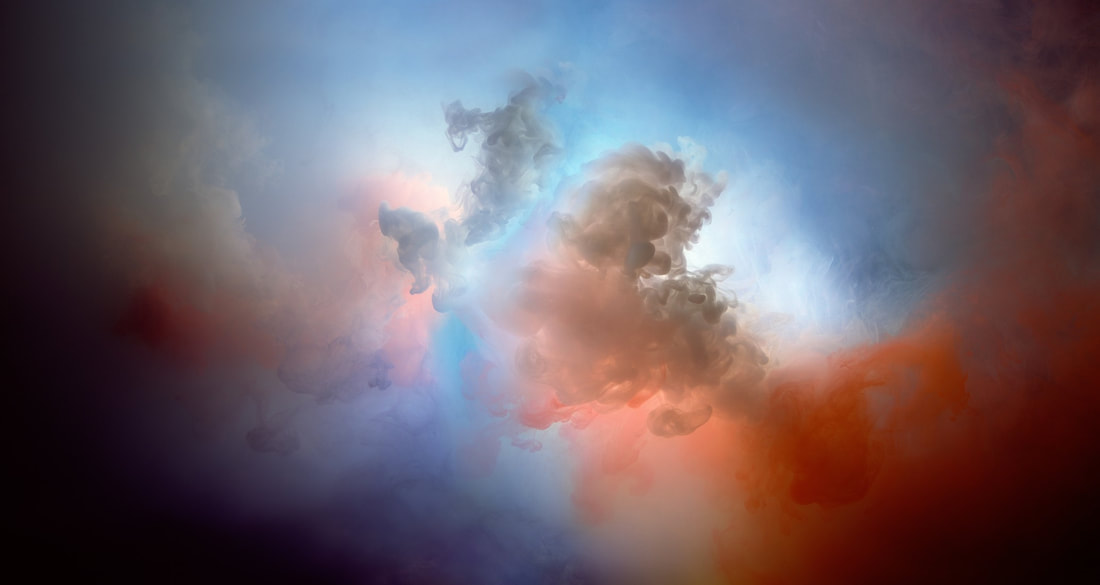
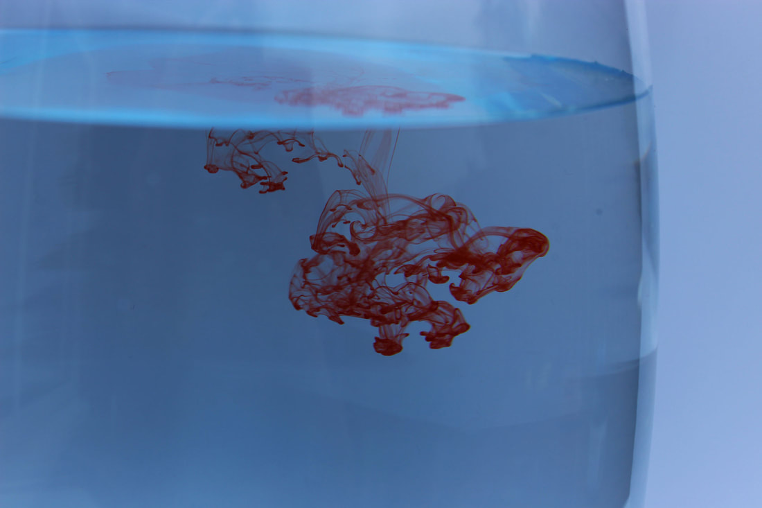
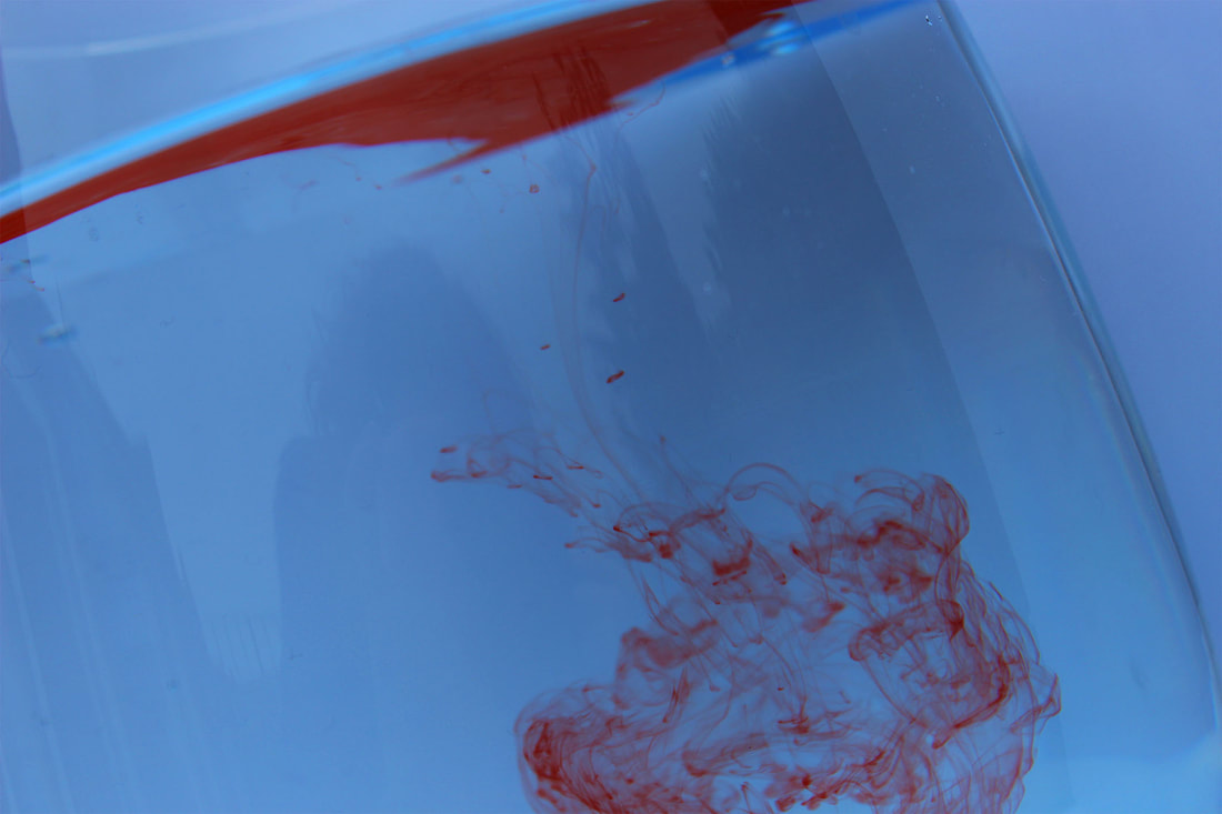
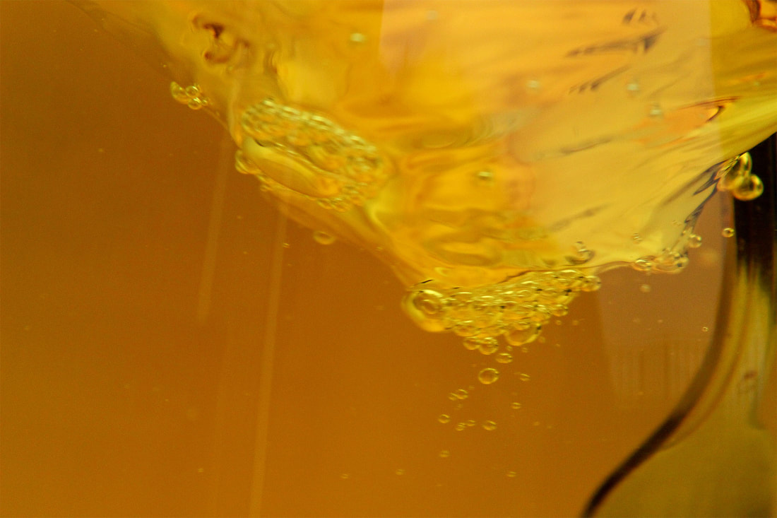
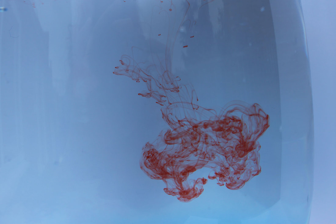
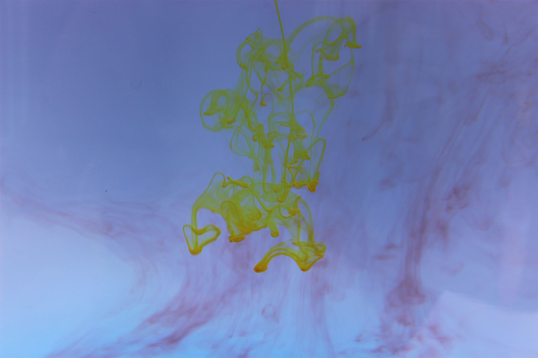
My Response
I think the colours used in Tobin Smith's images are important to create the illusion of movement. I used different coloured food dyes to create vibrant photos which evoke movement in the water and explosions of colour. I also created bubbles in the water by making a vortex, which further suggests movement within the photo.
|
|
|
|
|
|
|
|
|
These photos achieved my intentions as there is a clear suggestion of movement and there is lots of colour. Not all of my photos are perfectly focused however, so I should aim to improve this.
Development: Force of Identity
Merve Ozaslan - Natural Act
|
Merve Ozaslan was born in Istanbul in 1985, and is a ceramic and digital artist. Similar to John Stezaker, she wants us to consider the relationship between humanity and nature in her collage project 'Natural Act'. By combining photos of people and human structures with elements of nature, she represents the contrast between the two. She also uses black and white images of people, reflecting the often dull and grey aspects of city life, which contrast the brightly coloured photos of the natural world she uses. The shapes she outlines are often very defined, which I believe makes the end collage more effective and striking.
|
|
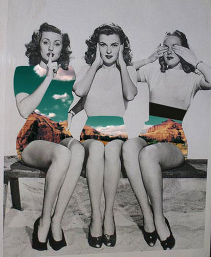
The women have had their skirts and dresses replaced with rocks and a bright sky, giving the impression of them being clear and a vision to an alternate world. They are expressing the traditional Japanese symbol of 'see no evil, hear no evil, speak no evil'.
|
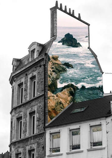
The stark contrast between the drab, grey city building and the colourful, vibrant sea highlights the natural beauty which has been replaced by human change in the modern world.
|
Nacho Ormaechea - Street Memories
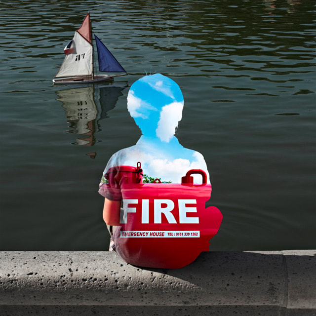
Nacho Ormaechea is Spanish born, but lives and works in Paris. He takes photos of people in their everyday life, and obscures part or all of their body with colourful photos of objects, nature or places. I think his use of composition is very effective, as he uses the Rule of Thirds to place the subject in an eye-catching position in the frame. His photos aim to make you question the life going on behind the person covered by the photo 'mask', as you can't see any of the emotions they are expressing. Moreover, the photos of the objects often have a stark contrast with the original setting of the person, for example the boy sitting by the lake who is covered with a fire hydrant.
|
|
|
This photo is extremely effective as it portrays a normal childish activity which has been dramatically enhanced by replacing the figure of the boy with a large red fire hydrant, almost as if he has been branded with it. This creates an irony between the calm scene of water and the boat, and the bright red of the hydrant which evokes fire and danger. The texture of the t-shirt emerging on the left side of his body draws away from this and gives a surreal effect. |
My Responses
In these responses I intended to erase a part of someone's identity, and I did this in different ways in each of my developments.
First Development
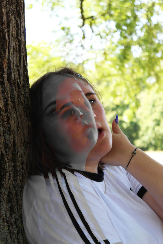
In this first response, I decided to use the double exposure technique I studied further back in the topic, and to focus simply on human character. My intentions were to give a sense of reflection and human behaviour.
|
|
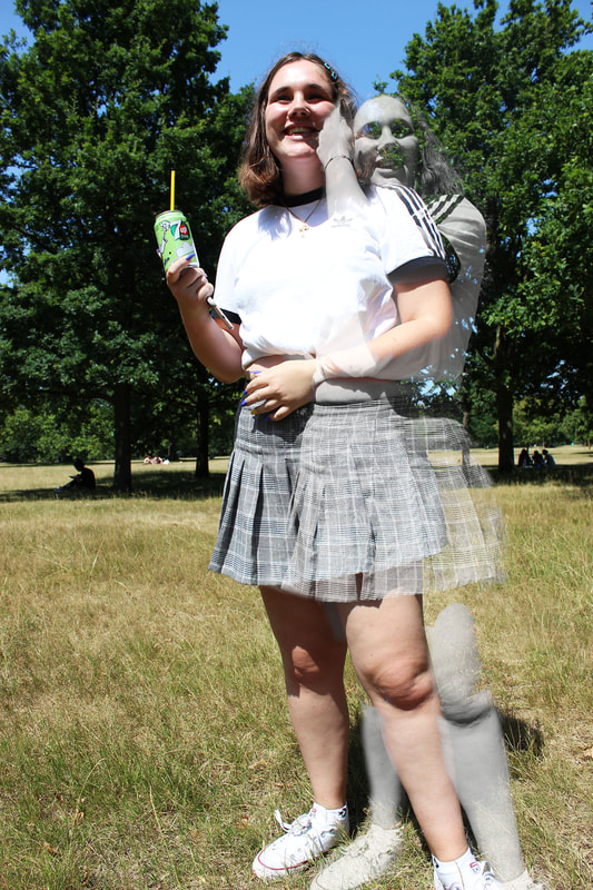
My editing method
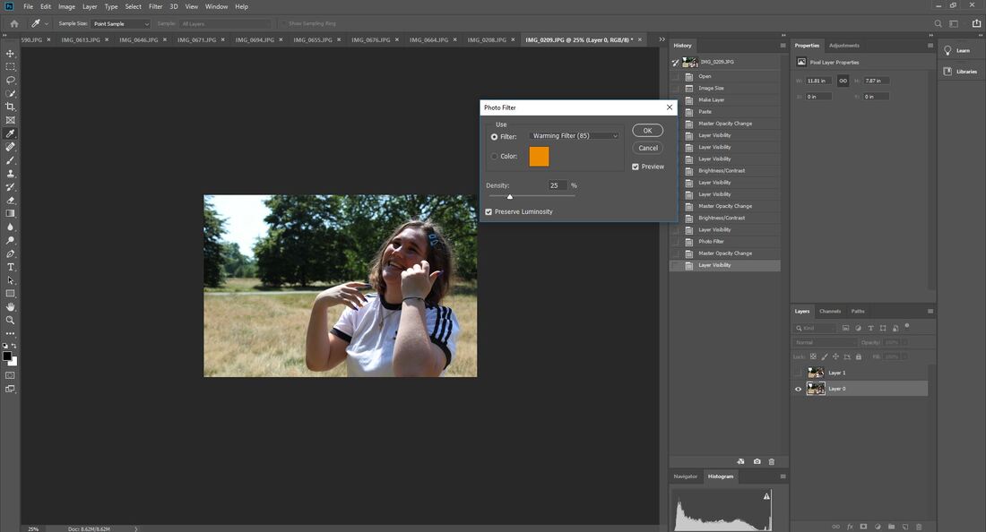
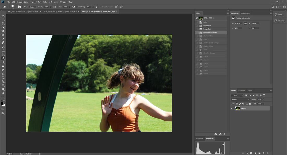
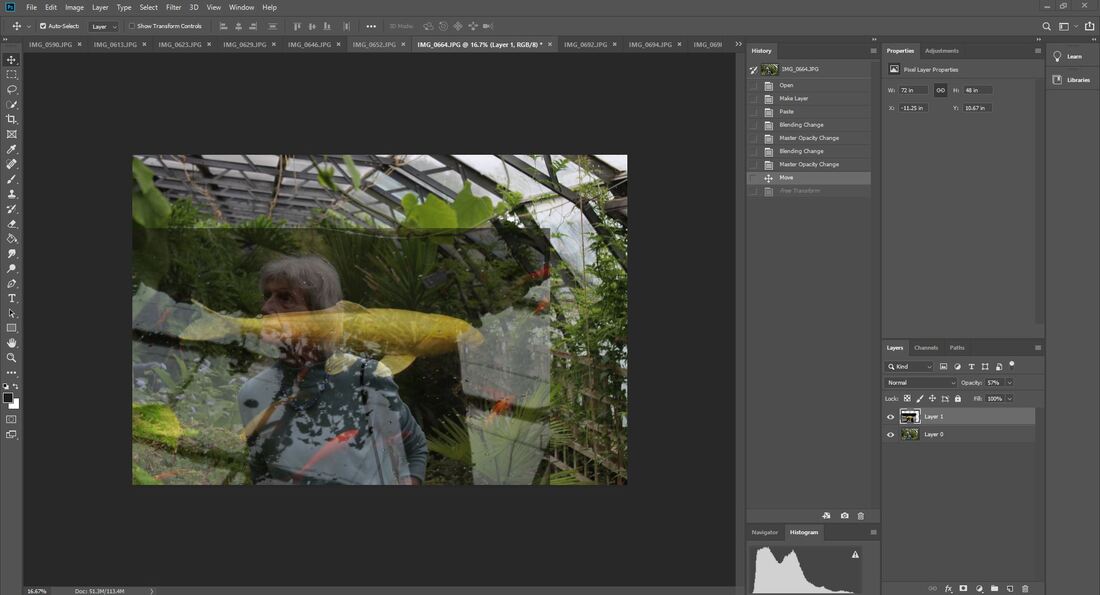
To begin with, I edited my two photos which I would be merging to be the same size, and placed them onto the same canvas. I edited my base photo (colour) subtly by changing the brightness and contrast.
|
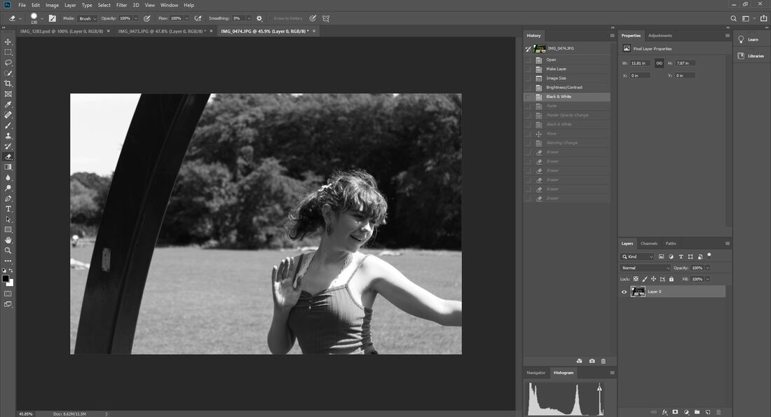
Next, I added a warming filter to my base photograph, to enhance the warm tones. This contrasts the black and white photo I overlayed it with.
|
|
|
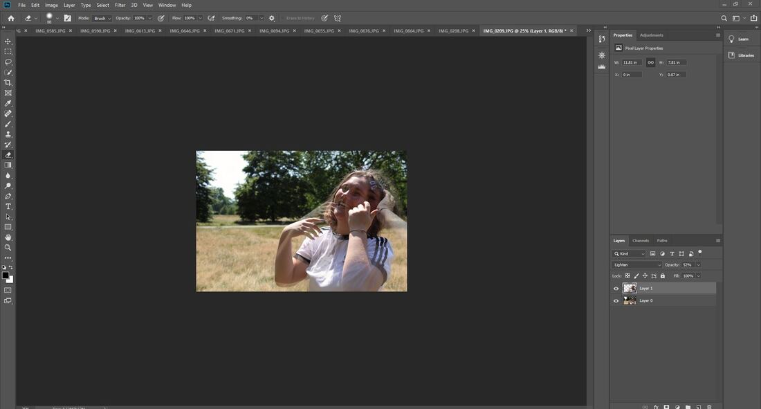
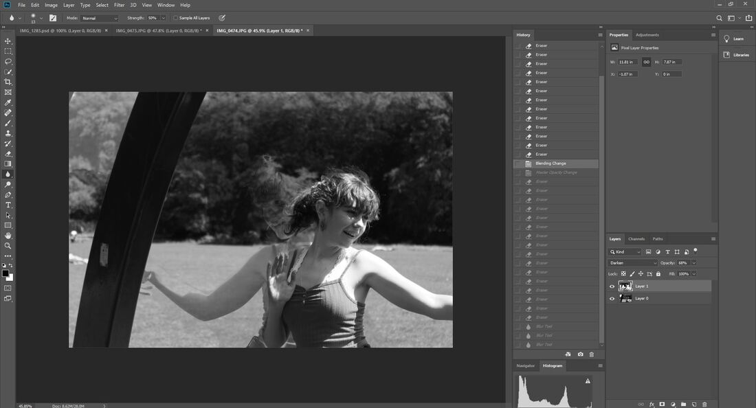
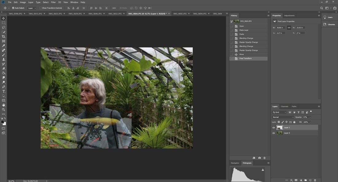
I blended my photos together by changing the opacity of the photo on the top layer to be more translucent. I used the lightening technique to make the photos seamlessly blur together, and erased parts of the top photo which I didn't want to include.
|
|
|
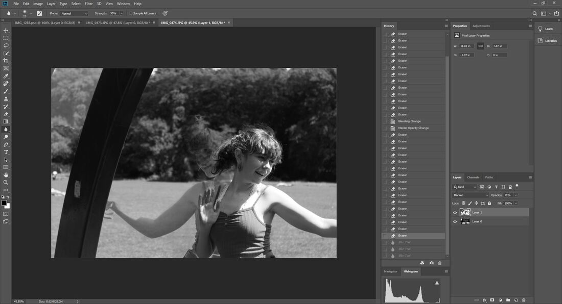
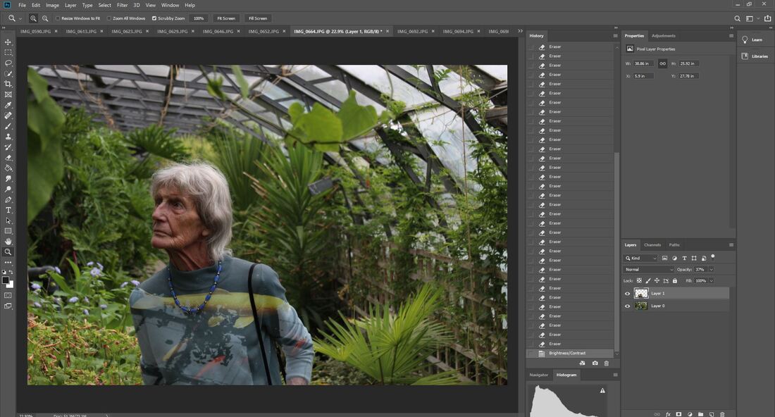
Finally, I made the top photo black and white, and edited the tones of each of the different colours until I was satisfied with how the blended together and contrasted the base photo. I think this look was effective, as it added movement and change in the photo.
|
|
WWW: My photos are well edited and I like the contrast between grayscale and colour
EBI: use different subjects to show different characters and moods
EBI: use different subjects to show different characters and moods
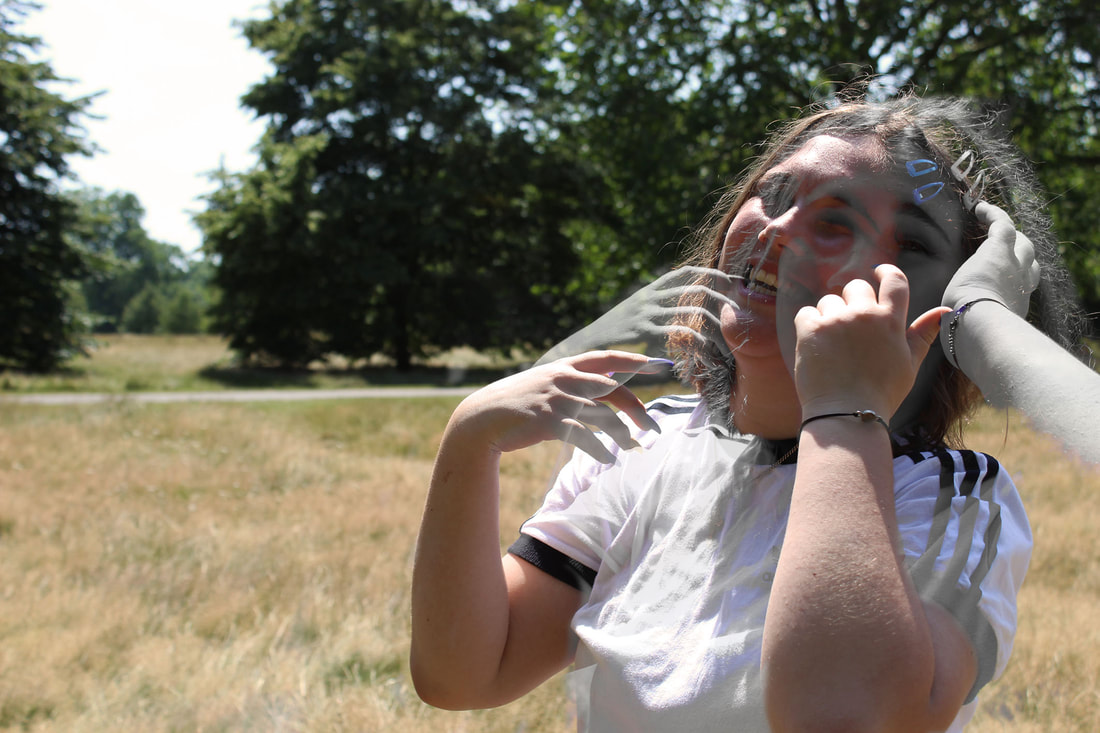
Second Development
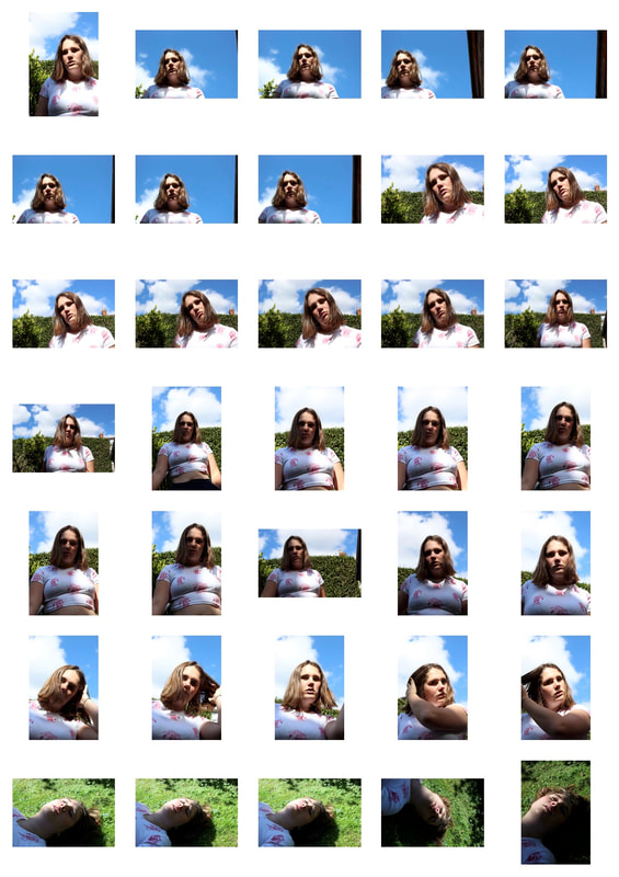
In my second response, I wanted to take my previous idea even further, this time incorporating more movement. I also wanted to make the shots look natural and unstaged, which is why some of the shots look more unexpected and candid.
|
|
My editing method
|
To begin with, I edited the photos similar to in my first development. I changed the brightness, contrast, and made other small tweaks to get the image I wanted.
|
|
|
As in my first development, I made the photo black and white, however this time I altered my base photo this way as well as the photo I would be overlaying.
|
|
|
After pasting my translucent photo onto the base photo and moving it into the position I wanted, I changed the blending method. In this edit, I used the 'Darken' property, however in my other edits I mainly used the 'Lighten' as the darker one suited these photos better than the others.
|
|
|
Finally, I erased around the translucent photo of Eva to get my desired effect and until it blended seamlessly.
|
|
WWW: My photos clearly show my intentions of movement
EBI: again expand on my use of different people
EBI: again expand on my use of different people
Third Development
After my second response, I realised I preferred how these types of photos looked in colour, and so I went back to using colour photos. I also strayed away from simply using portraits of people, and incorporated nature and other objects. In this development, I made sure to use a variety of subjects.
|
|
|
After I had made this edit, I realised the photos would have looked better if the texture of the subject's clothes had come through, so in my next 2 edits I made the photo of the object more translucent.
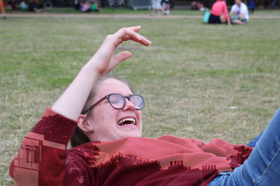
This photo is my favourite from this development, as I like how her hoodie fades into dark, and the rest of the photo is bright. I also like the contrast between midday light and sunrise.
My editing method
|
After separately editing my two photos, I placed the photo of the sunrise over Sophie, then erased around her jumper by making the photo of the sunrise translucent.
|
|
|
Once I was satisfied with how I had erased around the jumper, I increased the brightness and contrast on the layer containing the sunrise. This made the photo appear more vibrant, whilst still letting the texture of her jumper show through.
|
|
WWW: Use of texture and colour is good
EBI: Take even more care when erasing around the subject
EBI: Take even more care when erasing around the subject
Fourth Development
In this development, I decided to focus more on location and how it related to the subject, so I took photos where the subject was immersed in something that reflects something important to their life. In this case, it was nature.
|
|
|
|
|
Final Outcome Force - 1
I like the subtle effect created by the water and fish edited over the jumper in this photo, because at first it is almost unnoticeable and could appear unedited due to the way the photos blend and the still visible movement and creases of the top. The overall photo is very naturalistic and calm and the focus on the subject creates a clear green background which blends together well and contrasts with the bright colours of the jumper. I think this could have been improved if the reflection of the window had not been captured in the water with the fish, as it would give a more seamless effect.
Final Outcome Force - 2
|
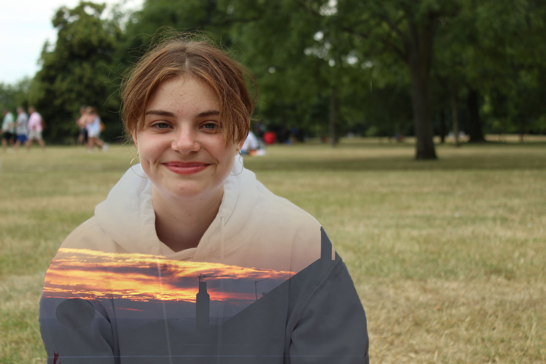
This photo is effective as it is at first a natural, peaceful scene with a good sense of depth due to the hint of the out of focus leaf in the foreground. The vibrant orange and yellow tones of the flower edited onto the jumper adds a shock of colour to an otherwise generally bland photo where the main colours are brown and green, which also highlights the beauty of nature and the impact this can have on humans. |
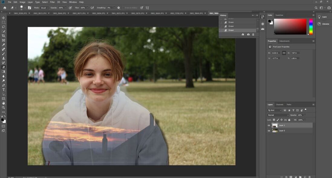
My editing method
|
My editing method was mostly very similar to my third development as the concept was generally the same, however I made sure to take extra care in the detail of these edits so they came out exactly as I wanted. I took extra attention to detail into account, for example carefully erasing around the necklace and making sure the edges were smooth and natural.
|
|
|
|
WWW: I stuck to and achieved my intentions
EBI: More variation in the photos of nature
EBI: More variation in the photos of nature
Final Development
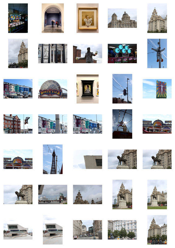
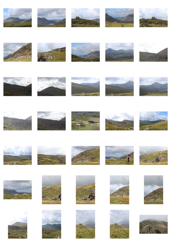
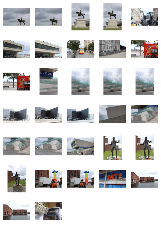
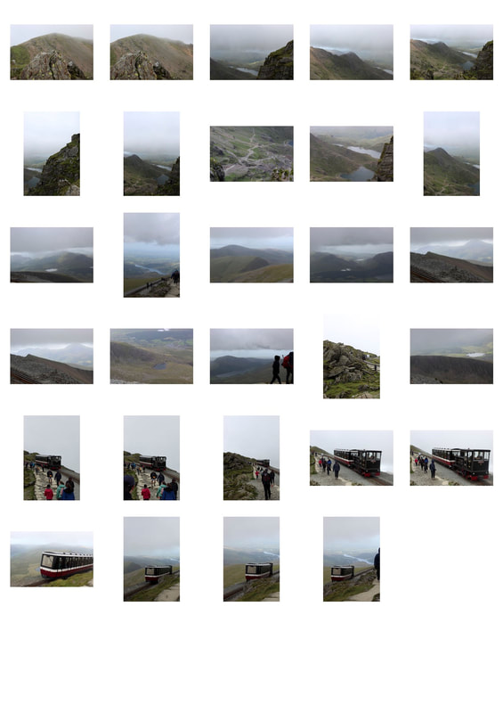
In my final development, I wanted to incorporate as many aspects of this unit as I could. This included the force of architecture, nature and double exposure, all enclosed within the bigger idea of identity. I wanted this to serve as a documentation of my summer holiday, so I incorporated photos taken from all of the places I went to during the summer. This includes Liverpool, Wales, and Blackpool.
|
|
|
|
Final Outcome Force - 3
|
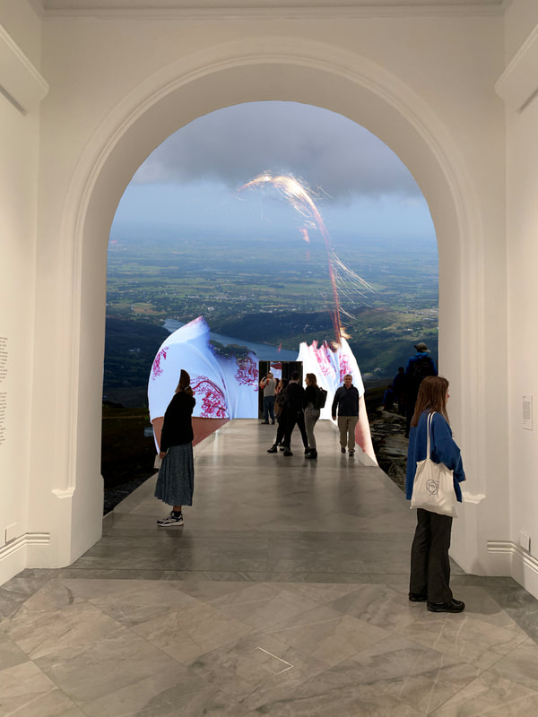
This photo represents the power of stepping into an alternate universe, which is both peaceful and yet unnatural. The people appear to be stepping through an archway and travelling down a walkway to a world where a face has merged with a mountain and the sky is purple. I like the smooth blend between the face and the mountain which give a seamless look, and the under stated colours in the foreground which contrast with the vibrant ones in the background. |
|
Final Outcome Force - 4
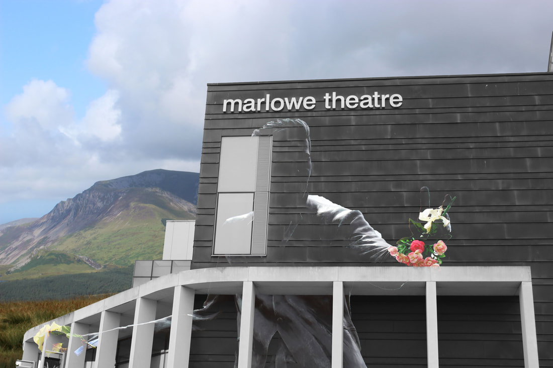
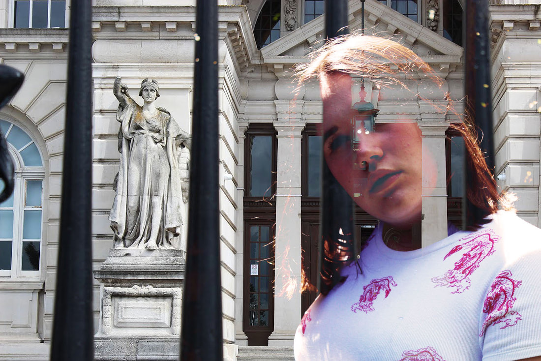
This photo depicts a scene which cannot possibly be real, however the viewer is almost tricked into believing it. The outline of the statue is effective as it blends into the grey of the building, and the highlights on the arms lead the eyes to the bunch of flowers at the end, which give a burst of colour amongst the surrounding grey. The sheer contrast between the man made sculptures and the natural mountain in the background represent the diversity the earth has within such small space and shows that both can be beautiful and yet ominous and overwhelming at the same time.
Final Outcome Force - 5
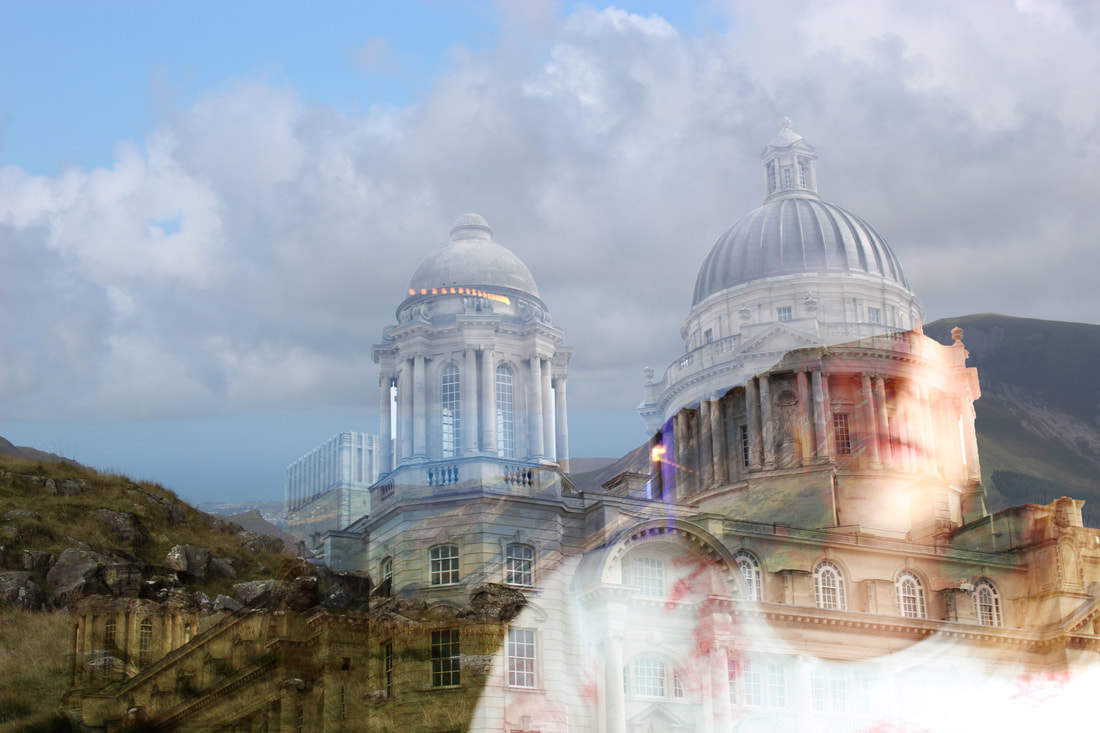
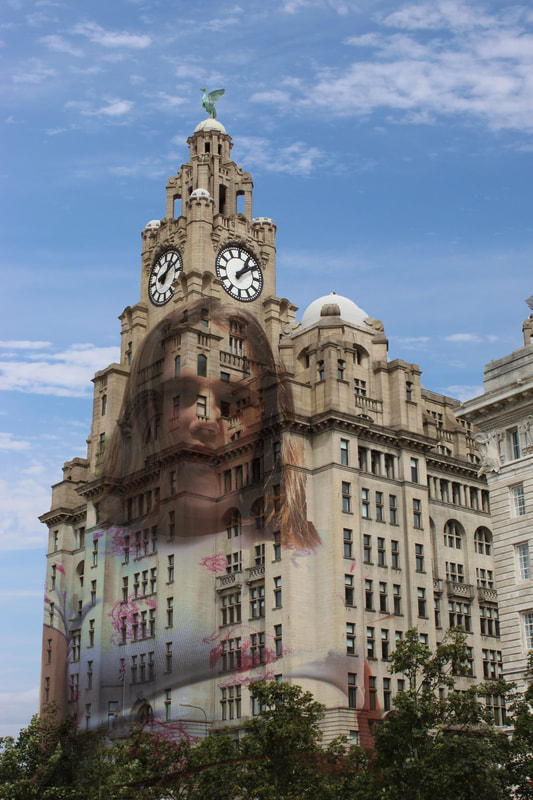
In this photo I wanted to represent how nature, humans and architecture are all linked together and co-dependent. One of my favourite aspects of this creation which is subtle but adds to the interweaving feel is where the neckline of Ava's top curves and joins neatly into the archway of the building. This wasn't planned, and yet looks effortless and adds to the smooth, connected tone of the photo. The rocks and grass blend together with the left hand side of the building, and add texture, and a slightly cooler, more sinister tone than the right hand side of the photo where it is generally bright, and there is added purple light coming from the LED strips in the background of the photo of Ava.
Final Outcome Force - 6
|
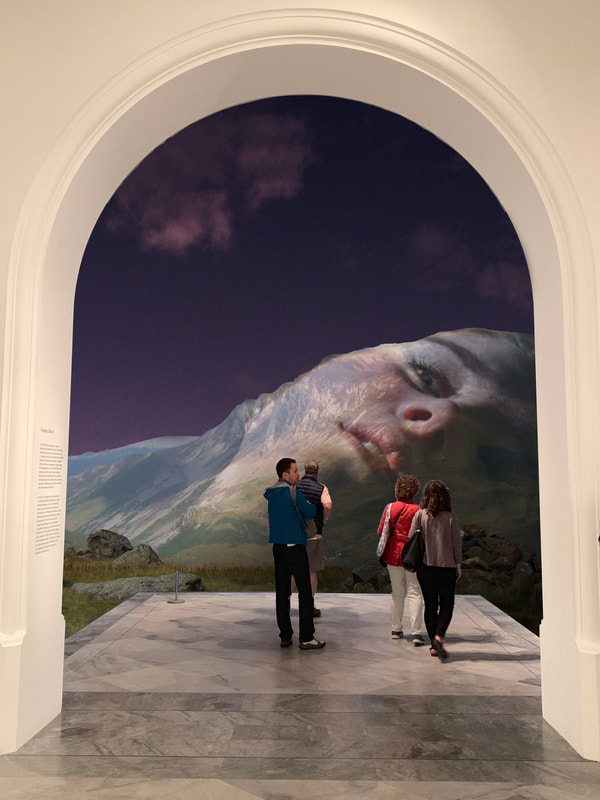
This photo is similar to a previous outcome and evokes the similar feeling of people stepping into an alternate universe. I think the added use of a door gives the effect of a portal into the unknown, and the uncertain mood is shown due to Ava's face being invisible, and only part of her hair being shown. The photo of the valley landscape is taken from high up, showing the distance between the people and the other side. I think the darkness surrounding it creates a more sinister tone, and hints that the other universe may not be idyllic like the people stepping into it might desire it to be, and that there are hidden monstrosities to be discovered.
|
My editing method
|
First, I separately edited my two main photos I would be using. I changed the brightness, contrast, and made sure I was happy with the colour balance of each of the colours.
|
|
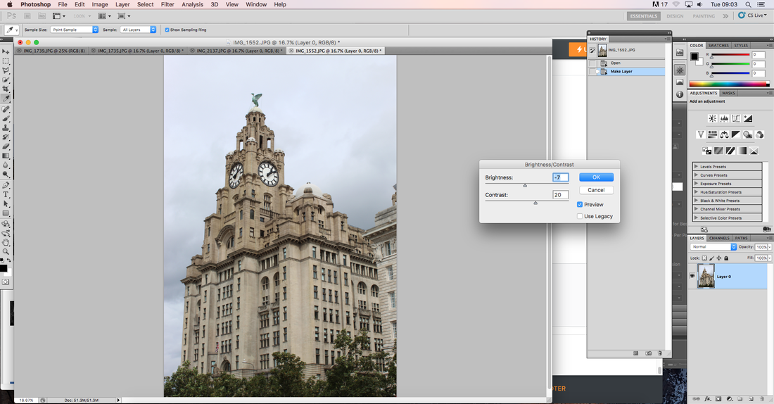
|
|
Next, I pasted the photo of Ava onto the photo of building and changed the way the photos were blended. I used the 'Darken' property to make her face and the design on her t-shirt come through, giving a surreal effect. I also erased any excess parts of the photo which I didn't want.
|
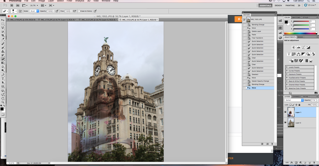
|
|
I used the quick selection tool to select the area of sky behind the building so I could replace it with a brighter, more striking sky. I used the area to rub out small cracks and hard to reach areas with more precision.
|
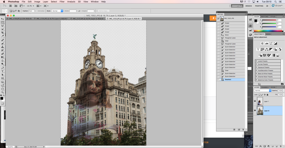
|
|
Finally, I placed the photo of the brighter sky behind the building to give it a towering effect, and give the photo some more colour.
|
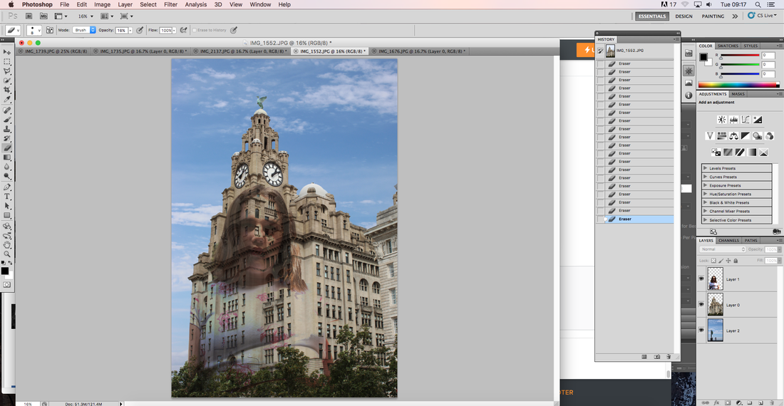
|
WWW: I'm happy with how I developed my ideas throughout the project and how my final edits turned out.
EBI: Variations in people used.
EBI: Variations in people used.
